| Author | Thread |
Comments Made During the Challenge  |
|
|
05/03/2005 10:38:16 PM |
|
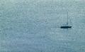
Maybe it is my monitor, but the colors look rather flat. 5 |
|
 Photographer found comment helpful. Photographer found comment helpful. |
|
|
05/03/2005 08:04:55 PM |
|
Nice mellow colors and tones. This one has been growing on me since I first looked at it. |
|
| Photographer found comment helpful. |
|
|
04/30/2005 10:16:39 AM |
|
The clouds in the backround seem a pixelated for some odd reason. But I'm sure you already have like ten thousand comments saying that :p |
|
| Photographer found comment helpful. |
|
|
04/29/2005 11:20:15 PM |
|
A little fuzzy and lacking intensity. |
|
| Photographer found comment helpful. |
|
|
04/29/2005 12:29:54 PM |
|
This is an interesting picture but my attention is really divided between the tower and the structure to the left of it. |
|
| Photographer found comment helpful. |
|
|
04/29/2005 10:40:13 AM |
|
| Photographer found comment helpful. |
|
|
04/29/2005 10:35:48 AM |
|
Is that military or civillian? Where is there a bridge top in the picture 9if that's what it is)? It needs more purpose and to be more in focus. Otherwise the idea has potential. |
|
| Photographer found comment helpful. |
|
|
04/28/2005 11:01:26 PM |
|
I like the photo - 7. If only you knew the next challenge was goig to be late night! :) |
|
| Photographer found comment helpful. |
|
|
04/28/2005 11:10:59 AM |
|
Seems a little out of focus but could also just be my eyes, good job. |
|
| Photographer found comment helpful. |
|
|
04/28/2005 10:20:20 AM |
|
Fits the challenge quite well, but seems out of focus. I notice that you can see some of the lines are pixellated - perhaps you can try a higher resolution shot. Composition is nice, and I love the lighting. |
|
| Photographer found comment helpful. |
|
|
04/28/2005 12:13:54 AM |
|
I would have rated this a bit higher had it been a bit more in focus. |
|
| Photographer found comment helpful. |
|
|
04/27/2005 10:14:03 PM |
|
Interesting. However, the tower needs to be more vertical. |
|
| Photographer found comment helpful. |
|
|
04/27/2005 04:26:20 PM |
|
This is really a cool shot. I think eliminating the area on the left by using a more rectangular crop would help though. |
|
| Photographer found comment helpful. |
|
|
04/27/2005 01:54:25 AM |
|
This is minimalist in the classic sense more than in the only-small-portion sense, but I'm not docking points for that. Unfortunately, the eye is drawn to the light at the top, which seems blurry, and I do dock points for that. The image is also somewhat drab. Boosting contrast might have helped. |
|
| Photographer found comment helpful. |
Home -
Challenges -
Community -
League -
Photos -
Cameras -
Lenses -
Learn -
Help -
Terms of Use -
Privacy -
Top ^
DPChallenge, and website content and design, Copyright © 2001-2026 Challenging Technologies, LLC.
All digital photo copyrights belong to the photographers and may not be used without permission.
Current Server Time: 06/28/2026 11:42:28 AM EDT.