| Image |
Comment |
| 04/27/2005 04:44:28 AM |
Hardware_v1by Man_Called_HorseComment: I have no idea what this is supopsed to be, and the blown highlight on the reflected glare is harsh and distracting. |
| 04/27/2005 04:41:28 AM |
condom senseby sacredspiritComment: I'm not sure what the focus is supposed to be. The title implies the condom, but the rose or the cigarettes could work just as well, making this shot pretty, interesting, and completely off topic. |
 Photographer found comment helpful. Photographer found comment helpful. |
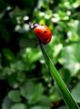
| 04/27/2005 04:38:32 AM |
Ladybird on the Topby mannjuditComment: Are they also called ladybirds? I only ever heard of them as ladybugs. Either way, a very nice image, with good colors and contrasts. |
| Photographer found comment helpful. |
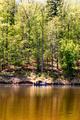
| 04/27/2005 04:36:40 AM |
Fishing Buddiesby leescComment: Pretty, but nothing draws the eye to the subject, which is almost hidden by the background. |
| Photographer found comment helpful. |
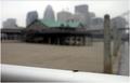
| 04/27/2005 04:34:50 AM |
Dead Bugby arsharifComment: An interesting setup, except that the background isn't blurry enough to keep the eye from being drawn by the bright green roof. Without the title, I would have thought that this was just a horrible picture of a house. Something needs to draw the eye to the subject. |
| 04/27/2005 04:33:09 AM |
Blindsby JewellianComment: This doesn't meet the challenge description, but it's minimalist in the classic sense, so I'm not scoring you down for that. It's an interesting concept, but lacks something to make it memorable. |
| Photographer found comment helpful. |
| 04/27/2005 04:32:08 AM |
Gravityby sofapezComment: Ack! Fuzzy subject on a harsh, painful white background. Please don't hurt the viewer. We score you down for that. |
| Photographer found comment helpful. |
| 04/27/2005 04:31:24 AM |
Johnny Guitarby pawdrixComment: Too many things draw the eye. Not minimalist. Otherwise not a bad shot. |
| Photographer found comment helpful. |
| 04/27/2005 04:30:11 AM |
Buttonby ckdakeComment: Cute concept, with the folds of the skin breaking monotony for the background. This would have been an excellent image... but it's not sharp. Scoring it still a 7, though. |
| Photographer found comment helpful. |
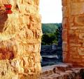
| 04/27/2005 04:29:04 AM |
Butterfly’s Castleby texaskevComment: The brightness of the rock draws the eye away from the butterfly. Darkened, this might have been an excellent shot. I also wish the depth of field had been narrower to blur out the distant area. |
| Photographer found comment helpful. |
Home -
Challenges -
Community -
League -
Photos -
Cameras -
Lenses -
Learn -
Help -
Terms of Use -
Privacy -
Top ^
DPChallenge, and website content and design, Copyright © 2001-2025 Challenging Technologies, LLC.
All digital photo copyrights belong to the photographers and may not be used without permission.
Current Server Time: 08/19/2025 08:03:53 PM EDT.