|
|
|
Showing 661 - 670 of ~1242 |
| Image |
Comment |
| 12/30/2006 05:13:17 PM | Pure Sugarby escapetoozComment: Hey there from the Critique Club
Camera Work/Technical: Terrific model and wonderful color with this capture. Everything looks very crisp, save the cotton candy on the stick.
Lighting: I think the lighting accounts for the soft look the the candy has. I think that side of the frame is just a bit hot causing the candy to blend into the background. The large bright spot also creates a distraction that pulls the eye from the attractive model and the great expression.
Composition/Content: Very well planned and executed. I do agree that the glasses frame should either be up a little or down a little. Running it straight through the eyes makes the eyes look very distorted.
My Opinion: I like it, and I think that it should have scored much better even as it. Moving the glasses and toning down the left lighting would have surely boosted it as well.
Eric |  Photographer found comment helpful. Photographer found comment helpful. |
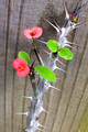
| 12/30/2006 04:59:21 PM | Sticky - Ouch! Crown of Thornsby pixeldustComment: Hey there from the Critique Club
Camera Work/Technical: Very nice white balance choice, yielding great colors and strong tones. The bottom flower looks a little out of focus to me.
Lighting: The bottom flower is also just a bit overexposed. There are also some distraction hot spots on most of the thorns. Shooting at a different time of day might have helped this a bit.
Composition/Content: I like the flow you created with the angle of the vine. It serves well to pull the viewer's eye up and into the image. I think that the content is a bit lacking. While I fully understand your interpretation, it was apparently not what the voters were looking for.
My Opinion: I think that the voters had more of a messy liquid theme in mind. Even still, with a little sharper focus and a little less exposure, I think this capture would have finished much higher.
Eric
| | Photographer found comment helpful. |
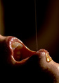
| 12/30/2006 04:46:27 PM | It's honey , honeyby clangley50Comment: Hey there from the Critique Club
Camera Work/Technical: Very clean, crisp focus, as well as a great depth of field. Also, your choice of white balance created very nice, warm tones providing a very inviting feeling to the image.
Lighting: I'd really like to see more light on the side of her face that is toward the camera. While the shadows fit nicely into this image, this part of her face is a bit too dark, thus pulling and holding the viewer's eye into the dark void.
Composition/Content: I agree that this one needed a tongue, but I also think some nose should have been included. Without the nose, the faces looks like it has some sort of uncomfortable deformity. This one was not far off the first place finisher. I even like your tones better, but you needed that nose.
My Opinion: I think the concept is far batter than the score it pulled, but it suffered in its execution. This really wasn't far from being a personal best. In my opinion, it only needed a nose and a little less shadow.
Eric
| | Photographer found comment helpful. |
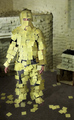
| 12/30/2006 04:35:02 PM | Sticky Notes (A scene from "Bruce Almighty")by ShmeeComment: Hey there from the Critique Club
First of all, congrats on your best finish to date, as well as your third highest score. Well-done and well-deserved.
Camera Work/Technical: This looks like it was a ton of work. You came up with a nicely creative concept and executed it nicely as well. Your focus is crisp and clear, and your tones are near flawless. My only complaint is that the Gaussian blur you added gave it too much of a cartoon-type feel.
Lighting: Your use of HDR yielded very nice and even lighting results.
Composition/Content: Very creative. I really like the stickies that have fallen off onto the floor. This added a lot of interest to the photograph, thus giving the appearance of a man falling apart under stress. Well seen in your mind's eye.
My Opinion: Definitely the best of the three similar entries. I think that you may have pulled a bit higher of a score without the background blur, but it worked well with the voters as it is.
Eric | | Photographer found comment helpful. |
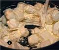
| 12/30/2006 04:20:07 PM | Melting Marshmallowsby dtouch1Comment: Hey there from the Critique Club
The first thing that strikes me about your image is the size. Smaller images always get hammered by the voters. There are some tutorials available to help with properly sizing images for the challenges. If you use PaintSHop, check HERE, and if you use PhotoSHop, check HERE.
Get this sizing issue handled, and I believe that your scores will fare much, much better. As far as the quality of the image goes, I'll echo the opinions of other voters that offered comments. There really is no focal point of the image, thus nothing really grabs the eye to offer any appeal. I can tell that it is sticky, but, without the title, I really couldn't see what it was. Work on your focus, as well as getting those images as large as possible.
Eric | | Photographer found comment helpful. |
| 12/30/2006 12:42:07 AM | Sticky Faceby karenkComment: Hey there from the Critique Club
Camera Work/Technical: You captured terrific colors in this image. I also like your choice of settings, capturing all elements of interest in crisp focus.
Lighting: Your lighting is nice and even. You did a very nice job capturing this one without loosing any details in the shadows or blown highlights.
Composition/Content: I'd like to see your cropping loosened up a bit. Chopping off fingers or body parts near joints gives more of an accidental snapshot than an intentionally composed image.
My Opinion: You met the challenge well, but with a bit different composition, this score would have finished much higher.
Eric
| | Photographer found comment helpful. |
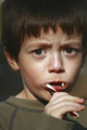
| 12/30/2006 12:18:31 AM | Candy Caneby sfmorrisComment: Hey there from the Critique Club
Camera Work/Technical: Nice capture and very nice focus. I also see some sort of color hue as well. I think that your post-processing is the culprit here.
Lighting: Excellent use of natural lighting. His face is lit terrifically and nothing is lost in shadows or blown highlights.
Composition/Content: I echo the adoration of previous commenters in that the expression is priceless. I do think that your cropping is just a bit tight. It give the image a very crowded and cramped feeling to it.
My Opinion: I like it, and I think it fits the challenge nicely. With a bit looser crop and less the hue, you score would have surely grown.
Eric
| | Photographer found comment helpful. |
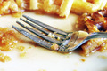
| 12/29/2006 11:48:00 PM | Leggo my Eggoby MonaLeeComment: Hey there from the Critique Club
First of all, welcome to DPC!!! I see that this is your first challenge, so I want to be the first to welcome you to the good times and the heartaches of this site. I think you can gain a lot of valuable knowledge on this site. Just keep shooting away and submitting your work to the praises and criticisms of others. I think that this is the way we learn best.
Camera Work/Technical: Excellent focus the produces a very crisp image. I also like your depth of field choice here. Your white balance is also spot-on, thus yielding the exact colors that the eye expects to see.
Lighting: Too harsh. That is the downfall of this image. I think that the overall image looks a bit washed out and is lacking some much needed contrast. I hope you don't mind, but I took this version of your image and made a few adjustments. I took the highlights down in Photoshop, as well as gave it a nice s-curve adjustment layer. This is how I would have processed it:

If you'd rather your copyrighted work not be re-displayed, please let me know and I'll be happy to take it down.
Composition/Content: I will have to disagree with pamelasue in that I don't think any more of the waffle is necessary. I think the composition that you put together looks just as it should. The fork is a bit centered, but it really works in this particular capture. The fork works very nicely to pull the eye into the image and the waffles serve as boundaries to keep it in and flowing around.
My Opinion: This is the beginning of an excellent shot. It it were a little underexposed your score would have surely soared. 5.3 is a very respectable score, but this one had a much higher potential. I hope this helps.
Eric
|
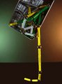
| 12/29/2006 11:24:18 PM | Sticky Magnetsby krglComment: Hey there from the Critique Club
Camera Work/Technical: Nice focus and fine settings to keep all the necessary elements in focus. Your chosen white balance also yields very nice tones and coloring.
Lighting: I really enjoy the warmth that you created with your lighting in this capture. The green and brown hues of the background work nicely to set your subject off.
Composition/Content: Very creative thinking to meet the challenge. It still seems a bit too centered to me, and the tilt of the tabletop(?), very horizon-like, gives the image an uncomfortable feel.
My Opinion: You absolutely met the challenge, but I don't think it was what the voters had in mind. Even still, with a bit different composition and a straightened horizon line, I think your score would have grown.
Eric
| | Photographer found comment helpful. |
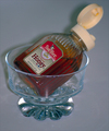
| 12/29/2006 10:57:21 PM | Sweet, Sweet, Honeyby TerminatorComment: Hey there from the Critique Club
First of all, welcome to DPC. I see that you have been here just over a month. I hope you are enjoying the challenges, as well as learning a bit here and there. The first thing that strikes me about your image is the size. Smaller images always get hammered by the voters. There are some tutorials available to help with properly sizing images for the challenges. If you use PaintSHop, check HERE, and if you use PhotoSHop, check HERE.
Get this sizing issue handled, and I believe that your scores will fare much, much better.
Eric
|
|
Showing 661 - 670 of ~1242 |
Home -
Challenges -
Community -
League -
Photos -
Cameras -
Lenses -
Learn -
Help -
Terms of Use -
Privacy -
Top ^
DPChallenge, and website content and design, Copyright © 2001-2025 Challenging Technologies, LLC.
All digital photo copyrights belong to the photographers and may not be used without permission.
Current Server Time: 08/12/2025 07:49:29 AM EDT.
|