| Image |
Comment |
| 11/19/2002 04:55:00 AM |
Reaching for Technologyby boyte1Comment: The hand in the hard drive really sets this apart from the other shots of similar comp. The rest of it is pretty good, no major flaws or distractions. - good luck, Inspzil |
| 11/20/2002 05:07:00 AM |
A Change In The Air....by tattooComment: Great idea. I saw this pic and the first thing I thought is "I'd have backlit this one" to accent the edges so it isn't blended right into the backdrop. I would have kept the top light where it is though, it looks nice there. Good Luck - Inspzil |
| 11/15/2002 05:01:00 AM |
Mosquitoby amonteforteComment: I am not really seeing this as a macro. The "mosquito" is way overexposed and it looks like the persons right arm was moving. Good luck - Inspzil |
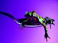
| 11/15/2002 05:28:00 AM |
Texture of....by fotofrogComment: The choice of subject and the way it's portrayed leaves this picture pretty boring, sorry to say. Not much for color in this pic and it isn't helping the appeal of it. Good luck anyway - Inspzil |
| 11/13/2002 05:16:00 AM |
Piano Blueby SeekerComment: Cool picture, but I do not see this as macro. I don't even think it's that close up. But like I said, it is a cool picture. Good luck - Inspzil |
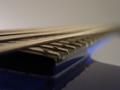
| 11/15/2002 05:08:00 AM |
High Strungby briansquaredComment: It looks harder to focus this picture like this, than it would be to give a little more DOF to the strings. Its strangely focused for about 1" of the strings. Neat trick but not so sure I like it. Is this a left handed bass? Good luck - Inspzil |
| 11/13/2002 10:35:00 PM |
|
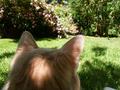
| 11/13/2002 04:59:00 AM |
Huntby vitsmakComment: I don't see this being a macro. The thing I do see is the thumb or finger at the bottom of the pic. That, I would imagine, is getting mentioned by anyone looking at the pic closely enough. Taking the pic while in the shadows is not a good idea, IMO. Good luck - Inspzil |
| 11/15/2002 05:19:00 AM |
|
 Photographer found comment helpful. Photographer found comment helpful. |
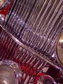
| 11/13/2002 04:52:00 AM |
Chrome Chrazyby timj351Comment: I like the majority of the composition on this one. A couple things are coming to my attention here. First is the angle. It seems for whatever reason, I would prefer the image tiliting the other way. the 2nd thing is he lights showing at the bottom. I feel they need to be in the pic, or out of it, not partly both - Inspzil |
Home -
Challenges -
Community -
League -
Photos -
Cameras -
Lenses -
Learn -
Help -
Terms of Use -
Privacy -
Top ^
DPChallenge, and website content and design, Copyright © 2001-2025 Challenging Technologies, LLC.
All digital photo copyrights belong to the photographers and may not be used without permission.
Current Server Time: 08/11/2025 10:17:24 PM EDT.