|
|
|
Showing 2201 - 2210 of ~3109 |
| Image |
Comment |
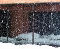
| 12/19/2002 02:52:26 PM | Snowy Windowsby mcrochipComment: Critique Club for Snowy Windows by Mcrochip
Composition - The biggest problem I have with this photo is that it lacks any real center of interest for me. The snow is nice (I live in Michigan and see enough of it every year) especially with the nice big flakes falling. The dark windows make for a great backdrop and contrast the falling snow nicely. It just sort of needs...well, a subject. The image does run a little uphill from left to right as well.
Background - This is the background. I keep envisioning a tall, thin wholesome looking girl with curly hair poking out from under her hat in a long dark wool coat catching snowflakes on her tongue.
Camera work - Nice job here. Well framed and settings adjusted pretty well to keep from being underexposed. The whiteness of snow has been known to give cameras fits from time to time. You did a great job capturing the motion of the snow.
Processing - Doesn't look like much was done here. That means not much was done, or that you did whatever you did well enough so that at least I can't tell
Overall - Technically, I think you did a nice job. But artistically, it really needs something to focus on more than the snow. The challenge of motion was met, but not much else. I don't think its a bad picture, but I think it really needs something (like a subject). - Inspzil
Message edited by author 2003-06-12 21:22:14. |  Photographer found comment helpful. Photographer found comment helpful. |
| 12/19/2002 02:51:55 PM | Fallingby bmarquezComment: Critique Club for Falling by BMarquez
Composition - Pretty nice composition really. A few things to note, which one by one, are minor notes. Cumulatively though they hurt the picture considerably. Technical issues first - The most obvious is the exposure. I notice in your comments you have the shutter speed and iso juxtaposed. This picture is overexposed, especially evident in the foreground with the bright green vegetation in front jumping off the page. It overpowers the image. The sunshine reflection on the left side is washed out which is another distraction. The image also seems to be tilted a bit. I think this picture would also be more effective panned back a little to show the trees above the waterfalls. From what I can see on the image, it looks like a worthy backdrop.
Background - This could use a little of the trees behind the waterfall as stated above. It would provide a little contrast between the water and the trees
Camera Work - This image is definitely overexposed. The 1/10 sec shutter speed was too slow. It left the sun's reflection in the water completely white and the foliage in front distracts from the picture. Depth of field is great. Framing is ok, but would be improved by moving back on the shot and leaving the amount of foliage the same, basically just adding some trees to the top 1/3 of the picture.
Processing - Unfortunately PS cannot add color to washed out areas. It could've however made the green in the foliage less bright. This would've helped the picture by making the vegetation in the foreground less distracting.
Overall - Everyone loves a good waterfall. This is definitely a great place to take a picture. Proper exposure is a must though, especially in these conditions. Panning back to add some color to the top of the picture is definitely recommended. I like the angle from which this was shot. This subject has a lot of photographic potential that would really make for some wonderful images with a few changes to the way it was framed and shot. - Inspzil |
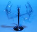
| 12/19/2002 02:51:15 PM | SEESAW.by tattooComment: Critique Club for Seesaw by Tattoo
Lucky you, you get me again!
Composition - Nice looking little conversation starting piece. I can't say I've ever seen one so I am intrigued to know exactly how it works. The motion depicted is adequate for this challenge, but not great. I think a little bolder version of the figures at top and bottom positions would've been better. They are there certainly, but a little too opaque. The blurry thing moving up and down between the top and bottom looks really good. I think that the subject of this pic could have, with a little extra exposure, made this image do better than 50th. Actually, the exposure with the figure on the left at the top is good. Its just that when the figure was at the bottom on the left that things got a little thin. I think the lighting in the picture is a little flat and the angle of the picture is okay, but could be moved to accentuate one figure to give more of a focal point to the image. Overall, the composition is sound, but not overwhelming.
Background - If I had one thing to change in this picture it would be the background. Basic black is my first choice. If not, something darker than what was used. I think the contrast between the figures and the background would really serve to make the figures stand out from the page providing a little depth. It might also hide the shadow at the bottom of the base a little better. This might have let you get a little more creative with the lighting to provide some planned shadows of the figures.
Camera work - The way the picture was taken, the camera work is adequate. A little more exposure with the left figure at the bottom would've been preferred, but you can't have it all. Aside from the twice aforementioned exposure issue, it is well done.
Processing - I can't tell that much was done to the photo, so that's good.
Overall - This has the potential to be a very good image. The start of it is solid here. A background change is the thing that stands out to me the most. The other changes will probably follow in natural order with that single change. This is not a flashy photo, but definitely solid in the way it was taken and with its subject matter - Inspzil |
| 12/19/2002 02:50:28 PM | All Fall Downby KonadorComment: Critique Club for All Fall Down by Konador
Composition - I like the composition of this photo. The dominoes are falling right to left which seems more natural to those of us in western society. The captured motion is good, which meets the challenge. I like that the dominoes are falling slightly uphill. I think that a slightly more dramatic angle would've been acceptable, and perhaps a bit more appealing. The only thing I could recommend to this picture is that the picture be taken a little further back to show the fallen dominoes, the falling dominoes, and the still standing dominoes.
Background - Basic black was a great choice to show the contrast between an ivory subject and aforementioned black background.
Camera work - Motion is well depicted by this photo. The standing dominoes are very clear as they should be and the fallen ones are a little blurry, as they should be. Camera work is very well done.
Processing - I must have your secret. The color of the dominoes is great. I'm sure it took awhile to get that mastered. You probably had the help of some PS expert too as I have some of these dominoes and they are quite yellowed looking. Bravo!
Overall - First impression is that this is a very good image and it has achieved what it set out to do - depict motion with falling dominoes. The idea of showing the already fallen dominoes just came to me as I sat here looking at the pic. With a little more 'room' in the picture, you could show multiple strings of dominoes falling and vary the patterns a little too. But that's another picture another day. I like this one Konador, you did a great job. - Inspzil
PS - If I type "domino" or "dominoes" one more time I'm throwing the keyboard
| | Photographer found comment helpful. |
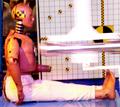
| 12/19/2002 02:49:14 PM | Safety Firstby CreativeFlyPhotoComment: Critique Club for Safety First
Composition - The first thing I noticed is that the dummy is out of focus even though there is nothing impacting him yet. The piston or whatever is going to strike him is very well captured. Pretty much the whole picture is out of focus, like it was taken at a very slow shutter speed. I really like the idea of this though. It could make a great image.
Background - The background is not square to the picture, especially since there is a grid screen on the right side. It makes it just that more obvious. The projectile is shooting downward as it appears in this picture. It would've looked better if the screen was all the way across the picture too to eliminate the test engineers or whoever is in the background.
Camera work - Definitely need some more light to enable you to shoot at a higher shutter speed. It would've been a great freeze action if you could capture the pison blurried and the rest of the picture clear.
Post-processing - Not really an issue here
Overall - This is a great idea, but with this combinations of things that could be improved, it was not accepted very well by the viewers. My picture also suffered from being out of focus, which was done on purpose. Some pictures are meant to be somewhat out of focus. My opinion on anything scientific or technical should be as clear as you could make it. I think if I were to take this pic, it would be blurry too from anticipating the impact the dummy is about to take. If you didn't use a tripod, it probably would be advisable. There is a great combination of colors here. I think this shot definitely has potential. - Inspzil |
| 12/19/2002 07:24:02 AM | |
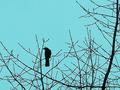
| 12/19/2002 07:23:00 AM | Unpruned melodyby JakComment: Sky could use a little more color, perhaps thru PS. The branches and the bird don't look particularly clear either. - Inspzil |
| 12/19/2002 07:16:30 AM | |
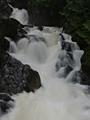
| 12/19/2002 07:10:25 AM | Deception Fallsby dltruexComment: This is a cool picture. I think it's a little underexposed and a little too soft on the focus end of it - Inspzil | | Photographer found comment helpful. |
| 12/19/2002 07:07:51 AM | |
|
Showing 2201 - 2210 of ~3109 |
Home -
Challenges -
Community -
League -
Photos -
Cameras -
Lenses -
Learn -
Help -
Terms of Use -
Privacy -
Top ^
DPChallenge, and website content and design, Copyright © 2001-2025 Challenging Technologies, LLC.
All digital photo copyrights belong to the photographers and may not be used without permission.
Current Server Time: 08/14/2025 04:40:11 AM EDT.
|