| Image |
Comment |
| 02/02/2003 01:22:40 PM |
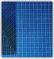
ArchiSquaresby Dallas_TXComment: Cool picture. It would be better if it were vertical with respect to the frame. I don't think those are exact square either, but I'm not that hardcore like some of the people are for this challenge. Close enough for me. - Inspzil |
 Photographer found comment helpful. Photographer found comment helpful. |
| 02/02/2003 11:50:59 AM |
|
| Photographer found comment helpful. |
| 02/02/2003 11:49:15 AM |
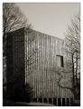
Where square people live.by Harz_JoergComment: The crop is a little too tight for my taste. I also think it needs a little more contrast. Not a bad photo and I do think that monochrome is well suited for this pic - Inspzil |
| Photographer found comment helpful. |
| 02/02/2003 09:18:11 AM |
Square Shimby GeneralEComment: Good use of colored light on this one. Well taken photo - Inspzil |
| Photographer found comment helpful. |
| 02/02/2003 09:10:30 AM |
Squares and Skyby bil99Comment: Looks like a good desktop wallpaper pattern, but not much in terms of artistic photography. sorry - Inspzil |
| 02/02/2003 09:05:52 AM |
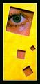
Colorful Squaresby ed728Comment: I would've concentrated more on the pencils. The cube adds nothing to this pic IMO. THe gradient pencils are enough for me - Inspzil |
| 02/02/2003 09:04:29 AM |
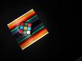
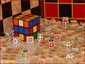
Game Squaresby ArtifactsComment: Too much stuff. More stuff doesn't make it more better. I appreciate what you are trying to do, but it doesn't really work for me - inspzil |
| Photographer found comment helpful. |
| 02/02/2003 09:03:14 AM |
The last pieceby dodobirdComment: Good solid image. I love the idea. Nice colors and well taken. A little flat, but the framing is good - Inspzil |
| 02/02/2003 09:02:02 AM |
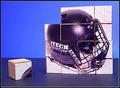
Midnight Squareby fsieradzkiComment: Good idea, Great photo. Very well taken indeed. The simplicity is good, not too simple. Seems to be a problem this week, oversimplifying - Inspzil |
| 02/01/2003 02:16:23 PM |
...Which Way?by catpixelComment: Critique Club by Inspzil
Composition - I like the composition of this photo to some degree. It isn't really weak nor really powerful either way. The post not being vertical bugs me a little. The background is dark and red and perfect for making the sign stand off the page. The foreground is pretty bright and very clear. I think the lighting works for the foreground. I think the few scratches on the sign where it was presumably hit give it a little character.
Photography - Well lit and exposed I think. DOF is not really an issue here and the photo is clear.
Post processing - I think this photo would be a candidate for radical transformations if it were mine. Maybe not for the challenge so much, but with a pretty basic one-subject relatively colorless shot, it might be time to have some fun. It looks like there may be a little jpeg artifacts floating around, but generally is pretty good and sharp.
Overall - This is a well taken photo. I'm not real wild about the composition though. The bend in the sign is enough to make it a little unique, but I think it needs something else. It is very close to being a really great picture. - Inspzil |
Home -
Challenges -
Community -
League -
Photos -
Cameras -
Lenses -
Learn -
Help -
Terms of Use -
Privacy -
Top ^
DPChallenge, and website content and design, Copyright © 2001-2025 Challenging Technologies, LLC.
All digital photo copyrights belong to the photographers and may not be used without permission.
Current Server Time: 08/17/2025 04:15:02 AM EDT.