| Author | Thread |
Comments Made During the Challenge  |
|
|
02/02/2003 02:47:32 PM |
|
get closer and or illiminate that neg space with a crop |
|
 Photographer found comment helpful. Photographer found comment helpful. |
|
|
02/02/2003 09:05:52 AM |
|
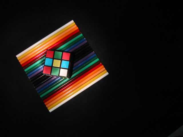
I would've concentrated more on the pencils. The cube adds nothing to this pic IMO. THe gradient pencils are enough for me - Inspzil |
|
|
|
02/02/2003 06:08:29 AM |
|
I like this. I think I would like it better rotated a bit to the left so that the pencils are more diamond oriented and the cube is horizontal to the top and bottom of the shot. |
|
| Photographer found comment helpful. |
|
|
02/01/2003 01:51:26 PM |
|
Too much empty space for me personally. Otherwise beautiful. |
|
| Photographer found comment helpful. |
|
|
02/01/2003 05:42:54 AM |
|
I love the colours against the black background. Excellent composition. I really like how you have arranged the pencils with the lines of them going in the one direction. Also the cube breaks up the lines which you have used (pencils). The lighting is excellent but imo the dark spot on the lower left kind of drags my eye down there. However an excellent, creative shot. This certainly meets this weeks challenge. GL :) 9 |
|
| Photographer found comment helpful. |
|
|
01/31/2003 06:41:09 PM |
|
Really like the composition in this photo! High score :) |
|
|
|
01/30/2003 03:51:23 PM |
Composition: Good
Technical: Good lighting/colour. Maybe a border?
Meets challenge: Yes
Overall impression: Good pic, but slightly lacking interest for me personally. 6 |
|
|
|
01/29/2003 08:51:44 PM |
|
nice idea. are those colored pencils? |
|
|
|
01/29/2003 02:41:59 PM |
|
|
|
01/29/2003 02:28:46 PM |
|
I like ho you have the square cube set up aginst the dark part of the background. I think that by elminating more of the black backround you would have hadmuch more intrest into your picture. Nice Job |
|
| Photographer found comment helpful. |
|
|
01/29/2003 07:54:14 AM |
|
Good idea and standing out. What is it in the bottom righht corner? |
|
|
|
01/28/2003 01:49:12 PM |
|
|
|
01/28/2003 12:56:07 PM |
|
I don't think the empty space on the right is necessary. THe colored objects are fine without it. |
|
| Photographer found comment helpful. |
|
|
01/27/2003 11:07:44 PM |
|
|
|
01/27/2003 06:42:37 PM |
|
light is a little harsh and glarey.. cover it with something to diffuse it adn you'll have awinner |
|
| Photographer found comment helpful. |
|
|
01/27/2003 02:15:25 PM |
|
| Photographer found comment helpful. |
|
|
01/27/2003 01:27:44 PM |
|
nice shot. i tried to take a picture of the cube, but it was not as good as this, so i did something else. I think this picture is very creative |
|
|
|
01/27/2003 08:08:22 AM |
|
I'd have prefered the objects places a little higher or lowe in the frame. Maybe even central in a square frame would work well. |
|
| Photographer found comment helpful. |
|
|
01/27/2003 06:02:30 AM |
|
Yoour innteresting setup seems a little lost in this black frame |
|
|
|
01/27/2003 02:01:26 AM |
|
That's interesting but there's too much "blank" space on the right for my taste. |
|
Home -
Challenges -
Community -
League -
Photos -
Cameras -
Lenses -
Learn -
Help -
Terms of Use -
Privacy -
Top ^
DPChallenge, and website content and design, Copyright © 2001-2026 Challenging Technologies, LLC.
All digital photo copyrights belong to the photographers and may not be used without permission.
Current Server Time: 06/27/2026 08:34:23 PM EDT.