| Author | Thread |
|
|
02/09/2003 07:30:09 PM |
Critique Club
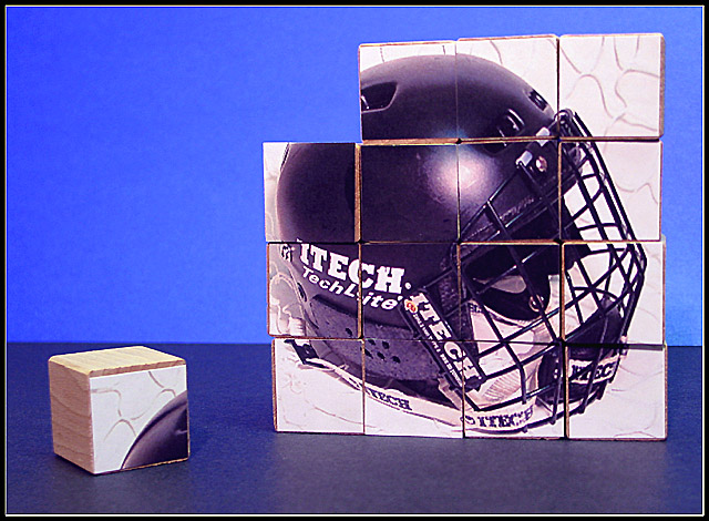
Composition-Content
I think that your idea for this was great, a very original take on the square theme. You have perfectly met the challenge. Composition is good here, but I think that if you had tilted the blocks a little, you would have achieved a more 3D effect, which would have added more dimension and interest to the picture. Personally, I like the use of negative space here and leaving a single block out was a good idea. I wonder if that using the hockey picture, you might have alienated a bit of the audience, you had comments from people that love the sport, but for those who don't I wonder if a brighter, more colourful picture might have helped this stand out.
Background
I think that the background is good, I like the different tones and the division of the top and bottom. Perhaps with a brighter picture on the blocks, the colour choice of the background would have had a stronger impact. As it is, I personally like the colour choice.
Technical
Great focusing and colour saturation here. The overall lighting is good, there is one hotspot on the helmet,I am not sure if that happened while taking the picture of the helmet (more likely, cause it is so shiny) or taking the final picture. If the former, then perhaps not using a flash would have helped, or bouncing the flash for softer lighting.
My Opinion
I think that all the effort put into this picture, really paid off. Really original idea and great shot. Perhaps the only thing I would change would be to tilt the cubes a bit for a more 3D effect and perhaps use lighting that cast shadows ( I like shadows!), perhaps to the side of cubes. Good Luck in the next challenge |
|
|
|
02/09/2003 11:00:31 AM |
Critique Club
Just to let you know that I have your picture to critique and will do it ASAP! |
|
Comments Made During the Challenge  |
|
|
02/02/2003 06:43:54 PM |
|
Hockey is the greatest sport on earth! |
|
|
|
02/02/2003 09:03:14 AM |
|
Good solid image. I love the idea. Nice colors and well taken. A little flat, but the framing is good - Inspzil |
|
|
|
02/02/2003 08:06:42 AM |
|
Very interesting shot. I like your choice of background and "ground", both blue. Very nice placement of the pieces. Goo luck. Jacko. |
|
|
|
02/02/2003 06:01:20 AM |
|
Really neat shot but it seems a bit grainy. Did you use Neat Image? |
|
|
|
02/01/2003 10:53:06 PM |
|
Some work went into this for a good result. Nicely done. Great photo: technically, appeal, uniqueness, color. Overall good job. |
|
|
|
01/31/2003 06:52:16 PM |
|
Very Creative - I like the composition as well! |
|
|
|
01/31/2003 01:41:02 PM |
|
The missing cube? Very good photo and i really like football so i think you chose a very good subject. |
|
|
|
01/30/2003 02:43:52 PM |
|
I really like how you broke the entire image into many pieces. I also enjoy the fact that you are a hockey fan as am I. But I think that having a light blue background al helps create intrest in this image. Nice Work |
|
|
|
01/29/2003 08:13:07 PM |
|
I think I would prefer a different tint to this photo - the blue doesn't sit well with me. |
|
|
|
01/29/2003 02:42:26 PM |
|
very creative. too much negative space in the top left side. |
|
|
|
01/28/2003 02:51:54 PM |
|
This looks good. I like how you have this set up. Good work. |
|
|
|
01/27/2003 03:01:47 PM |
|
Looks like a puzzle for rednecks. Nice colors for the background and setting. Good job. |
|
Home -
Challenges -
Community -
League -
Photos -
Cameras -
Lenses -
Learn -
Help -
Terms of Use -
Privacy -
Top ^
DPChallenge, and website content and design, Copyright © 2001-2026 Challenging Technologies, LLC.
All digital photo copyrights belong to the photographers and may not be used without permission.
Current Server Time: 06/28/2026 08:02:31 PM EDT.