| Image |
Comment |
| 02/24/2003 05:24:49 AM |
Harris Hawkby scrooslooseComment: I don't like the fence in the background but the bird is magnificent. Very well taken. A pinch more exposure might've done you good if it didn't was the background out |
 Photographer found comment helpful. Photographer found comment helpful. |
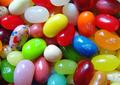
| 02/24/2003 05:21:30 AM |
Jelly Belliesby KazComment: Nice bright colors on this one. Lots of highlights on the beans, I don't like how they are sort of oblong. I would think a hightlight on something like this would be small and round. Nice shot |
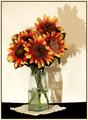
| 02/24/2003 05:19:11 AM |
dollby shutterflyComment: This looks like it might fit in a sunflower themed room. My friend used to have one at her house that this would fit right into. The biggest problem being that its' not terribly focused. Other than that is has nice colors and is well framed with good background |
| Photographer found comment helpful. |
| 02/24/2003 05:12:41 AM |
The Weakest Linkby rmahanComment: I like the lighting and the shadows. Good choice of background colors as well. |
| Photographer found comment helpful. |
| 02/24/2003 04:38:24 AM |
one item, wine, glass, drink, vertical, nobody, close-up, empty, curve, blue, fragile, transparent by Pep VentosaComment: Great subject and composition. The tight center crop works very well. The pic IMO looks like its been oversharpened or taken with a high ISO. It also is a little overexposed for my tastes. The blue is a nice color for the background. |
| Photographer found comment helpful. |
| 02/24/2003 04:35:55 AM |
Dawn at the Harbourby andrewmComment: Pretty good photo. Lacking the crispness to make it a really good photo though. I like the concept and the angle, just wondering where the sun is at this point. |
| Photographer found comment helpful. |
| 02/24/2003 04:32:51 AM |
Snowstormby chakkobboComment: Is this Miami? This looks like a photojournalism shot. A little dark for my tastes but not badly taken or anything. I'm glad this missed us. |
| 02/23/2003 09:23:55 AM |
Entrance!by 3boyzMomComment: Greetings from the Critique Club
By Inspzil (who happens to be 3otherboysdad :))
Composition - I like the idea of this pic, it works well for the challenge. Biggest most distracting thing about this picture is the top right corner where the ceiling is showing. I think if the pic could've been taken from a bit higher perspective pointing down that could've been minimized or avoided all together. It isn't terribly distracting, but the first thing I noticed. The "e" being a little cut off I think is less of a distraction. It meets the challenge and is pretty well composed.
Technical - Great job with this photo. It is remarkably clear, well exposed, good DOF with terrific color and very crisp. Not much else to say except that this photo is remarkably well taken.
Overall - Nothing blowing me away, nothing flashy, but an excellent idea and very well executed. The things that I mentioned that could be improved are easily fixable (easy for me to say :) but I don't think would've made your score jump up by leaps and bounds, because this is a good photo regardless. Nice job and keep the good photos coming. Good luck with DPC and your boys. - Inspzil |
| 02/23/2003 08:15:49 AM |
Peek a Boo!by mcraelComment: Greetings from the Critique Club
By Inspzil
Composition - Good concept for Where's Waldo. I think the challenge on the whole produced some interesting photos. This is no exception. There are 2 things about this photo that I don't like, and all the rest I like. The first is your "vase," and the doily looks like a napkin. The second is the dominance of the shadows in the pic. The colors I think are great, the double exposure thing is cool, the framing is nice. The biggest thing that I can't get around are the darn shadows.
Technical - Well done. My wife has tried doing stuff with the multiple exposure feature on her 602 with not much success. This was well done and well thought out.
Overall - A little of the finishing touches added to this and you'd really have something. This is a well executed picture, just the setup might've been better served with some better props and less shadows. Good job Mcrael, keep up the good work. - Inspzil |
| Photographer found comment helpful. |
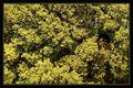
| 02/20/2003 07:56:00 AM |
The Chameleonby macroviperaComment: Greetings from the Critique Club
By Inspzil
Composition - This was tricky to see how it met the challenge. I had to look at it a second time (on 2 consecutive days) and now I see the point of it. I think as an image, its too much of the leaves thing. For the challenge, I think its pretty good. Not much else to say about composition at this point.
Technical - I think the focus is a little soft, especially on the foliage part of it. It may be the focus of the slide itself which would make it significantly harder to make a clear image. A couple degrees of sharpen in PS might help some. The exposure is actually pretty good. I could see the subject being exposed a bit more and the slide image a little less, but its not bad as is.
Overall - Not a whole lot to say about this image really (for this long-winded critic anyway). I genuinely like the idea, but I just don't think this came out near as well as it could've. As you stated though it was just preliminary. I think it met the challenge well but as strictly an image, I don't really like it. Sorry I couldn't be more helpful on this one. Good luck on future challenges - Inspzil |
| Photographer found comment helpful. |
Home -
Challenges -
Community -
League -
Photos -
Cameras -
Lenses -
Learn -
Help -
Terms of Use -
Privacy -
Top ^
DPChallenge, and website content and design, Copyright © 2001-2025 Challenging Technologies, LLC.
All digital photo copyrights belong to the photographers and may not be used without permission.
Current Server Time: 08/18/2025 04:16:21 AM EDT.