| Image |
Comment |
| 03/25/2003 10:00:00 AM |
Looking down on San Antonioby xertionComment: Greetings from the Critique Club
By Inspzil
Composition - The cityscape of San Antonio... This is not a bad picture, but a little, ordinary, for lack of a better word. I think that as far as these types of shots go, it is a better bet to have something as a strong focal point for the viewers. Even an ominous sky can sometimes work sometimes. There really isn't anything wrong with the picture, just lacking some interest I think. I wish the sky was all nice and blue like it is on the right side, but you can't have everyting I know. That flat looking complex at the bottom of the frame I think could've been cut out and we wouldn't miss it. Maybe if you changed the aspect a bit and made it more of a panorama type shot... but generally those shots do not do well on dpc. It just needs something to give it a little of the "wow" factor.
Technical - Not badly taken. Could be a little more sharp but it isn't really soft or anything. Looks a pinch overexposed. That might help the sky out a little too by making it a little more blue.
Overall - This is a difficult picture to critique because it really doesn't have anything WRONG with it. There isn't a whole lot you can change about it to make a substantial improvement without rethinking the composition again. Maybe it would be better to concentrate on one block of buildings as opposed to the whole cityscape. Sorry I don't have more advice to offer on this one. If you could just make it worse I could talk more and feel more important :P Good luck in the future challenges. - Inspzil |
 Photographer found comment helpful. Photographer found comment helpful. |
| 03/25/2003 09:33:04 AM |
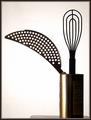
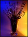
Bouquetby magnetic9999Comment: Greetings from the Critique Club
By Inspzil
I wrote one for this picture earlier this morning, but I'm not sure what happened to it so I guess I'm doing it again.
Composition - Great line leading into the vase with the cheese grater thing. That was the first thing I saw when I looked at this pic. The best thing about this pic that I like is the color of the receptacle. I'm not sure I like the little table there. It looks like it could be a fuzz off the horizon. This is very simple but has some very good qualities that make it compositionally strong including the geometry and the way the utensils are silhouetted.
Technical - Well taken, as always. The one thing that gets my attention is the funky diagonal lines where the whisk wires meet the handle. Doesn't look like anything wrong that you did, but maybe it was the resizing of the picture didn't agree with it. Aside from that, everything else looks pretty darn good.
Overall - Simple, but well done. Excellent picture quality. Good lines and shapes. Like the framing and exposure. Nice work. Good luck in future challenges - BoB |
| Photographer found comment helpful. |
| 03/25/2003 05:04:50 AM |
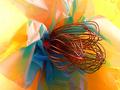
Whisk Bouquetby GraciousComment: Greetings from the Critique Club
By Inspzil
Composition - This sort of reminds me of a flower macro. Its a good idea. I think it definitely meets the challenge. In terms of composition, there are a couple things that come to mind right away that catch my attention. The framing seems sort of crowded. What I think for this image is that the "flower" should start further to the left and open up to the wider side. In this photo, it starts about center and crowds the right side of the photo. Also they seem to be pointing a little down from vertical where I think they would look better pointing up a little. I think a lot of my varying ideas of perception regarding this shot are going under the assumption that this is simulating a blossom. As always with my CC stuff, take what you think is viable and ditch the rest :)
Technical - Well lit and well exposed. Focus is pretty good but it looks a little oversharpened to me. It looks like it might be a little grainy too which would be a distinct side effect of being oversharpened. The other processing looks pretty good.
Overall - Well conceived. There are a couple things I tweak in this image regarding the framing of this photo. I really like the light and the yellow color. Hope this could be of some help to you. Good luck in future challenges. - Inspzil |
| 03/25/2003 04:43:15 AM |
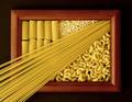
Pastaby FranziskaLangComment: Greetings from the Critique Club
By Inspzil
Composition - Very nice decorative variety of pastas arranged neatly on what appears to be a picture frame. This is meeting the challenge very well. The thin spaghetti does a wonderful job of providing leading lines into the picture frame. The first time I saw this during voting that spaghetti, for whatever reason, really reminded me of the sun's rays showing through the window except the sun itself is not visible. I think this quality was the appeal of this photo for me. The spaghetti acts as a sort of border between the mostaccioli noodles and the macaroni noodles. Well conceived by whomever thunk it up. Well executed by you.
Technical - Very well taken photo. Exposure could've been just a little more to give the 3 darker sides of the frame just a bit more light. This is a very nice crisp clear photo though. The kind a well trained Nikon user should take :) I don't see anything unusual about the way this was taken or the post processing. Very nicely done.
Overall - Well set up and well taken photo. The spaghetti makes this picture in my eyes. It acts as a divider and a path for the viewer to follow from the bottom corner right on up into the midst of the noodles. Despite not being your idea, I think it definitely deserves the score it got for great execution. Nice job. Keep up the good work and good luck in future challenges. - Bob
|
| Photographer found comment helpful. |
| 03/23/2003 10:06:21 AM |
|
| 03/20/2003 05:22:56 AM |
From Scratchby karmatComment: I like the radical angle and the color approach. The background is a little busy but not too bad. Nice job |
| Photographer found comment helpful. |
| 03/20/2003 05:08:35 AM |
With Flavourby Pep VentosaComment: A little underexposed for my tastes. I like the framing and the idea of the lighting, it just needs a little more. The colors came out really well. Good luck |
| Photographer found comment helpful. |
| 03/17/2003 05:23:09 AM |
Asiaby lionelmComment: I like this. Simple is good. THe only thing I'd suggest is to take the picture from slightly further up. I believe the angle would still maintain your reflections and it will put a little more of the dish and sticks in the frame. It would also add just a hint more color to this and I think it needs a little more color. Pretty good shot. |
| Photographer found comment helpful. |
| 03/17/2003 05:19:58 AM |
Bouquetby AleciaComment: Great colors. I like the idea a lot. I think it might be just a teeny bit underexposed on the utensils though. On the whole it is very well executed. |
| Photographer found comment helpful. |
| 03/16/2003 11:08:21 AM |
|
Home -
Challenges -
Community -
League -
Photos -
Cameras -
Lenses -
Learn -
Help -
Terms of Use -
Privacy -
Top ^
DPChallenge, and website content and design, Copyright © 2001-2025 Challenging Technologies, LLC.
All digital photo copyrights belong to the photographers and may not be used without permission.
Current Server Time: 08/24/2025 08:29:39 AM EDT.