| Author | Thread |
|
|
03/25/2003 10:00:00 AM |
Greetings from the Critique Club
By Inspzil
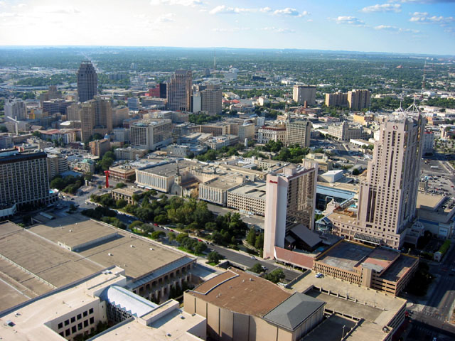
Composition - The cityscape of San Antonio... This is not a bad picture, but a little, ordinary, for lack of a better word. I think that as far as these types of shots go, it is a better bet to have something as a strong focal point for the viewers. Even an ominous sky can sometimes work sometimes. There really isn't anything wrong with the picture, just lacking some interest I think. I wish the sky was all nice and blue like it is on the right side, but you can't have everyting I know. That flat looking complex at the bottom of the frame I think could've been cut out and we wouldn't miss it. Maybe if you changed the aspect a bit and made it more of a panorama type shot... but generally those shots do not do well on dpc. It just needs something to give it a little of the "wow" factor.
Technical - Not badly taken. Could be a little more sharp but it isn't really soft or anything. Looks a pinch overexposed. That might help the sky out a little too by making it a little more blue.
Overall - This is a difficult picture to critique because it really doesn't have anything WRONG with it. There isn't a whole lot you can change about it to make a substantial improvement without rethinking the composition again. Maybe it would be better to concentrate on one block of buildings as opposed to the whole cityscape. Sorry I don't have more advice to offer on this one. If you could just make it worse I could talk more and feel more important :P Good luck in the future challenges. - Inspzil |
|
 Photographer found comment helpful. Photographer found comment helpful. |
Comments Made During the Challenge  |
|
|
03/22/2003 03:53:09 PM |
|
meets challenge good overall |
|
|
|
03/19/2003 10:34:12 PM |
|
A little hazy and no point of interest. |
|
| Photographer found comment helpful. |
|
|
03/19/2003 06:18:34 PM |
This is a cool city shot, those clouds look like marshmellows!
|
|
| Photographer found comment helpful. |
|
|
03/18/2003 08:47:33 PM |
|
This is a very clear photograph. The rotation is out to the right slightly +/- 1%. The angle of lighting is from the left front causing the sky to appear washed out. This would be corrected if the light were from behind you and would give you a uniform blue sky. |
|
| Photographer found comment helpful. |
|
|
03/18/2003 02:44:45 PM |
|
good picture and nice idea |
|
| Photographer found comment helpful. |
|
|
03/18/2003 02:33:44 PM |
|
nice use of color and nice angle |
|
| Photographer found comment helpful. |
|
|
03/17/2003 11:15:00 PM |
|
I've been in that tower, although I don't remember the name. One of the better city vistas this week. |
|
| Photographer found comment helpful. |
|
|
03/17/2003 08:05:37 PM |
|
Nice wide angle. Beautiful sky! |
|
| Photographer found comment helpful. |
|
|
03/17/2003 05:50:04 PM |
|
About cityscape, I think there has to be either something, like city landmark, as subject of the image, or nothing dominent as texture and pattern. I find neither of them here. Hope my theory is helpful. |
|
| Photographer found comment helpful. |
Home -
Challenges -
Community -
League -
Photos -
Cameras -
Lenses -
Learn -
Help -
Terms of Use -
Privacy -
Top ^
DPChallenge, and website content and design, Copyright © 2001-2026 Challenging Technologies, LLC.
All digital photo copyrights belong to the photographers and may not be used without permission.
Current Server Time: 07/16/2026 03:15:10 AM EDT.