| Image |
Comment |
| 04/06/2003 09:56:59 AM |
In the Spotlightby aussieComment: Pretty good DOF on this guy. A little greater F and I think you'd have scored a little better. I would've suggested a slightly tighter crop too. Bring him a little closer to us. |
 Photographer found comment helpful. Photographer found comment helpful. |
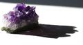
| 04/06/2003 09:55:31 AM |
A Rare Findby rll07Comment: Looks like part of a geode. Very nice subject but I don't think you really capitalized on the wonderful colors as well as you could've. I think the framing and lighting could use a little help. I'd have made the piece of stone more in the middle and moved the light source up to shorten the shadow. If the colors would've really shown on the present shadow, it might've been worth it but it only shows up as a couple of specs. Nice photo, but I think it has a lot more potential |
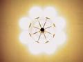
| 04/05/2003 12:14:09 PM |
Eclipsed Rotational Symmetryby MaYzComment: Interesting pic. Pretty cool actually. Looks like a light fixture to me. The edges are pretty grainy. Other than that it looks pretty good. |
| Photographer found comment helpful. |
| 04/05/2003 11:03:52 AM |
Circle of Lightby the_emaxxComment: Interesting pic. Reminds me of the operating room lights from like Quincy or Mash. I think its just a little too much overexposed. i think it was meant to be a little. The focus on the fixture part could be a little sharper. Good idea for symmetry. |
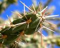
| 04/05/2003 10:58:12 AM |
Cactiby dacrazyrnComment: Awesome shot. Is this for the symmetry challenge? I ask because its a great macro. Doesn't look indoors, but very nice. I don't like this particular shot for this challenge, but it is really a quality image. |
| Photographer found comment helpful. |
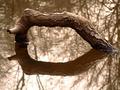
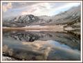
| 04/05/2003 10:05:07 AM |
Symmetry By Reflectionby paynekjComment: Solid composition and well taken. I like the overall color tone of this shot. Nice and peaceful and a real throwback to more sepia times. |
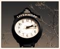
| 04/04/2003 01:58:16 PM |
Time Keeperby TarbiniComment: Greetings from the Critique Club
By Inspzil
Composition - Color tones are great. They really add a lot to the shot overall. I love the "glowing" leaves on the branches, an equally great effect. This has a 60's look to it I think. The branches work well to show some depth to the pic. My biggest qualm with this pic is that the bottom half of the clock is not really well focused like the top half. Not sure why, but thats how I see it.
Technical - Extremely well taken. Good DOF, exposure is great, just a touch soft on the focus on the clock as I said above. The biggest, best difference in this photo is the remarkable job you did adjusting color, levels and making it unusual in terms of tone, but familiar in an eerie way. Very well done.
Overall - A nice strong image. Not too dynamic, but a soild composition backed by some awesome editing. Very good work! Good luck on your future challenges. - Inspzil |
| Photographer found comment helpful. |
| 04/04/2003 01:38:18 PM |
|
| Photographer found comment helpful. |
| 04/04/2003 01:36:06 PM |
Fresh Snowby pncowleyComment: Crop a little off the bottom and I give you a 10. Why can't I have this kind of scenery? No fair!! Truly amazing image. - 9 |
| Photographer found comment helpful. |
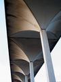
| 04/04/2003 01:30:44 PM |
Aerial Followingby boyte1Comment: This looks like a worthy structure to photograph. I think a little better perspective or angle and a little better framing would really make it a lot better of a photo. Good concept and choice of subject though. |
Home -
Challenges -
Community -
League -
Photos -
Cameras -
Lenses -
Learn -
Help -
Terms of Use -
Privacy -
Top ^
DPChallenge, and website content and design, Copyright © 2001-2025 Challenging Technologies, LLC.
All digital photo copyrights belong to the photographers and may not be used without permission.
Current Server Time: 08/25/2025 05:01:48 AM EDT.