| Image |
Comment |
| 05/05/2005 05:02:56 PM |
|
| 05/05/2005 05:00:45 PM |
Light Fantasticby p2jvrComment: Too much contrast to my taste. more suttle colors_amber tones would have worked much better in my humble opinion. |
 Photographer found comment helpful. Photographer found comment helpful. |
| 05/05/2005 04:59:18 PM |
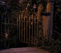
2068 Mainby RolandBComment: Every picture tells a story and this one is about a gate. Nicely highlighted, definately the object of the image partnered with the gate post. The left side of this image is dead weight and could easily be cropped off for a square presentation. A lovely image as it is though. High marks! |
| Photographer found comment helpful. |
| 05/05/2005 04:54:57 PM |
lonely treeby jcclucciComment: Closer cropping would solve many of my issues with this image, light on left bottom and maybe its a bush on the right. The top of the tree could use a little more light or exposure. A very good effort, some obstackles are very hard to overcome. |
| 05/05/2005 04:41:04 PM |
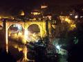
Study in Pastelsby joe_minerComment: This is an ambicious image, congradulations. As with all old buildings, over time they settle to where no two angles are the same. You just have to choose 1 that works best. In This case the choice I would make is the corner where the blue and orange facades meet because of its strengthe. The building as it is, is heavily weighted to the left of the image so it appears to be listing. Just by rotating the image a tiny bit, it will regain its balance. The rest of the composition is very good. I really like the ambiance. |
| Photographer found comment helpful. |
| 04/30/2005 01:45:24 AM |
War of the Tacksby sofapezComment: Originally posted by train:
Hello Jahn for the critque club
Well thank you for giving this image to critique where do I start
Did you really think this would appeal as an image to the mass of D P C voters
For a joke it would be sick, funny but for an image of photography I cant really see what you were expecting to gain from this
Maybe if the tacks were stuck in anything else but skin I could see the point (excuse the pun)
What is the yellow object at the top left
I find there is nothing really positive to contribute to this image
even the focus is not very clear
colour ok but I am sorry Not the most interesting image I have come across sorry if I hurt your feelings its just an honest critique
Better luck for nicer images and for your future challenge contribution
Best wishes Sally |
I didn't think this was submitted for critique. other than that... no comment_sorry to have put you throught it.
Message edited by author 2005-04-30 01:46:18. |
| 04/30/2005 01:35:59 AM |
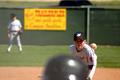
One More Strike!by ph223048Comment: If it wasn't for the helmet in the forground, this would be excellant. good job on the depth of feild. |
| 04/30/2005 01:31:32 AM |
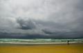
One last ride?by LevTComment: whats the subject, the surfer or the skyline? interesting color work. to ride, or not to ride....ride. |
| Photographer found comment helpful. |
| 04/30/2005 01:29:12 AM |
|
| Photographer found comment helpful. |
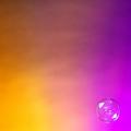
| 04/30/2005 01:27:14 AM |
Minibubby CorySmithComment: I have lighting issues, the gold bugs me because the color is so saturated. the bubble is good_fascinating. |
| Photographer found comment helpful. |
Home -
Challenges -
Community -
League -
Photos -
Cameras -
Lenses -
Learn -
Help -
Terms of Use -
Privacy -
Top ^
DPChallenge, and website content and design, Copyright © 2001-2025 Challenging Technologies, LLC.
All digital photo copyrights belong to the photographers and may not be used without permission.
Current Server Time: 08/04/2025 06:24:41 AM EDT.