| Author | Thread |
Comments Made During the Challenge  |
|
|
05/10/2005 12:24:17 PM |
|
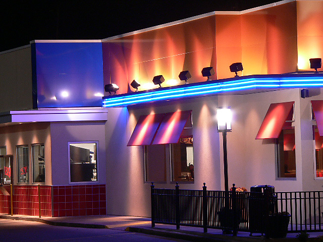
Nice color. Not common in this challenge. |
|
 Photographer found comment helpful. Photographer found comment helpful. |
|
|
05/10/2005 08:03:48 AM |
|
Fantastic - looks like a film set! Is it?! |
|
| Photographer found comment helpful. |
|
|
05/08/2005 10:07:36 PM |
|
Great colours and good exposure. Given there is no sense of pattern I think it could have been enhanced by a clear subject. I know it was probably unavoidable, but I do find the bright light distracting in such a prominant postion in the frame - but nevertheless you have achieved a good result. Well done. |
|
| Photographer found comment helpful. |
|
|
05/08/2005 07:21:56 PM |
|
Good exposure, lots of color....cool |
|
| Photographer found comment helpful. |
|
|
05/06/2005 10:39:38 PM |
|
Aw, darn, it's crooked... |
|
| Photographer found comment helpful. |
|
|
05/06/2005 04:59:48 PM |
|
| Photographer found comment helpful. |
|
|
05/06/2005 12:18:13 PM |
|
| Photographer found comment helpful. |
|
|
05/06/2005 10:10:28 AM |
|
very neat colours, i wouldve rated it higher if the angle was different... instead of two buildings almost going straight across, maybe a whole line of buildings zooming out and an angle |
|
| Photographer found comment helpful. |
|
|
05/06/2005 09:44:23 AM |
|
This is a really nice iamge. I really like the different kinds of color seen throughout this image. Nice work. |
|
| Photographer found comment helpful. |
|
|
05/06/2005 03:54:23 AM |
|
good composition, I love the colors. It needs to be rotated |
|
| Photographer found comment helpful. |
|
|
05/05/2005 07:09:12 PM |
|
| Photographer found comment helpful. |
|
|
05/05/2005 06:28:35 PM |
|
| Photographer found comment helpful. |
|
|
05/05/2005 04:53:32 PM |
|
great picture, very colourful |
|
| Photographer found comment helpful. |
|
|
05/05/2005 04:41:04 PM |
|
This is an ambicious image, congradulations. As with all old buildings, over time they settle to where no two angles are the same. You just have to choose 1 that works best. In This case the choice I would make is the corner where the blue and orange facades meet because of its strengthe. The building as it is, is heavily weighted to the left of the image so it appears to be listing. Just by rotating the image a tiny bit, it will regain its balance. The rest of the composition is very good. I really like the ambiance. |
|
| Photographer found comment helpful. |
|
|
05/05/2005 02:20:24 PM |
|
Lovely colors, shame it's tilted to the left, that could have been easily fixed... |
|
| Photographer found comment helpful. |
|
|
05/05/2005 01:39:42 PM |
|
| Photographer found comment helpful. |
|
|
05/05/2005 10:15:45 AM |
I like the colors but the verticals are not vertical.
The photo is lacking a strong point. |
|
| Photographer found comment helpful. |
|
|
05/05/2005 01:35:12 AM |
|
Seems to be tilted to the left. Presumably this was not deliberate. |
|
| Photographer found comment helpful. |
|
|
05/05/2005 01:26:36 AM |
|
Very nice array of colors. |
|
| Photographer found comment helpful. |
|
|
05/04/2005 11:16:17 PM |
|
Very sharp and great colors. Needs to be leveled. |
|
| Photographer found comment helpful. |
|
|
05/04/2005 08:54:02 PM |
|
Beautiful colors, perfect exposure. I would like it much better straightened. |
|
| Photographer found comment helpful. |
|
|
05/04/2005 05:47:42 PM |
|
| Photographer found comment helpful. |
|
|
05/04/2005 02:26:47 PM |
|
The lines of this are very interesting. |
|
| Photographer found comment helpful. |
|
|
05/04/2005 01:55:00 PM |
|
| Photographer found comment helpful. |
|
|
05/04/2005 12:27:02 PM |
|
Photo seems wonky. Some great colours though. |
|
| Photographer found comment helpful. |
|
|
05/04/2005 12:18:42 PM |
|
Well, this sure does stand out by its vibrant and splendid colors. Great subject and composition - both very appealing- The only thing I have to point out is that it seems to me it needs a slighlty rotation to the right. Otherwise, very well done. |
|
| Photographer found comment helpful. |
|
|
05/04/2005 12:09:43 PM |
|
I really like this! It has kind of an art deco kind of poster fel to it. You did great with the sharpness. |
|
| Photographer found comment helpful. |
|
|
05/04/2005 11:57:28 AM |
|
Fantastic colours and angles |
|
| Photographer found comment helpful. |
|
|
05/04/2005 10:32:01 AM |
|
I like all the different colors |
|
| Photographer found comment helpful. |
|
|
05/04/2005 09:46:43 AM |
|
| Photographer found comment helpful. |
|
|
05/04/2005 07:22:09 AM |
|
Striking colours, it appears to me to need rotating right a little to make the walls/lamp column vertical. |
|
| Photographer found comment helpful. |
|
|
05/04/2005 07:14:10 AM |
I like this, it could almost have been painted - well spotted! Avery crisp image with superb colouring and an interesting composition.
Bumping up to 10! |
|
| Photographer found comment helpful. |
|
|
05/04/2005 06:59:02 AM |
|
Nice image. Nice colors but I think the building should be level perhaps at the far right corner of the structure or with the fence. |
|
| Photographer found comment helpful. |
|
|
05/04/2005 02:17:47 AM |
|
Nice colors. It does appear to be slightly tilted. |
|
| Photographer found comment helpful. |
|
|
05/04/2005 02:00:50 AM |
|
| Photographer found comment helpful. |
|
|
05/04/2005 01:30:40 AM |
|
Nice colors! You might want to rotate it a little clock-wise to straighten up the vertical lines. |
|
| Photographer found comment helpful. |
|
|
05/04/2005 12:50:06 AM |
|
horizon tilt is distracting. |
|
| Photographer found comment helpful. |
Home -
Challenges -
Community -
League -
Photos -
Cameras -
Lenses -
Learn -
Help -
Terms of Use -
Privacy -
Top ^
DPChallenge, and website content and design, Copyright © 2001-2026 Challenging Technologies, LLC.
All digital photo copyrights belong to the photographers and may not be used without permission.
Current Server Time: 06/28/2026 03:12:51 AM EDT.