| Image |
Comment |
| 12/10/2009 12:25:37 PM |
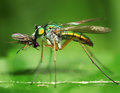
Red Bugby crikComment: I am not sure if it is a problem of cropping or exposure, or what else, but the picture lacks details on the bug and this is too bad for a picture of a bug! |
 Photographer found comment helpful. Photographer found comment helpful. |
| 12/10/2009 12:21:07 PM |
A Fly on the Wallby Pattyd1230Comment: The poor focus makes it a bad photo... too bad, as the close-up and colors were very interesting! |
| Photographer found comment helpful. |
| 12/10/2009 12:20:03 PM |
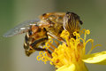
breakfast on the fly by rozComment: Colors, composition, sharp focus... everything is wonderful in this picture! I wonder who will get the blue between you and the eye of the tiger... |
| Photographer found comment helpful. |
| 12/10/2009 12:18:36 PM |
|
| Photographer found comment helpful. |
| 10/21/2009 11:42:27 AM |
Hurricane Floraby NeilComment: This is absolutely wonderful! Thanks for showing what can be achieved with camera motion! |
| Photographer found comment helpful. |
| 12/31/2008 05:38:31 AM |
Beaten by the wind yet still smilingby ThaiComment: I think the curtain in the background is distracting and there is something not working with the lighting (the face is too much darker than the hands). Anyway I like the relaxed pose and the peaceful expression. |
| Photographer found comment helpful. |
| 12/31/2008 05:36:08 AM |
|
| Photographer found comment helpful. |
| 12/31/2008 05:33:14 AM |
Generationsby Photonut66Comment: Unfortunately this is not very interesting. There is too much brown, the man is not smiling nor thoughtful, the baby does not show his/her eyes, the pose is not dynamic and too much centered (there are not leading lines to give some movement to the composition). I like the idea, though. Maybe a darker background and a different position of the two (as the man holding the baby with both hands and looking into the baby's eyes) would have helped in making it a more attractive picture. |
| Photographer found comment helpful. |
| 12/31/2008 05:25:23 AM |
Strength and splendor are her clothing, and she laughs at a future dayby smardazComment: Very nice portrait and model! I also like very much the lighting and sharpness. If there's anything, I am not enthusistic of the composition. Maybe having the subject a bit more on the right, so that you could have some more blank space on the left, would have given some space for her look to go through. Or maybe cropping out the right side of the image, cutting away the earring, would have better drawn the attention on her face. Just my thought. Anyway one of my favourite images of the challenge. |
| Photographer found comment helpful. |
| 12/31/2008 05:12:48 AM |
Granddaddyby freakin_hilariousComment: Very good photo, I like the high key and the not perfeclty centered composition. I only wish the eyes were fully open, as they are looking down I feel I miss the object they are looking at. |
| Photographer found comment helpful. |
Home -
Challenges -
Community -
League -
Photos -
Cameras -
Lenses -
Learn -
Help -
Terms of Use -
Privacy -
Top ^
DPChallenge, and website content and design, Copyright © 2001-2025 Challenging Technologies, LLC.
All digital photo copyrights belong to the photographers and may not be used without permission.
Current Server Time: 08/05/2025 10:28:20 AM EDT.