| Image |
Comment |
| 04/26/2006 07:37:02 AM |
Red&Greenby roby21112Comment: too much white (crystal) between the two - complementary element is not obvious enough for me. The white circles (bottom one too) are too distracting. 7 |
 Photographer found comment helpful. Photographer found comment helpful. |
| 04/26/2006 07:34:53 AM |
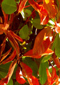
Outshineby typologicComment: Loved the contrast between the lit element and its darker counterpart! 9 |
| Photographer found comment helpful. |
| 04/26/2006 07:33:50 AM |
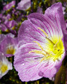
Glowing Margaritaby youngnovaComment: A little (!) over-processed (lost the stem, and reds look a little blurry. Still, neat image! 8 |
| Photographer found comment helpful. |
| 04/26/2006 07:32:36 AM |
...Life is Goodby RKTComment: Good movement on this - and good pick-up on the colors. Still, something in the overall image isn't quite working for me. Ahhhh, I might have cropped out the wheel area - even if you lost much of the bottom stripe, ALL the stripes would have been more empasized! 7 |
| Photographer found comment helpful. |
| 04/26/2006 07:29:36 AM |
Niceby LilhoopComment: Overprocessed (with lots of blown spots) 6 |
| 04/26/2006 07:28:51 AM |
Steps to championshipby KitaComment: Champion Image? A little light in the yellow area, but still I like the colors and comp in this one! 8 |
| Photographer found comment helpful. |
| 04/26/2006 07:27:10 AM |
|
| Photographer found comment helpful. |
| 04/26/2006 07:26:05 AM |
Orangeby ClayaComment: Orange could have been a little more in focus - and the pith less blown. 6 |
| Photographer found comment helpful. |
| 04/26/2006 07:24:51 AM |
Flora Complimentariaby ArtifactsComment: Could use a little darkening - center feels blown. Also, nearest edges are more blurred than I would prefer. 6 |
| Photographer found comment helpful. |
| 04/26/2006 07:23:37 AM |
|
| Photographer found comment helpful. |
Home -
Challenges -
Community -
League -
Photos -
Cameras -
Lenses -
Learn -
Help -
Terms of Use -
Privacy -
Top ^
DPChallenge, and website content and design, Copyright © 2001-2025 Challenging Technologies, LLC.
All digital photo copyrights belong to the photographers and may not be used without permission.
Current Server Time: 08/26/2025 09:26:15 AM EDT.