| Author | Thread |
Comments Made During the Challenge  |
|
|
05/02/2006 02:18:02 PM |
|
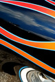
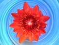
Lots of color in this, but a little too busy for my taste. |
|
 Photographer found comment helpful. Photographer found comment helpful. |
|
|
04/30/2006 08:58:39 PM |
|
hmmm, seems the lightings a bit harsh |
|
| Photographer found comment helpful. |
|
|
04/30/2006 07:30:23 PM |
|
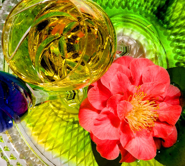
wow... there is lots of stuff in this photo |
|
| Photographer found comment helpful. |
|
|
04/30/2006 11:17:46 AM |
|
unappealing aesthetically |
|
| Photographer found comment helpful. |
|
|
04/30/2006 06:36:17 AM |
|
This photo is very busy, and there are too many colours for this challenge. |
|
| Photographer found comment helpful. |
|
|
04/29/2006 01:55:17 PM |
|
Kinda busy, but nice colors and pov. |
|
| Photographer found comment helpful. |
|
|
04/29/2006 12:26:30 PM |
|
Interesting idea, with vibrant colours. The composition is a little complicated for me though. |
|
| Photographer found comment helpful. |
|
|
04/29/2006 12:24:37 PM |
|
This is almost too busy... there is nowhere for my eye to land |
|
| Photographer found comment helpful. |
|
|
04/29/2006 09:20:27 AM |
|
| Photographer found comment helpful. |
|
|
04/29/2006 05:38:57 AM |
|
| Photographer found comment helpful. |
|
|
04/27/2006 08:45:36 PM |
|
2 - Too busy in my opinion. Main colors I'm seeing first are yellow and pinkish red - followed by green then blue, etc. Perhaps tweaking in pp of the hue and a tighter crop may have helped you. Overall this shot with 'less', may have been stronger in my opinion. |
|
| Photographer found comment helpful. |
|
|
04/27/2006 08:44:31 PM |
|
There is way too much going on in this photo, and the blue definitely distracts when it shouldn't even exist in a red/green composition. |
|
| Photographer found comment helpful. |
|
|
04/26/2006 11:31:04 PM |
|
| Photographer found comment helpful. |
|
|
04/26/2006 08:21:29 PM |
|
This is just too busy. There are too many things to look at...the detail of the plate (I'm assuming that's what that is on the bottom), the multiple glasses, the patterns within the glass, the details of the flower, etc. The POV feels off-keel and the overall lighting feels a bit harsh. |
|
| Photographer found comment helpful. |
|
|
04/26/2006 01:03:11 PM |
|
| Photographer found comment helpful. |
|
|
04/26/2006 07:23:37 AM |
|
This feels too busy (items, lights, shades, etc.) 6 |
|
| Photographer found comment helpful. |
|
|
04/26/2006 05:31:51 AM |
|
it's nice...a little busy for my liking, but I like the perspective |
|
| Photographer found comment helpful. |
Home -
Challenges -
Community -
League -
Photos -
Cameras -
Lenses -
Learn -
Help -
Terms of Use -
Privacy -
Top ^
DPChallenge, and website content and design, Copyright © 2001-2026 Challenging Technologies, LLC.
All digital photo copyrights belong to the photographers and may not be used without permission.
Current Server Time: 06/28/2026 05:51:55 PM EDT.