| Image |
Comment |
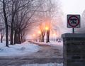
| 02/02/2005 01:36:37 AM |
So What Speed?by kirtiebuComment: Very interesting sign. Love the font style of the writing and the "beat up" look of the sign! |
 Photographer found comment helpful. Photographer found comment helpful. |
| 02/02/2005 01:35:54 AM |
Railroad Xingby m2iwComment: Those are lights not signs! Perhaps it can be up for interpretation...I'll give you that. Afterall, they are giving you a "message". Composition is very nice. Not a fan of the yellow X in the background though. |
| Photographer found comment helpful. |
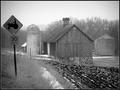
| 02/02/2005 01:34:46 AM |
Summer's Sanctuaryby mfairbanksComment: Focus is a little soft. Plus, which sign is your "subject"? Visually not composed to its full potential. |
| Photographer found comment helpful. |
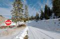
| 02/02/2005 01:33:58 AM |
Weather Neglectedby nordicgirlComment: This would be a little stronger if there was more contract between the sign and the trees. The image as a whole has a very "flat" feel to it. Perhaps intentional...? |
| Photographer found comment helpful. |
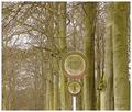
| 02/02/2005 01:33:07 AM |
Mountain Signby WawaaComment: Lots of uninteresting visual "debri" in the background of this photo. The sign is interesting but a little dull. Probably didn't use a flash, and not enough post processing. The best thing you ahve going for you are the mountains in the background. Wish you would have cropped out the powerlines..... |
| Photographer found comment helpful. |
| 02/02/2005 01:31:34 AM |
Crossingby pumaComment: Interesting perspective. Very nice. 7 |
| Photographer found comment helpful. |
| 02/02/2005 01:30:47 AM |
|
| Photographer found comment helpful. |
| 02/02/2005 01:29:17 AM |
|
| Photographer found comment helpful. |
| 02/02/2005 12:30:08 AM |
Guaranteed Satisfactionby CorySmithComment: Wish the focus was sharper and it was composed a more interesting fashion. It would be easier on the eye if it didn't "almost" fill the whole frame. Feels cramped. Its kind of like how in motion film cinematography, you should never fram just someone's head in the shot cut off at the neck. Its whats called a tansition point. Bad. Whats better is to either go tighter or wider. (If it were a person that would mean cropping off the top of the forehead and the chin, or slightly wider, a crop including some of the shoulders. Hope this makes sense.
Chris |
| Photographer found comment helpful. |
| 02/02/2005 12:26:08 AM |
|
| Photographer found comment helpful. |
Home -
Challenges -
Community -
League -
Photos -
Cameras -
Lenses -
Learn -
Help -
Terms of Use -
Privacy -
Top ^
DPChallenge, and website content and design, Copyright © 2001-2025 Challenging Technologies, LLC.
All digital photo copyrights belong to the photographers and may not be used without permission.
Current Server Time: 08/25/2025 05:06:32 PM EDT.