| Author | Thread |
|
|
08/28/2006 12:42:46 PM |
|
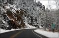
I like the tones in this shot - good job on the trees. Nice lines of composition too, although I think I'd like to see the sign a little more offset to the right. If you have any more of the shot on the left, you could include it with a wider crop - I think this might give it a more "complete" feel, as it would show more of the road's path. Still, nice capture. |
|
 Photographer found comment helpful. Photographer found comment helpful. |
Comments Made During the Challenge  |
|
|
02/08/2005 06:29:04 PM |
|
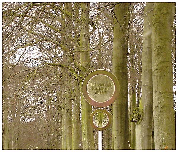
Too flat, nicely spotted though. |
|
| Photographer found comment helpful. |
|
|
02/06/2005 03:38:10 PM |
|
|
|
02/06/2005 02:13:49 AM |
|
I like the composition, well balanced, but you have done something to the photo to make it unclear? |
|
| Photographer found comment helpful. |
|
|
02/06/2005 02:09:01 AM |
|
Composition makes the background distracting, flat color, the sign gets lost in the trees |
|
|
|
02/05/2005 06:29:15 PM |
|
I like the way that the signs have taken on the same appearance as the trees. |
|
| Photographer found comment helpful. |
|
|
02/04/2005 11:40:29 PM |
|
This whole picture has a green tone to it...was it intentional? |
|
|
|
02/04/2005 01:15:22 PM |
|
|
|
02/04/2005 12:54:45 PM |
|
Maybe too much un-sharp masking for web viewing... |
|
| Photographer found comment helpful. |
|
|
02/02/2005 08:21:29 PM |
|
i like how it blends in with the background. took me a second to find it. |
|
| Photographer found comment helpful. |
|
|
02/02/2005 04:55:34 PM |
|
The idea for this image is OK, but the execution is not so good. It looks as though it has had Neatimage applied poorly and that it is oversharpened. Both combine making the image poor quality. Positioning the main subject (the sign) in one of the rule of thirds intersection points would improve the composition. |
|
| Photographer found comment helpful. |
|
|
02/02/2005 04:36:41 AM |
|
The tree on the extreme right is really spooky. |
|
|
|
02/02/2005 01:33:58 AM |
|
This would be a little stronger if there was more contract between the sign and the trees. The image as a whole has a very "flat" feel to it. Perhaps intentional...? |
|
| Photographer found comment helpful. |
Home -
Challenges -
Community -
League -
Photos -
Cameras -
Lenses -
Learn -
Help -
Terms of Use -
Privacy -
Top ^
DPChallenge, and website content and design, Copyright © 2001-2026 Challenging Technologies, LLC.
All digital photo copyrights belong to the photographers and may not be used without permission.
Current Server Time: 06/30/2026 08:42:08 PM EDT.