|
|
|
Showing 121 - 130 of ~256 |
| Image |
Comment |
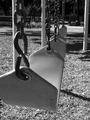
| 08/29/2002 12:53:00 PM | Thrill Rideby JenguinComment: this is a very nice shot, and definitely one of the better composed "swing" shots in the challenge. one of the things i've noticed missing from all of them is a sense of action. i know the challenge didn't allow any children in the shots, but even if one of these swings was held out a bit on an angle to show that it was in use sometime recently, it might add a lot more feeling to the image. all of the swing images being so static almost seems like one of those kidnapping prevention posters or something. they seem so desolate and depressing. but technically, this was very well done, and i dig the use of black and white. good job (and sorry to single yours out for expressing my feelings about the swing shots, i just feel this one probably could have really benefited from some action.) |
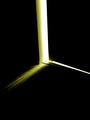
| 08/29/2002 12:41:00 PM | Childhood Spent Locked in Closet, Rays of Hopeby paganiniComment: the title is absolutely horrendous. try not to use that space to explain your photograph. however, the use of light and the composition of this shot is great. very well done. i know you're taking a hit on the subject matter, but it's a very artistic shot with a very real subject matter, and i think you've done it well. good work. |
| 08/19/2002 01:30:00 AM | Sharpby mciComment: Thanks to everyone who commented. "New Knife" was the concept of this photo. I figured new knives cut people. I really like Jim's suggestion of the title "New Cook" or "New Chef". That would definitely have fit as well. Anyway, as you can see by my description of the photo, I knew the "blood" was bad. I could have sworn I had some fake blood around, but I couldn't find it. I shot this at like 10pm Sunday night and we didn't even have any food coloring. I believe the final concoction was a mix of Caro Syrop, Ketchup, and Hershey's Chocolate Syrup. Definitely didn't come out good on the knife, but I don't think the rest is too bad. Anyway, thanks again. |
| 08/18/2002 03:49:00 AM | Thin Iceby GeneralEComment: the lighting here is really harsh, and you subject isn't really very interesting. i'm not sure i really get the connection to the challenge, either, but i don't take points off for that. you might want to crop off the top corners where your pan ends, and try to get more natural lighting instead of bouncing the harsh flash off the metal surface. |
| 08/18/2002 03:30:00 AM | GameBoyby mcmurmaComment: great subject. good composition and lighting. nice macro. good job. |  Photographer found comment helpful. Photographer found comment helpful. |
| 08/18/2002 03:46:00 AM | Our New Life Togetherby langdonComment: this looks like it's a nicely composed photo, but it's really dark. as a silhouette, it would be really nice if there was more lighting in the background to make the figures stand out. i lower angle might have been better here as well, to get rid of the two harsh lights in the ceiling and the chandelier growing out of his back / her hands. other than these things, this is a nice attempt. | | Photographer found comment helpful. |
| 08/18/2002 03:27:00 AM | The Force Be With Youby karmatComment: excellent. great composition, subject, focus. my only nitpicks: maybe a stop or two too dark, and you might want to try cropping off some of the right hand side. otherwise, everything is really great. good work. | | Photographer found comment helpful. |
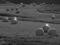
| 08/18/2002 03:42:00 AM | New bales of hayby jonrComment: this shot has a really flat tonal range, and it hurts it a lot. the lack of any real black or white makes this a bad candidate for a black and white photo. i don't know if you used a star filter to get those light flares, but i think they add a harshness to this image that detracts a bit. |
| 08/18/2002 03:33:00 AM | Bouquet for the drawing artistby sylkComment: this has the beginnings of a great shot. nice composition and i love the pattern. the lighting is a bit harsh and the bluish background area in the upper left corner really detracts from the overall feeling. i know it can be very hard to get a solid white background, though, so you did a pretty good job. good work. |
| 08/18/2002 03:36:00 AM | Needful Thingsby jmsetzlerComment: this could easily be a best buy ad. great focus and composition, great subject. very well done. if i were to REALLY nitpick, i'd say that something about the cropping bothers me. my eye is being drawn to the mole on his cheek in the lower left corner, so you might want to crop that out, and maybe something pulled back a little bit so as not to be so close to his face might work a little better. but again, this is being really nitpicky. great shot. |
|
Showing 121 - 130 of ~256 |
Home -
Challenges -
Community -
League -
Photos -
Cameras -
Lenses -
Learn -
Help -
Terms of Use -
Privacy -
Top ^
DPChallenge, and website content and design, Copyright © 2001-2025 Challenging Technologies, LLC.
All digital photo copyrights belong to the photographers and may not be used without permission.
Current Server Time: 12/20/2025 01:27:53 AM EST.
|