| Image |
Comment |
| 08/23/2002 07:14:00 AM |
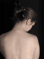
Utilitarianby indigo997Comment: I like this idea, but find the image a little too dark. I think it's the lighting. Would like more on the hair so can see the pencils and shapes and have more definition of the hair texture. 5, Kavey |
 Photographer found comment helpful. Photographer found comment helpful. |
| 08/23/2002 07:05:00 AM |
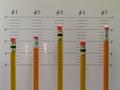
I'm positive it's #2 officer!by dpatteeComment: Oooh the USUAL SUSPECTS! This makes me smile, even on the Nth viewing! Would like more light/ better colour on the pencils, ahem, I mean suspects. 7, Kavey |
| 08/23/2002 06:24:00 AM |
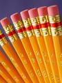
Just Pencilsby jkiolbasaComment: I love the shapes and the DOF and the way the identical pencils could almost be one moving pencil. Good colour, good lighting and the background colour is spot on. 6, Kavey |
| 08/20/2002 05:42:00 PM |
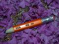
My Brother the Artistby KrazyKatComment: Lovely sharp light on the pencil and definition in the finger whorls. Something about the composition doesn't quite work for me, it's something about the white space at the top left but I can't put my finger on it (no pun intended). 5, Kavey |
| 08/21/2002 06:48:00 PM |
Sigh...by lisaeComment: Cute! A lot of grain in the background, perhaps this is intentional, or down to the camera. The pencils just look so cute. I like the big margin at the bottom - makes me think the composition is very deliberate within the entire frame. 6, Kavey |
| Photographer found comment helpful. |
| 08/20/2002 10:44:00 AM |
|
| 08/23/2002 06:27:00 AM |
Rest In Peaceby David EyComment: The texture and colour of the background is what draws me to this one, and the way that the colour combo (to me) is not attractive but that just makes me look more. 6, Kavey |
| Photographer found comment helpful. |
| 08/20/2002 01:02:00 PM |
Creativity Toolby stephanComment: Nice colour, I think this works with the soft focus, like the appearance of colour washing within a black and white print. The sketch included at the bottom is too messy (for me) and pulls it down a couple of points. Just my opinion though. 5, Kavey PS Looking forward to finding out how you achieved this interesting effect. |
| Photographer found comment helpful. |
| 08/20/2002 12:32:00 PM |
Time to Reflectby GraciousComment: I like the soft pastel colours, which are unusual in this challenge and therefore do stand out. I love the inclusion of the flowers and candle. I am not sure the exact composition works perfectly - it's a little unbalanced from left to right. The top left corner seems a little too empty compared with the rest. 5, Kavey |
| 08/20/2002 10:46:00 AM |
|
Home -
Challenges -
Community -
League -
Photos -
Cameras -
Lenses -
Learn -
Help -
Terms of Use -
Privacy -
Top ^
DPChallenge, and website content and design, Copyright © 2001-2025 Challenging Technologies, LLC.
All digital photo copyrights belong to the photographers and may not be used without permission.
Current Server Time: 08/04/2025 07:24:30 PM EDT.