| Image |
Comment |
| 09/20/2002 11:17:00 AM |
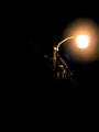
Mechanical Fireflyby sknittel646Comment: I like the feeling of place this gives me. The deep blackness and the way the light only illuminates the area directly around it conveys the darkness of the location. I would like the light and fence top to be at the left of the frame. 5, Kavey |
| 09/18/2002 11:53:00 AM |
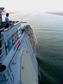
All in the Same Boatby MiekaComment: I really like this but for my taste the boat is TOO far in the corner and too small in the frame. I think the neg space would be more striking if the boat took up more of the frame, the sky would then have more of a shape of it's own around it. A portrait crop of the left side of the picture works for me. 5, Kavey |
| 09/20/2002 12:10:00 PM |
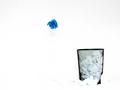
Blew itby FrooberComment: Nice emptiness. The vivid blue is striking. I find the paper infront of the bin too blown out, and merging into the background too much for my tastes. And I'd prefer the blue paper further to the left of the frame to balance the bin, but that's just my preference. 6, Kavey |
 Photographer found comment helpful. Photographer found comment helpful. |
| 09/18/2002 11:44:00 AM |
|
| 09/21/2002 12:35:00 PM |
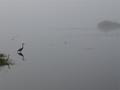
Froggy Morningby GotchaComment: The grey background is very atmospheric and I like the limited objects - especially the repetitive nature of the two brds at the right and the way they are balanced by the shrub to the back right. 8, Kavey |
| Photographer found comment helpful. |
| 09/21/2002 10:21:00 AM |
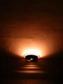
lamp on the white wallby prkembyComment: This makes an interesting abstract of light, shadow and texture. The shapes created are quite interesting. 6, Kavey |
| 09/21/2002 10:23:00 AM |
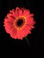
Midnight Flowerby tapnhodgComment: Apologies for not leaving a proper comment. Please email me if you'd really like one. I�ve voted this image a 6. Kavey |
| 09/21/2002 10:36:00 AM |
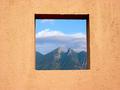
Framedby lmhrComment: Well framed, though the wall isn't very striking and I think it's colour detracts from the view within. 6, Kavey |
| 09/21/2002 12:46:00 PM |
Hannahby ZeissmanComment: I am not usually a fan of baby shots at all, nor do I usually mark them highly, so this is an exception for me. The shapes here are just fantastic. The angle of her head, and the way her arm pushes into the negative space are exactly right. Makes for a great composition. The highlights in her eyes are great and you've caught her hint of a smile so well. There's a little too much blow out in the highlights of her skin, but not massively so. Great shot! 9, Kavey |
| Photographer found comment helpful. |
| 09/20/2002 11:53:00 AM |
aloneby LanSnakeComment: Wonderful texture in the water - I am almost more interested in the water than the duck. In that sense you could say the negative space is wowwing me, but at the same time the duck isn't strong enough balance against it, in the positive (for my tastes). 6, Kavey |
| Photographer found comment helpful. |
Home -
Challenges -
Community -
League -
Photos -
Cameras -
Lenses -
Learn -
Help -
Terms of Use -
Privacy -
Top ^
DPChallenge, and website content and design, Copyright © 2001-2025 Challenging Technologies, LLC.
All digital photo copyrights belong to the photographers and may not be used without permission.
Current Server Time: 08/17/2025 09:09:42 PM EDT.