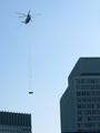
DPChallenge: A Digital Photography Contest You are not logged in. (log in or register
 
Browse Settings
Currently viewing:
Registered UserKavey

Show comments:

Per page:

Order:

Comments:


Comments Made by Kavey
Pages:   ... [466] [467] [468] [469] [470] [471] [472] ... [561]
Showing 4681 - 4690 of ~5610
Image Comment
Rescue! This story and more at 11!
12/05/2002 05:38:12 PM
Rescue! This story and more at 11!
by KarenB

Comment:
Critique Club


Initial thoughts
Interesting event but poor composition and poor quality jpeg.

Composition/ Content
Content is reasonably interesting, given the challenge topic, though not particularly interesting of itself.
Composition doesnât work for me â feels incohesive. The shape made by the buildings/ sky isnât very strong graphically. The lines of the buildings arenât parallel to the frame. The rope hanging from the helicopter is also not vertical within the frame. Although the position of the helicopter in the frame adheres to the rule of the thirds this is unbalanced by the buildings â their inclusion in the shot adds context/ environment (which may be necessary to tell the story) but does not aid composition.

Background
As the background is just sky there is little to say about it. Not too whited out.

Camera Work - Technical
Exposure isnât quite right â buildings seem a little dark â though shooting into the sky does make this very difficult to get right.

Digital Processing - Technical
Sky seems very noisy â is it a crop from a much larger picture or has it been taken on the low res setting of your camera?
Iâd recommend using a program such as neatimage to lose that noise.
There are compression artifact âjaggiesâ along the edges of the heliblades.

Fits The Challenge
Yes. Clearly there is a story to be told here. I think the photo in itself would support an article about the story, but not really illustrate the story on itâs own.

Your Opinion On The Photo
Compositionally and content-wise this photo isnât one that has strong appeal for me.

(Sorry Karen, I truly hope this critique isnât offensive or disheartening â if any aspect of it upsets you please let me know and I can edit it out).
Photographer found comment helpful.
Search For War Hero Dad Has Come To An End
12/05/2002 12:01:57 PM
Search For War Hero Dad Has Come To An End
by Marsha

Comment:
Critique Club


Composition/ Content
Content is simple and stark. Composition is better than if the grave stone were centred but not altogether pleasing. There is too much else in frame to concentrate on the gravestone. Focal point to me is the clump of grass to the right of the frame â itâs where my eye keeps pulling back to. I do also return to the cross symbol on the stone itself. Because of the angle of the sun the face of the stone is in dark shadow and the edges of it in strong light. This means that the light isnt really falling on the main element of the image.

Background
The other graves and particularly the buildings at the top of the frame do detract from the grave stone face itself.

Camera Work - Technical
Lighting not ideal â perhaps better to take the photo at a different time of day â and therefore exposure not overly pleasing.

Digital Processing - Technical
Contrast seems a littlet oo high.

Fits The Challenge
Content is clearly intensely personal but I am not sure it makes a photo with huge impact for other viewers. However it does clearly have a story to tell â I get an inkling of the journey behind it â I imagine an adult making a trip to somewhere far from home in order to find the grave of their father, killed in action.
Watching Mexico Independence Day Parade
12/05/2002 11:46:04 AM
Watching Mexico Independence Day Parade
by JEM

Comment:
Critique Club


Initial thoughts
Sweet contents, composition weak.

Composition/ Content
The two little girls are attractive and the candid nature of the shot is appealing. It could be improved with eye contact though that would be difficult to achieve on a candid shot.
I like the way that the yellow colour is echoed in the clothing of both.
In terms of composition Iâd rather have their feet/ arms included in shot â as it is the girl on the left is reaching out of shot â I want to see what she is reaching for.
The positioning of their faces within the frame is satisfactory and the line of the kerb balances this out in the lower third of the frame.

Background
The background is somewhat distracting â in particular I dislike the dark leg or pillar behind the girl at the right â it is not a good background for her dark hair colour and it means we lose the strong shape of her head. The other feet in the background are also messy. I do, of course, appreciate that this is only to be expected in a candid shot of this nature â I am expressing this only in terms of what would improve the shot further for me.

Camera Work - Technical
Focus seems a little soft in their faces though perhaps this is an issue of resolution, I am not sure. Colours and light have been captured well.

Fits The Challenge
Without the title it would be hard to relate this to any particular story and perhaps it would be worth exploring candid shots of the crowds which also include the parade. With the title this is certainly the kind of shot I could imagine in a local paper, in terms of content.

Your Opinion On The Photo
I find the image pleasant to look at but not to the extent of being drawn back again and again for further viewing.
Photographer found comment helpful.
The Face of American Resolve
12/05/2002 11:31:38 AM
The Face of American Resolve
by Turbotech

Comment:
Critique Club


Initial thoughts
Emotive content, image seems very dark.

Composition/ Content
I like the off-centred composition and the way the face is cropped but not completely halved. Including the cap/hat and only a little of the shirt clarified that the man is a solder without losing focus on his face. Content is stark and uncompromising, which fits the title and is therefore clearly deliberate.
Focal point is confusing. There is just enough detail in the eye that I am drawn to it but not enough to satisfy so it is not the focal point it could be. I think perhaps the eye needs to be either wholly in shadow or a little more in the light. An alternative focal point might be the mouth but the highlights which are stronger on the cheek donât tend to encourage that. Therefore the focal point seems to be his nose and the highlights on his cheek.

Background
Clean black does not detract from the subject but also doesnât allow the subject to stand out from it. This may be deliberate â it does bleed into the shadows well but does not work for me, personally.

Camera Work - Technical
Focus seems good on the face, a little soft on his shirt. Exposure and lighting are probably deliberate but just a bit too dark for me.
Digital Processing - Technical
Cant see any artifacts, seems fine to me.

Fits The Challenge
Yes, given the current political/ military situation in the US â perhaps there is a cloud hanging over the future or this soldier â he has the resolve â will he be called on etc. There could certainly be a story there.

Your Opinion On The Photo
The photo seems well taken â in that I believe it looks as it was intended to by the photographer. It doesnât sit well with me partly because of personal politics and partly because itâs too dark visually for me.

Message edited by author 2002-12-06 13:58:03.
Two Tone Tonic
12/04/2002 07:27:41 PM
Two Tone Tonic2nd Place
by jmsetzler

Comment:
test
kavey
Me, Myself and I and I and I and I and I
12/04/2002 06:41:09 PM
Me, Myself and I and I and I and I and I
by Swashbuckler

Comment:
Shit... this looks like me to me and it isnt me! It's you!
Spooky!
:)
Kavey
Photographer found comment helpful.
Bonfire 2002:  Texas Aggies Remember 1999 Collapse
11/30/2002 01:09:00 PM
Bonfire 2002: Texas Aggies Remember 1999 Collapse
by Froober

Comment:
Well captured and well exposed - great silhouettes.
Compositionally I'd shave a little bit off the left side.
9, Kavey
Photographer found comment helpful.
Vogue Magazine:  Less than 30 shopping days to Xmas!
12/01/2002 04:22:00 PM
Recycle Magazine
11/30/2002 01:05:00 PM
Recycle Magazine
by goodtempo

Comment:
This is interesting! Great content and nice colours.
I'd either like to see more of the "path" coming to the front - the two rows of tires with mostly water between - or crop close in on the lower part of the shot as a landscape orientation. Current composition keeps leading my eye out of the frame.
8, Kavey (voting after all)
Photographer found comment helpful.
Christmas Season is Upon Us ( small town news)
11/30/2002 01:03:00 PM
Christmas Season is Upon Us ( small town news)
by Sonifo

Comment:
WOW!
This is stunning - excellent lighting - love the pool of light within the darkness and the composition too.
Voting after all!
10, Kavey
Photographer found comment helpful.
Pages:   ... [466] [467] [468] [469] [470] [471] [472] ... [561]
Showing 4681 - 4690 of ~5610


Home - Challenges - Community - League - Photos - Cameras - Lenses - Learn - Help - Terms of Use - Privacy - Top ^
DPChallenge, and website content and design, Copyright © 2001-2025 Challenging Technologies, LLC.
All digital photo copyrights belong to the photographers and may not be used without permission.
Current Server Time: 08/23/2025 02:25:04 AM EDT.