| Image |
Comment |
| 05/01/2003 12:11:19 PM |
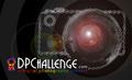
got focus?by chuckComment: Nice addition of blue ribbon at lower right and nice chocie of where to add colour in URL - though I'd made the "C" blue also.
Not keen on the font choice for "got focus?" and the photo image seems rather strange - is it a composite? Doesn't seem right to me.
5, Kavey |
| 05/01/2003 12:10:06 PM |
Use With Cautionby mcmurmaComment: Rather Star Wars isn't it? :D
Interesting idea but doesn't draw me in - feels like too much text to plow through.
I do like your strapline - It's not just an online photo contest...
5, Kavey |
 Photographer found comment helpful. Photographer found comment helpful. |
| 05/01/2003 12:09:05 PM |
Untitledby PHOTOCHlXComment: Interesting idea but the film cannister really doesn't say DIGITAL photography to me. That said, it's nicely put together. Not keen on textured green background.
5, Kavey |
| 05/01/2003 12:08:14 PM |
DPC Stickerby CLarson557Comment: Simple layout and idea.
Not keen on textured background and think camera image would be stronger without flash blow out.
5, Kavey |
| Photographer found comment helpful. |
| 05/01/2003 12:07:15 PM |
dpcby Ricky CleaveComment: Good simple design. Personally not keen on font chosen for website name nor colours for DPC background.
5, Kavey |
| 05/01/2003 12:06:22 PM |
Photography Holeby me2you1Comment: Interesting photo but overpowers text elements and sticker message for me.
5, Kavey |
| Photographer found comment helpful. |
| 05/01/2003 12:02:47 PM |
Open Your Eyesby mciComment: Not quite sure why there are two different designs here? Is this how the sticker would be or do you mean that one of the two designs entered needs to be chosen - if the latter - I feel you should have chosen and entered one of them.
Nice colours and simple layouts. Not too keen on extent of white blur behind your strapline.
6, Kavey |
| 05/01/2003 12:01:12 PM |
|
| Photographer found comment helpful. |
| 05/01/2003 12:00:02 PM |
.by dsidwellComment: Cool idea and nicely done. Feels a little unbalanced in composition to me. I am definitely not keen on choice of font.
6, Kavey |
| Photographer found comment helpful. |
| 05/01/2003 11:59:10 AM |
|
| Photographer found comment helpful. |
Home -
Challenges -
Community -
League -
Photos -
Cameras -
Lenses -
Learn -
Help -
Terms of Use -
Privacy -
Top ^
DPChallenge, and website content and design, Copyright © 2001-2025 Challenging Technologies, LLC.
All digital photo copyrights belong to the photographers and may not be used without permission.
Current Server Time: 08/24/2025 09:56:57 PM EDT.