| Image |
Comment |
| 01/29/2004 01:03:21 PM |
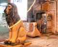
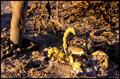
Don't let your luck go awayby FlipperComment: Undeniably a lion though not one that conveys the zodiac sign very strongly to me.
Photo suffers from lighting - I think it's the direction of the (rather strong) light that's causing that white faded effect on the back of the lion's mane. The focus seems to be aimed at the background - the lion seems soft but the STOP posters in the background are sharp. I kind of like the haphazard jumble of signs, concrete barrier and old petrol pump behind him - gives a slightly surreal air to the image. |
 Photographer found comment helpful. Photographer found comment helpful. |
| 01/29/2004 12:59:31 PM |
|
| 01/29/2004 12:59:09 PM |
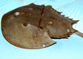
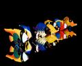
Cancer the crab (Horseshoe Crab)by ladpupmoeComment: Given that the challenge is to represent one of the signs of the zodiac my feeling is that traditional crabs, that are closer to the most commonly seen image of the Cancer sign, would be better used here.
In terms of the image itself I think that the frame feels crowded - the crop is very close to the edge of the subject - it feels too close to me. The colour of the background doesn't appeal to me and the fanned out stripes toward both top corners are a little distracting - they don't add anything. |
| Photographer found comment helpful. |
| 01/29/2004 12:55:19 PM |
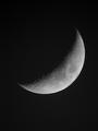
Cancer (Planet -The Moon)by vtruanComment: Well captured. Whilst I don't have the fanatical belief some do that all images mustb be original ideas I do think this doesn't really add anything new to the thousands of moon crescent photos out there in the world and therefore it doesn't really capture my interest. But in terms of technical success - I think it's nicely done. |
| Photographer found comment helpful. |
| 01/29/2004 12:51:57 PM |
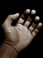
Aries - Friendship and Loyaltyby kuarkComment: The lone hand, in this position, doesn't convey friendship or loyalty to me - perhaps it may have done if the viewpoint were of the hand reaching towards me? I like the image itself a lot, the detail comes through well in black and white. Lighting is a little harsh - my focus keeps returning to those white fingertips. |
| Photographer found comment helpful. |
| 01/29/2004 12:50:31 PM |
El Alacrán (scorpio)by Evil_MunkyComment: His camouflage colourings mean he doesn't stand out against the drab background, especially because the strong light is creating so many shadows from the rubble and branches. I would also suggest the composition might be better if he were looking into rather than out of the frame. |
| Photographer found comment helpful. |
| 01/29/2004 12:49:22 PM |
|
| Photographer found comment helpful. |
| 01/29/2004 12:46:56 PM |
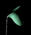
The Water Pourerby ColeyComment: Interesting light and shadow but not enough interest for me in terms of the content itself. |
| 01/29/2004 12:46:29 PM |
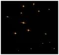
Geminiby Firstrich1Comment: Simple and attractive though i think it lacks a focal point. |
| Photographer found comment helpful. |
| 01/29/2004 12:45:58 PM |
Aquarius - the water carrierby johnmComment: Personally, although I'm happy to accept that your interpretation is as valid as more obvious ones, it certainly doesn't convey the theme to me in any way.
Colour, close up and angle are quite striking. |
| Photographer found comment helpful. |
Home -
Challenges -
Community -
League -
Photos -
Cameras -
Lenses -
Learn -
Help -
Terms of Use -
Privacy -
Top ^
DPChallenge, and website content and design, Copyright © 2001-2025 Challenging Technologies, LLC.
All digital photo copyrights belong to the photographers and may not be used without permission.
Current Server Time: 09/02/2025 05:10:35 PM EDT.