|
|
| Image |
Comment |
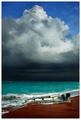
| 04/19/2005 08:56:17 PM | In the Path of Havocby CutterComment: The colors of this image divides it into four sections: The brown ground, the green sea, the black clouds and the blue sky. Makes it very interesting, but in a way confusing, or thought provoking if you wish. But a good job at capturing so much in one frame. |  Photographer found comment helpful. Photographer found comment helpful. |
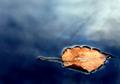
| 04/19/2005 08:54:32 PM | Adriftby admart01Comment: A really good spring photo. The reflections and textures, how the leaf is stuck in the ice... Simplicity at its finest. | | Photographer found comment helpful. |
| 04/19/2005 08:52:58 PM | Fiji stormy sunsetby blancericComment: Great! This belongs with my top of the pack. The colors and contrasts between them stand out very well. The reflections on the ground are exquisitely captured as well. | | Photographer found comment helpful. |
| 04/19/2005 08:50:21 PM | Sunset Silhouetteby SammieComment: Beautiful. Wish I could see more of the sunset though, or something that'd add a little more interest to the composition. But all in all, a good one. | | Photographer found comment helpful. |
| 04/19/2005 08:49:11 PM | Flat Iron Moonby eqsiteComment: This is a good subject, and the centered composition works. I'm not very fond of the technical aspects though, the colors aren't what they're supposed to be (and not overdone enough if it was intentional ;) | | Photographer found comment helpful. |
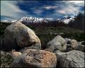
| 04/19/2005 08:46:24 PM | Mount Olympusby dsidwellComment: This one caught my eye while browsing the thumbnails. My hat is off - magnificent! | | Photographer found comment helpful. |
| 04/19/2005 08:44:34 PM | Levelby JMSComment: I really like this one. The colors are in good contrast to each other, and it's sharp. You could have made the surroundings entirely black, though, that's the only thing that comes to mind. |
| 03/23/2005 10:14:02 PM | A bee-line to the grave.by koltrane75Comment: Greetings from the Critique Club!
You're a brave man to post this, as it is a pretty controversial shot. However, I love the many sides of photography I get to see here at DPC, so thanks for doing it.
When it comes to meeting the challenge, "Lines" is a very wide topic, so it's difficult to say anything else than that you have done.
Black and white is probably the best thing for this shot, but there's nothing that screams "Wow!" about the technical or compositional parts of this image. It's done well, but nothing extraordinary - I think you know that, though.
The composition is a little tight in my opinion. The image is also a little busy and disturbing, because of all the small white spots and a lot of reflections. I don't know what you have thought though, getting it messy might have been your pure intention, and thus it's done right. Composition isn't a rule-based art anyhow. But anyhow, maybe the use of some negative space and a slightly less cropped image would help to give the eye a natural point of rest. What I'm attempting to say is that I don't think it's a fantastic photograph in itself, mainly because of the composition and somewhat because the post processing is a little dullish - some more contrast and highlights could help.
But was an exciting image your intention? I don't think it was. You wanted to tell a story, and you've experienced drug abuse yourself in the past. You're telling me to stay away from the damn things, because it doesn't do you well at all. It's a mess, and in the end it leads you to the grave.
By telling the viewer this, you've done a good image. The title and image work well together. But, as you know, I doubt that a DPC entry is the right medium to push this message.
With that, I wish you happy easter and thanks for keeping controversiality and photography together. If you have any comments on my critique, feel free to PM me. | | Photographer found comment helpful. |
| 03/23/2005 09:58:36 PM | Life Linesby marboComment: Happy easter, and greetings from the Critique Club!
First, congratulations on an 86% percentile and top 50 positioned image. Well deserved in a wide challenge with many contenders.
You have chosen an almost-square crop for this image. I think it works very well for a centered/all-covering composition like this. The lines work against each other, and the fact that it's not entirely diagonal adds a little disturbance against the chosen cropping, and that makes the image more exciting.
You've captured a sharp and clear, well-contrasted image of a difficult subject. You need to get up close to get it, and it needs a well-placed light. You've done all these things well. The only thing I want to pick on is that I think the frame is nicely placed, but it is twice as large as I'd like it to be. However, I really like the colors, the glow, contrast that tells me that you've done great both in capturing the image and post-processing it.
It meets the challenge, of course, and a good interpretation of it given your title. Depicting the flow of time and life with a flower might be a cliche, but a good one that you've used well.
Technically, it's a good shot. You seem to have had a lot of light to do this, and you've captured good detail. I had a look at your portfolio, which is pretty impressive and variated - you seem to know what you're doing, so a technical critque won't be nescessary.
It's hard to critique an image that contains this little, but you have done well in creating a simple, yet impressive shot. The glow and the really close macro is what gets you ahead of the other flower shots in this challenge.
If you have any questions or comments about this critique, please PM me. | | Photographer found comment helpful. |
| 03/23/2005 09:37:00 PM | Silhouetted Leafby HeavyComment: Greetings from the Critique Club!
A few things that come to mind about this image has already been commented - the image is a little busy, since there's no natural point of rest to my eye on this one. I think that you could create a better silhouetted leaf with a simple lighting setup, and get a better result, since the sunlight is a bit intrusive (esp. at the right end).
Composition is a subjective thing, and my opinion is that it could be changed so there's a vanishing point or a clearer subject - another perspective could help this image, I think. However, I can only state my feelings about it, and your intention is by far the most important.
You have, however, captured good color and detail here. There are many shades of green color, and a good dynamic range. You state in your portfolio that you want to know your camera better - well, I think you know it pretty well. It's a sharp image with enough depth to cover the entire image (which is appropriate for the composition you chose), it's sharp and clear, and well exposed except that I think you could've chosen another way of lighting. So technically, this is a well done thing. You also seem to know post-processing, as it is not evident in the image what you have done (a good thing, I think).
It meets the challenge, of course, but still, this is a rather wide subject.
Keep on working, good luck at top 10!
If you have any comments about my critique, please PM me. | | Photographer found comment helpful. |
Home -
Challenges -
Community -
League -
Photos -
Cameras -
Lenses -
Learn -
Help -
Terms of Use -
Privacy -
Top ^
DPChallenge, and website content and design, Copyright © 2001-2025 Challenging Technologies, LLC.
All digital photo copyrights belong to the photographers and may not be used without permission.
Current Server Time: 08/03/2025 04:01:25 PM EDT.
|