| Author | Thread |
Comments Made During the Challenge  |
|
|
04/25/2005 10:46:01 PM |
|
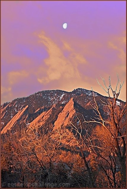
nice perspective, but IMO it has too much contrast. |
|
 Photographer found comment helpful. Photographer found comment helpful. |
|
|
04/25/2005 08:11:13 PM |
|
Overpixelated,bad choice of gradient,5 |
|
| Photographer found comment helpful. |
|
|
04/25/2005 07:33:10 PM |
|
Image appears to be over processed for colors. Colors seem unrealstic. Oversharpening or separate processing between sky and horizon resulted in distracting haloing. Might have considered offsetting the moon to one side or the other of the frame as opposed to having it directly in the middle. |
|
| Photographer found comment helpful. |
|
|
04/25/2005 05:17:56 PM |
|
looks like mars!...except for the trees...maybe a bit over processed, but it certainly stands out, the more i look at it the more it appeals! |
|
| Photographer found comment helpful. |
|
|
04/25/2005 04:41:40 PM |
|
A great strong visual as a graphical representation but imho less processing and staying more withing its natural colors would have yielded a more highly exciting entry. Bumping from 5 to 6. |
|
| Photographer found comment helpful. |
|
|
04/25/2005 03:26:58 PM |
|
im just guessing here but i think you might have used too much high pass sharpening. |
|
| Photographer found comment helpful. |
|
|
04/25/2005 08:35:27 AM |
|
Your color saturation leaves a little to be desired here. I think it would be a stronger photograph if the colors had been a little more realistic. |
|
| Photographer found comment helpful. |
|
|
04/24/2005 01:17:16 PM |
|
Godd capture. I don't like the horzon being in the center. |
|
| Photographer found comment helpful. |
|
|
04/24/2005 06:13:43 AM |
|
The cloud looks like smoke coming out of a volcano. I`m not to keen on the colour. |
|
| Photographer found comment helpful. |
|
|
04/23/2005 01:50:29 PM |
|
color seems overprocessed and blown out to me |
|
| Photographer found comment helpful. |
|
|
04/22/2005 01:53:13 PM |
|
love the colors, very unusual and interesting |
|
| Photographer found comment helpful. |
|
|
04/21/2005 01:12:46 PM |
|
I believe the colors are too enhanced. |
|
| Photographer found comment helpful. |
|
|
04/20/2005 08:31:46 PM |
|
Beautiful shot, I personally don't care for the border with this one. |
|
| Photographer found comment helpful. |
|
|
04/20/2005 03:37:18 PM |
|
stunning sky - colours are mesmerising |
|
| Photographer found comment helpful. |
|
|
04/20/2005 12:46:21 PM |
|
Looks a bit over-proccessed. |
|
| Photographer found comment helpful. |
|
|
04/19/2005 08:49:11 PM |
|
This is a good subject, and the centered composition works. I'm not very fond of the technical aspects though, the colors aren't what they're supposed to be (and not overdone enough if it was intentional ;) |
|
| Photographer found comment helpful. |
|
|
04/19/2005 07:51:49 PM |
|
| Photographer found comment helpful. |
|
|
04/19/2005 10:28:25 AM |
Man, I miss Boulder! It's as beautiful as ever, eh?
Your shot seems a bit harsh - like it's both out of focus and over-usm'ed. I like the colors very much, but the details are rather dulled out.
All in all, though, it was real nice to see a familiar scene :) |
|
| Photographer found comment helpful. |
|
|
04/19/2005 09:16:14 AM |
|
this is probably one of those images where the size reduction really takes away from the overall potential of the image. here, it comes across a bit flat and a bit soft. i love the colors, but am left feeling that something is missing. oh well, it's probably just me. good luck! |
|
| Photographer found comment helpful. |
|
|
04/19/2005 08:44:21 AM |
|
A bit too surreal-looking for my taste. |
|
| Photographer found comment helpful. |
|
|
04/19/2005 07:54:15 AM |
|
Moon overexposed with a blue halo. A graduated ND filter would help with this. |
|
| Photographer found comment helpful. |
|
|
04/19/2005 04:42:04 AM |
|
Great colouring, almost looks like another planet. |
|
| Photographer found comment helpful. |
|
|
04/19/2005 12:17:21 AM |
|
looks almost like a painting. very nice. |
|
| Photographer found comment helpful. |
Home -
Challenges -
Community -
League -
Photos -
Cameras -
Lenses -
Learn -
Help -
Terms of Use -
Privacy -
Top ^
DPChallenge, and website content and design, Copyright © 2001-2026 Challenging Technologies, LLC.
All digital photo copyrights belong to the photographers and may not be used without permission.
Current Server Time: 06/29/2026 01:12:36 AM EDT.