| Image |
Comment |
| 11/17/2004 09:34:08 PM |
Daddy's Girlby debitiptonComment: Great family shot! Unfortunately the high brightness and possibly compensated contrast is washing out the girls arm and he face. With those aspects improved I'd have given this a nine, at least. For now, a 7. Good luck! |
 Photographer found comment helpful. Photographer found comment helpful. |
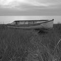
| 11/17/2004 09:30:20 PM |
High and Dryby orussellComment: Perfect light, contrast. Perfect horizon angle (very important to me). Excellent ablance. I love this shot. 10. Well done and good luck! |
| Photographer found comment helpful. |
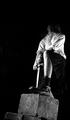
| 11/17/2004 09:22:11 PM |
Sword In the Stoneby JasComment: INteresting composition. I generally like this, but feel the brightness is too low and the contrast too high. On my screen the chin is almost completely lost in the dark creating a "stare zone" distraction. (The brain wants to see what it can not quite see. Well mine does anyhow :) Still, I like the composition and camera angle etc dso much I'm giving you a 7. Good luck! (Might be the Scotsman in me deep down somewhere! ) |
| 11/17/2004 09:18:53 PM |
Moodyby space amoebaComment: I feel the focus should have been most clear on the hands and book. Adjusting contrast down to bring the short shadow to the left alittle (of image) and also decrease the brilliance of the light just under the book might have also improved this image. 6. Good lcuk. |
| Photographer found comment helpful. |
| 11/17/2004 09:14:41 PM |
i doby sacredspiritComment: Good shade and framing. Butit's just way to dark for me. Not sure I understand the title either (but that doesn't really count.) If lightened, yo might need to reduce contrast slightly to keep the far leg in the "gray zone". Did you have your computer screen turned up high brightness in low light perhaps? it's so easy to do with black and white images. What a shame. 6. |
| Photographer found comment helpful. |
| 11/17/2004 09:08:33 PM |
Can´t wait...by LalliSigComment: Lovely pose and a rare opportunity. Great angle and framing. I felt the contrast was little too high washing out shades on the chest and near shoulder areas. (This would look softer on a CRT monitor.) 8. Good luck! |
| Photographer found comment helpful. |
| 11/17/2004 09:05:02 PM |
|
| 11/17/2004 09:04:02 PM |
Tempus Fugitby Tech-DComment: Your camera has an amazing level of clarity for such a low light and long exposure. I feel the focus in this image, whilst highlighting that fact admirably, is of too narrow a field making the foreground a major distratcion. The overall lighting and choice of surface is very good however. 7. |
| Photographer found comment helpful. |
| 11/17/2004 08:59:45 PM |
My RacheLoveby theONE77Comment: Nice subject and pose. She certainly is lovely :)
Portraiture work is generally accepted as best when the eyes of the subject are in clear(est) focus. I tend to agree. Your photo would also be improved, in my opinion, with the contrast level reduced to enhance the shade gradient across the forehead etc. Otherise, good crop and framing. Well done. 3. |
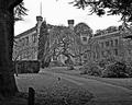
| 11/17/2004 06:33:46 PM |
Old Hallby peeceeComment: Perpective distorion makes it dofficult to decide an appropriate horizon angle in shots like this doesn't it? Personally, I'd prefer the see the two corner pillars perceptually vertical. It's al ovely shot though. The shade balance suits the era of the subject imo. 8. Good luck! |
| Photographer found comment helpful. |
Home -
Challenges -
Community -
League -
Photos -
Cameras -
Lenses -
Learn -
Help -
Terms of Use -
Privacy -
Top ^
DPChallenge, and website content and design, Copyright © 2001-2025 Challenging Technologies, LLC.
All digital photo copyrights belong to the photographers and may not be used without permission.
Current Server Time: 08/22/2025 06:30:33 AM EDT.