| Image |
Comment |
| 04/29/2005 10:48:38 PM |
|
 Photographer found comment helpful. Photographer found comment helpful. |
| 04/29/2005 10:46:57 PM |
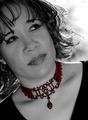
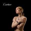
Highlighting Beautyby Travis99Comment: Nice use of desaturation. This looks like it would be a great ad for a Univ. of Wisconsin, Madison school paper. 7 |
| Photographer found comment helpful. |
| 04/29/2005 10:45:27 PM |
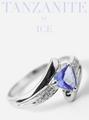
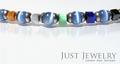
Iceby bruskiComment: Great layout. Could use more clarity on the ring so it pops out. 7 |
| Photographer found comment helpful. |
| 04/29/2005 10:44:27 PM |
|
| Photographer found comment helpful. |
| 04/29/2005 10:43:15 PM |
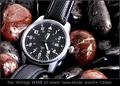
OUTBACKby DrJOnesComment: Unique approach, nice layout. A definite rugged appeal. 7 |
| Photographer found comment helpful. |
| 04/29/2005 10:41:27 PM |
|
| Photographer found comment helpful. |
| 04/29/2005 10:40:23 PM |
|
| 04/29/2005 10:39:23 PM |
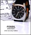
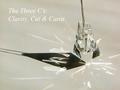
The Three C'sby PollyBeanComment: Love the reflection and shadow. Gem and text could use just a tad more oomph to really pop out! 7 |
| Photographer found comment helpful. |
| 04/29/2005 10:37:20 PM |
|
| Photographer found comment helpful. |
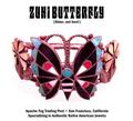
| 04/29/2005 10:35:48 PM |
Zuni Butterflyby GeneralEComment: Nice - especially without any shadow. Crisp, clear, good choice of font. Well done. |
| Photographer found comment helpful. |
Home -
Challenges -
Community -
League -
Photos -
Cameras -
Lenses -
Learn -
Help -
Terms of Use -
Privacy -
Top ^
DPChallenge, and website content and design, Copyright © 2001-2025 Challenging Technologies, LLC.
All digital photo copyrights belong to the photographers and may not be used without permission.
Current Server Time: 08/27/2025 06:01:43 AM EDT.