| Image |
Comment |
| 07/02/2005 04:38:49 PM |
Deadly Crossing - Speed Killsby BeagleboyComment: powerful image - the wreath is so still and the road has so much movement - makes the overall impression very tense - the red tones ass to the tension. |
 Photographer found comment helpful. Photographer found comment helpful. |
| 07/02/2005 04:36:55 PM |
|
| Photographer found comment helpful. |
| 07/02/2005 04:36:19 PM |
|
| Photographer found comment helpful. |
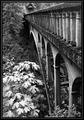
| 07/02/2005 04:17:25 PM |
Spanning Timeby LucidLotusComment: lovely masterful etc. A perfectly composed image - I like the bright foliage in front shich draws the viewers eyes forward while the strong lines of the bridge suck you back - a nice tension is set up. |
| Photographer found comment helpful. |
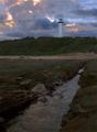
| 07/02/2005 04:15:18 PM |
Taunting the Ominousby peterishComment: oh beautiful - what do you do when the perfect photo appears in front of you and the light is wrong? I dont know the answer. This mid day sun is so hard to get right, the foam is much too bright. I am glad you took the picture anyways. the blues are great. |
| 06/29/2005 10:40:06 PM |
|
| 06/29/2005 08:31:10 PM |
|
| Photographer found comment helpful. |
| 06/29/2005 08:22:26 PM |
Leader of the packby neeneefortwoComment: The leading lines work - they point straight to the man - why is he so interesting? because he has a bandage on his knee? Bright sun is soo hard to work with. Getting the exposure right for the sun and the shade. your shade looks perfect but that leaves your subjects over exposed ("blown out"), maybe it sould have been better to expose for the sun and let the shaded areas be too dark, the background is less important to this scene. |
| Photographer found comment helpful. |
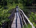
| 06/29/2005 07:44:45 PM |
Bridgeby MonaComment: wow - double leading lines - without the wonderful shadows this might be a boring shot but those somewhat undecided shadows seem to agrue with the unstraight railings to convince my eyes to travel accorss the brigde. nice. |
| Photographer found comment helpful. |
| 06/29/2005 07:42:47 PM |
Lighthouse Hillby StagoleeComment: foreground is murky - perhaps there are too many elements in the composition I like the murky mysterious forground, I like the swirly eater in your leading line. I like the lighthouse on the hill with the clouds but one does not lead to the other and the two halfs dont seem to go together. also is it tilted ever so sligtly to the left? |
| Photographer found comment helpful. |
Home -
Challenges -
Community -
League -
Photos -
Cameras -
Lenses -
Learn -
Help -
Terms of Use -
Privacy -
Top ^
DPChallenge, and website content and design, Copyright © 2001-2025 Challenging Technologies, LLC.
All digital photo copyrights belong to the photographers and may not be used without permission.
Current Server Time: 07/27/2025 03:45:00 AM EDT.