| Image |
Comment |
| 09/05/2002 01:16:00 PM |
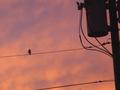
Bird On A Wireby PM76227Comment: I think this is one of those shots where the original scene was breathtaking but it doesn't translate well into a photo. If it had been just one bird, and one wire silouetted agains that pretty sky it would have evoked a mood. And if there are enough pixels left, you could edit it. The electrical stuff on the left is just too heavy. the telephone pole leans in. The other little bird is way too close to the top and maybe he shouldn't be there at all/. |
| 09/03/2002 12:11:00 AM |
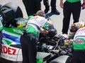
Car trouble at the GrandPrix.by jimsappComment: Nice use of that green. I like that it is carried in the guys belly and in his hand on the upper right. The green really ties it all together. Really nice composition. |
| 09/09/2002 10:41:00 AM |
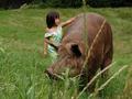
Chrissie and Mayanaby emorgan49Comment: Chrissie is my pig. And she is SOME PIG as EB White would say. Thanks for the votes but I feel like I fooled the system. This IS a great pig, a great big pig. But this is NOT a great photo. I like my pig. I think the way she looks at the camera, I like the off-the shoulder dress on the five year old. I like the contrast in size. I like the mood becasue I am giving the pig away and it was a sentimantal moment that came through. And clearly the subject is interesting to an audience! I do NOT like any of the photographic elements, color is washed out, focus is off. I do not much like to composition, and I HATE the grass in the front. I wish I'd had time for another shot, but YOU try to get a 400 lb pig to pose. I would have given me a 4. |
| 09/04/2002 12:34:00 PM |
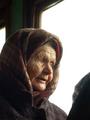
an old woman in the train by hudzComment: Perfect picture. This is my second favorite. Of course her face is wonderful, but I love to colors too. that green in the window frame does nice things for her eyes and the brown frames the green wall the way the plaid coat frames her green eyes, nice. I like the blob on the right too, It makes me think she's not all alone and without the abstact pressence of thta person she would be too vulnerable. I like that the window is white rather than sky colored or treed. The blank white makes a perfect baance to the dark walls and the dark coat. Lighting is perfect. 10 |
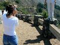
| 09/09/2002 11:02:00 AM |
Photo-Op, Big Surby GeneralEComment: The composition os off - I gave it a sx. The way it is set up, the center of interest is the black space in the middle. And I don't think that's what you intended. Even with the two thirds thing the girl and her guy are STILL too far at the edge to be in range. So what the eye sees first is the line of posts and the shadows the make...which are nice BTW. Both peope are a bit too chopped off, A lille more of each and a tiny bit more background on the sides would have moved them in so that the viewer would see tem first and not have to search a second for the center. Couldn't back up, you say, well, that's why it's a six. Perfect scene does not always make perfect picture. (PS 6 is like a B- on my scale). |
| 08/26/2002 12:11:00 PM |
Tatooineby jenaromComment: Aaagh - make at least one of them stand up straight. |
| 08/26/2002 11:51:00 AM |
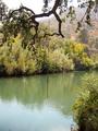
After The Rainby NeroComment: Would have been better without the truck. it's too light and distracting, Without it the colors are stunning. |
| 08/26/2002 12:40:00 PM |
|
| 08/26/2002 12:40:00 PM |
|
 Photographer found comment helpful. Photographer found comment helpful. |
| 08/26/2002 12:07:00 PM |
|
Home -
Challenges -
Community -
League -
Photos -
Cameras -
Lenses -
Learn -
Help -
Terms of Use -
Privacy -
Top ^
DPChallenge, and website content and design, Copyright © 2001-2025 Challenging Technologies, LLC.
All digital photo copyrights belong to the photographers and may not be used without permission.
Current Server Time: 07/17/2025 07:55:43 PM EDT.