| Image |
Comment |
| 07/25/2004 09:49:05 AM |
|
 Photographer found comment helpful. Photographer found comment helpful. |
| 07/25/2004 09:47:21 AM |
Balance in Natureby MarjoComment: whoa - not quite sharp enough to win maybe but sure desreves a top ten! Balanced composition, balanced colors, balanced theme on so many levels. really great image! |
| Photographer found comment helpful. |
| 07/25/2004 09:24:39 AM |
human balanceby brunasComment: ummmm yum - I wixh I had taken this one. it's not easy t get good lighting with that slotchy through-the-trees-sunshine. |
| Photographer found comment helpful. |
| 07/25/2004 09:23:15 AM |
1959by wickedpeteComment: Great! Almost perfect but there is a funny color clash beteen the car and the sky. Also maybe dropped to tight on his head? |
| 07/25/2004 09:18:34 AM |
|
| 07/25/2004 09:17:36 AM |
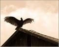
... on one leg ...by GordonComment: Ha- this is great! And the balance is implied - nice sublte touch, everyone should be able to envision a flamingo on one leg or a plastic one on one stick. nice composiiton, nice DOF. |
| Photographer found comment helpful. |
| 07/25/2004 09:14:50 AM |
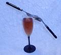
Balanced Imbalanceby adineComment: I like this one - However the center of balance seems shifted to the right, making it feen actually unbalanced. I wonder if that was deliberate or whether it might be more effective croppec closer on the left and wider on the right. you would lose some of the reflection but I'm not sure that is critical to the image, it serves as a leading line that leads out, off the frame. Usually we want leading lines to lead into the image so the viewer will look at it longer. |
| Photographer found comment helpful. |
| 07/24/2004 01:49:49 PM |
|
| Photographer found comment helpful. |
| 07/24/2004 01:48:07 PM |
|
| Photographer found comment helpful. |
| 07/24/2004 01:43:11 PM |
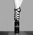
The Celtic Balanceby ColeyComment: why the square crop? wouldn;t a narrower crop emphasize the image better?
ok - i agree with you about the sides adding negative space - now what about cropping away the table, leaviing half the beer can and all negative space? maybe it is the bottom, floor or whatever, that is extra - also it has less contrast that the dancer and the can. is less dramatic. |
| Photographer found comment helpful. |
Home -
Challenges -
Community -
League -
Photos -
Cameras -
Lenses -
Learn -
Help -
Terms of Use -
Privacy -
Top ^
DPChallenge, and website content and design, Copyright © 2001-2025 Challenging Technologies, LLC.
All digital photo copyrights belong to the photographers and may not be used without permission.
Current Server Time: 07/30/2025 07:43:32 AM EDT.