|
|
|
Showing 881 - 890 of ~4457 |
| Image |
Comment |
| 07/24/2007 06:40:24 AM | A Country Dreamby jbirkmanComment: Greetings from the critique club :)
Well I didn´t vote in this challenge but if I had, this shot would have gotten a 4 from me. I am sorry but it just isn´t appealing to me, it´s not aesthetically pleasing and not interesting either. First off, the lighting. I want to go so far as to say you took this shot completely during the wrong time of day. I say this because of the shadows in the frame, the sun is somewhere to the left/behind the subject and obviously quite high in the sky wich results in these strong shadows from trees to your left wich I don´t find appealing at all. I don´t know wich heading you are facing when shooting this but try taking this photo either around dusk or dawn, whatever works best for this subject, that would lead to much softer shadows and a much more pleasant color tone to the whole scene.
Just compare this shot to this one Ursula took, the biggest difference between them (besides the backround of course) is the lighting/time of day it was taken at.

I am also not really fond of the composition, you cut off the right part of the barn and in the lower left corner there is then a straw, I would much rather have wanted to see you rotate to your right and included the whole barn and excluded that straw. I have often gone to the length of just plain picking up straws like that and reshooting the image if they intrude in my photograph like that :)
To be not so totally negative I do like the location and photograph seems pretty well exposed and the colors are nice (although I would much rather prefer dusk or dawn colors).
Kind regards from Iceland, Lárus. |  Photographer found comment helpful. Photographer found comment helpful. |
| 07/24/2007 06:23:27 AM | oh dear! NO.....not the lense..i can use that with my DSLRby romysreeComment: Greetings from the critique club :)
I didn´t vote in this challenge but would probably have given this a 5 or a 6 depending on how I thought it would stack up to the rest of the photo in the challenge. It seems to me to have placed a bit lower than I would have though and I can´t really figure out why. I mean it´s a nice shot tecnically, lighting is totally ok and focus, sharpness and clarity are also good. Perhaps it´s the high key feel to the image/white backround that lowered the votes since most people think of nightmare as something dark and scary and wanted that instead of an advertisement look? Who knows, that is not bothering me but I am just speculating why this didn´t score too well.
Also it kindof lacks wow facor, I mean there is no dynamic in the shot. Maybe if you had taken it so the hand with the hammer had some motion blur, like it was just about to smash the lens or even better, had you just gone all the way and actually smashed it to bits, you would definately had gotten a better score.
Kind regards from Iceland, Lárus. | | Photographer found comment helpful. |
| 07/23/2007 12:53:02 PM | Greatest Fearby boohejoComment: Greetings from the critique club :)
Well I see this is your first entry on DPC, welcome to the battlefield! I didn´t vote in this challenge and if I did, I probably would have voted this photograph a 4 wich to me means not really a bad photo but nothing really that grabs me about it and it doesn´t really fit the challenge all that well, hence the 4.
I got the impression before reading your own comment on the photo that it was pretty much a snapshot, you just took any photo of the week, slapped a title on it to tie it in with the challenge and voila. It wasn´t till I read your comment that I got that dreaming about a giant boat crashing down on you was your worst nightmare. You can pretty much see that the voters agreed, most didn´t get it and thought the nightmare was going on a cruise or sinking boats, not being run over by a boat.
What I am trying to say is that it kindof looks like you didn´t put any effort into this photo and DPC voters really like effort. Know what you should have done to get a better score? Should have thrown that guy into the water, having him swimming there closer to the boat and framed the photo so the pier he´s standing on wasn´t in the photo, preferrablly also not the pier to the left. That would have been so much cooler and gotten you a much better score.
I do like the sense of the boat looming over the guy in the photo and the composition is good, nice use of the frame.
Don´t let the low score scare you away and just go for the next challenge guns blazing and try to do something unexpeced but first and foremost, be sure to make it ironclad that people get what your photograp is about.
Kind regards from Iceland, Lárus. |
| 07/20/2007 10:54:56 AM | Seven Times In Seven Placesby EssAreDubyaComment: Greetings from the critique club :)
I didn´t vote in this challenge but truthfully this image would probably have gotten a 5 from me and I would have moved on without commenting. The main reason for that is I don´t really find the image bad but just not really all that interesting and in my opinion has a very weak link to the challenge topic.
When opening this shot I spent about 5 seconds figuring out how exactly it fit´s to this challenge before I concluded you must have meant the green digital numbers to the right. Did you notice that not one of the clocks has a 7 in them somewhere? One thing that would have seriously improved the interest of this shot is if you had taken this image when the minute dials said *.07 instead of *.18.
Anyway, I think most of the relatively low score can be attributed to that people probably had to stop and wonder how exactly it fit the challenge, I think on average the DPC voter spends 1-2 seconds and don´t bother with detailed observation of photos.
Also, for my taste and probably most other people it´s just way way too dark, looks like you needed to be there earlier, when shooting an outdoor looking into an indoor I usually try to do it around dusk and not after sunset cause then there are the best odds of the lighting being even on the inside and outside so you get good exposure for both.
I do like the coloring of the inside and their silhouettes, that part you definately nailed.
Again, the shot is not bad but just isn´t terribly interesting and has in my opinion a weak tie to the challenge, but not bad at all.
Kind regards from Iceland, Lárus. |
| 07/20/2007 07:20:51 AM | Rosesby jjusaComment: Greetings from the critique club :)
Well first off, congrats on the top 10 placement. I don´t have terribly much to critique about this photo, I like it pretty much the way it is, it definately meets the challenge and I am not surprised it did well in the challenge. Instead I might just say what I personally would have done diffrently had I taken and processed it.
As far as taking it, it´s top notch, I like the composition, DOF and lighting, good choice to only use ambient lighting.
However, had I processed the shot, I would probably have goen with slightly warmer WB, I would have burned in her shoulder to match the lightness tones of her cheek, because the shoulder is so bright it kindof steals attention from her face and flowers.
That´s pretty much it :) Kind regards from Iceland, Lárus. | | Photographer found comment helpful. |
| 07/19/2007 12:29:27 PM | Antique Store Glassby SheryllComment: Greetings from the critique club :)
Well this certainly fits the challenge. I did not vote in this challenge but if I had, I would probably have given this a 5 or a 6, not really sure wich and would have to compare it to the rest of the challenge to decide fully. That means I think this is a pretty good photo, not bad at all but just isn´t as interesting as the subject could be and seems a bit like a snapshot, a good snapshot but still a snapshot.
Before even reading what you had to say about the photo I got the feeling like you only took a couple of photos and just let that be enough instead of exploring what angle was best for this subject. I can´t put my finger on it but I just get the feeling this was not the best angle or perspective on these bottles. They do seem interesting to me so coudos for spotting them and taking a picture, not sure normal people would do that so great eye to spot them.
I like the colors and DOF, shot is just a tad too dark for my personal taste but nothing that is bothering me. I think the lighting is mostly what´s \"wrong\" with the shot, just compare this glass shot to the one in the 4th place and you should get what I mean. I know you didn´t control the lighting in this shot but that is pretty much the biggest difference between this shot and the one in the 4th place, the feeling of lighting and carefully set up glasses versus your shot.
Anyway, like I said, this shot is allright despite my nitpicking :)
Kind regards from Iceland, Lárus. | | Photographer found comment helpful. |
| 07/19/2007 10:40:29 AM | A Midsummer Dreamby LalliSigComment: Originally posted by navyasw02:
holy crap, that's a sharp photo. was it close to that sharpness without the unsharp mask? |
Hehe, funny you should say this as it´s probably the least sharpened photo I have sent in all year, but yeah, I mean a 85mm prime and a Canon 5D does yield some pretty sharp photos to begin with... :) |
| 07/19/2007 10:36:12 AM | Seven Spiritsby darnokComment: Greetings from the critique club :)
Well again I get a shot from the top 5 of this challenge and again I don´t really know what to say, there is pretty much nothing I can critique on this shot. It´s well lit, crystal clear regarding contrast and sharpness, the strong color is very good and well it´s a prett good shot.
Only thing I can say is I have seen "it" (or very similar shots) before and I have a strong feeling I will see 10 or more like it in the Still Life challenge that is open for submission now. Needs something extra to really impress me, like a goldfish in each of the glasses or whatever. Again, very well done on the lighting, I know how hard it can be to light glass.
Kind regards from Iceland, Lárus. | | Photographer found comment helpful. |
| 07/19/2007 07:38:12 AM | Seven Archesby BHusemanComment: Greetings from the critique club :)
Well I don´t really know what to say about this image. First off congratulations on the 5th place, this could very well have ribboned in my opinion. I really like the colors, contrast, sharpness and details in this shot and composition is also very good. Only thing that could have made this shot better would have been an absolutely still water reflection and maybe a cloud or two in the vacant sky but that´s hardly for you to control. Can´t really come up with anything I would want to improve with this shot so I´ll just leave it at that.
Congrats again! Kind regards from Iceland, Lárus. | | Photographer found comment helpful. |
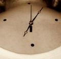
| 07/19/2007 07:25:23 AM | My Body Clock by manishComment: Greetings from the critique club :)
Now this I like, I don´t love it but if I had voted in the challenge you would probably have gotten a 7 from me. It´s very different and takes a little time to get, wich I personally think is a good thing. However, that is probably what cost you dearly in regards to the score, I think on average the DPC voter spends about 1-2 seconds in viewing each image before voting and I guess most people did not get it.
I am not totally surprised cause I suspect pretty much nobody got that you used 7 pieces to create the clock, I know I didn´t till I read your description of the photo. I think that you should have kept the minute dial on exactly the 12 o´clock position so the hour dial would have shown the time as exactly 7, having it 5 minutes past (or was it supposed to be 7 minutes past?) is just confusing me and I suspect a lot of other people.
Anyway, think the score can mostly be written off on people who use any and every opportunity to find fault in meeting the challenge and voted accordingly. Maybe I am too pessimistic but people like that seem to grow more common here at DPC. At least take comfort in that 17 of the voters really liked your shot and I am not surprised, had I voted they would have been 18.
To get a better score from me though you would have needed to skip that t-shirt or whatever the model was wearing. Also maybe stand up more straight to get a better perspective on the neck, preferrably showing the spine a little bit, at least the angle the photo is shot from makes the model seem a bit hunched over if you get my drift. I like that you made the shot duotone, I don´t think it would have appealed nearly as much to me had it been in color.
Nice work, keep it up!
Kind regards from Iceland, Lárus. | | Photographer found comment helpful. |
|
Showing 881 - 890 of ~4457 |
Home -
Challenges -
Community -
League -
Photos -
Cameras -
Lenses -
Learn -
Help -
Terms of Use -
Privacy -
Top ^
DPChallenge, and website content and design, Copyright © 2001-2025 Challenging Technologies, LLC.
All digital photo copyrights belong to the photographers and may not be used without permission.
Current Server Time: 08/14/2025 08:59:00 AM EDT.
|