| Image |
Comment |
| 01/11/2007 02:39:55 PM |
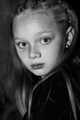
délicatement by TOYComment: Very, very very nice photo. Good tonal range, nice rich blacks (I had a photo teacher drill rich blacks into my head). While some may think the strand of hair is a bit distracting I think it really adds to the "feel" of the photo. Top 10 for sure. |
 Photographer found comment helpful. Photographer found comment helpful. |
| 01/11/2007 02:37:48 PM |
i don't nameby Shiva DasComment: Lighting seem a bit harsh. Nice capture. Wonder if you'll get any responses of "I don't comment". |
| 01/11/2007 02:36:42 PM |
Lilyby LalliSigComment: Good shot, nice expression. Should be a top 10 at least. |
| Photographer found comment helpful. |
| 01/11/2007 02:35:26 PM |
Sweet Dreamsby CascadesComment: Very nice, maybe a little flat contrast wise- might be might work monitor I maybe shouldn't use it for voting on B&W.
Lovely capture and not too much drool :) |
| Photographer found comment helpful. |
| 01/11/2007 02:31:35 PM |
|
| Photographer found comment helpful. |
| 01/11/2007 02:28:59 PM |
The Look of Love...by M&MComment: I like the graniness, don't care much for the blown out highlights. I call them blown out, because it doesn't strike me as a high key shot. |
| Photographer found comment helpful. |
| 01/11/2007 02:27:54 PM |
At the end of the dayby TrollComment: I would've cropped this tighter, off the bottom at least. I find the necklace a little distracting with the light reflecting off it. |
| Photographer found comment helpful. |
| 01/05/2007 07:27:39 PM |
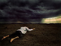
Limits by JudiComment: Originally posted by Judi:
....and has heaps of room for improvment... |
I wouldn't go as far as saying heaps of improvement. Like I said fabulously done and thank you for the response.
And couldn't he have just slept on the grass while you waited for the light? Damn, selfish models. :)
|
| Photographer found comment helpful. |
| 01/05/2007 06:16:48 PM |
Limitsby JudiComment: Fabulous shot, well thought out and exectued. One question:
What do you think led to the "floating" look of the man? When I first saw it I really thought it was a bit of a lighting issue- ie standing out a bit much compared to the rest of the scene or maybe lack of shadows. But after looking at it more I think it might be a sense of scale. He seems almost a little too big for the overall shot.
|
| Photographer found comment helpful. |
| 12/26/2006 03:36:12 PM |
|
| Photographer found comment helpful. |
Home -
Challenges -
Community -
League -
Photos -
Cameras -
Lenses -
Learn -
Help -
Terms of Use -
Privacy -
Top ^
DPChallenge, and website content and design, Copyright © 2001-2025 Challenging Technologies, LLC.
All digital photo copyrights belong to the photographers and may not be used without permission.
Current Server Time: 08/04/2025 06:18:17 PM EDT.