| Image |
Comment |
| 11/24/2004 01:17:48 AM |
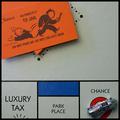
doh!by hopperComment: Had to add the car, just to it was 3-d, huh? Cute, the border meshes well with the borders of the spaces. You seem to have captured the texture on the board well, but the car is a little off. |
 Photographer found comment helpful. Photographer found comment helpful. |
| 11/24/2004 01:16:50 AM |
License to Killby GeneralEComment: The title completely ruins this for me. Probably a "5" on its own, a little soft, not a balance composition. |
| Photographer found comment helpful. |
| 11/24/2004 01:16:01 AM |
|
| Photographer found comment helpful. |
| 11/24/2004 01:14:35 AM |
|
| 11/24/2004 01:14:15 AM |
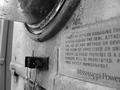
The Man Upstairsby ShadowrainComment: I entirely miss any connection this has to the challenge. The crop, keeping thewhite bricks on the left in, draws important away from the silhouette. |
| Photographer found comment helpful. |
| 11/24/2004 01:13:03 AM |
Between Quartersby moswynComment: Good exposure on the ref, keeping his shirt black and white. The background is blurres well. Nice job. |
| Photographer found comment helpful. |
| 11/24/2004 01:12:20 AM |
|
| 11/24/2004 01:10:42 AM |
Authorityby GolferDDSComment: How did you get the soles of his shoes? Very authoritative stance, but maybe too extreme. |
| Photographer found comment helpful. |
| 11/24/2004 01:09:51 AM |
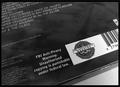
Who's Afraid?by EyesOnlyComment: If the track list were just a bit soft in comparison to the warning label, they would completely relinquish all attention. As it is, they draw it somewhat. |
| 11/24/2004 01:08:06 AM |
That's Enough!by GPComment: Um.... What is the blue light? Good use of negative space, but more depth-of-field on the statue, keeping it sharp, would help. |
| Photographer found comment helpful. |
Home -
Challenges -
Community -
League -
Photos -
Cameras -
Lenses -
Learn -
Help -
Terms of Use -
Privacy -
Top ^
DPChallenge, and website content and design, Copyright © 2001-2025 Challenging Technologies, LLC.
All digital photo copyrights belong to the photographers and may not be used without permission.
Current Server Time: 08/21/2025 01:56:25 PM EDT.