| Image |
Comment |
| 07/22/2002 12:38:00 AM |
Garden Angelby jmsetzlerComment: excellent shot. the strong white horizontal in the upper left is distracting, buts thats the only thing i would change. ~ mcmurma Aesthetics...8 Meets Challenge...8 Overall....8 |
| 07/24/2002 12:41:00 PM |
Yard Sale Item # 13by leviadidasComment: i have one of these, and know their texture very well. Unfortunately it does not come through in your photo. the focus is too soft, perhaps using a tripod or making sure your cameras macro mode (if it has one) is engaged. also the image itself is a bit plain, getting much closer (just the table or a portion of it) would show off the texture in the wood better and make for a much stronger image overall, i think. ~mcmurma Aesthetics...3 Meets Challenge...4 Overall...4 |
| 07/25/2002 01:27:00 AM |
Aperture within the pierby RoninComment: this looks great in black and white--try it! it is a nice shot. The white diagonal beneath the knothole is distracting to me, but the image is well done. ~mcmurma Aesthetics...8 Meets Challenge....9 Overall...8 |
| 07/24/2002 11:42:00 AM |
Weatheredby MrsKroComment: interesting image. it looks more painted than weathered, though. still it is nice. a slightly wider crop showing the entire bucket (or whatever it is) would be nice. also, would like to see the small leaves that appear to be stuck in a web removed. ~mcmurma Aesthetics...8 Meets Challenge...8 Overall...8 |
| 07/25/2002 01:05:00 AM |
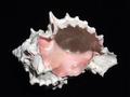
Pink Murexby autoolComment: very nice, i love that floating through space feeling... ~mcmurma Aesthetics...8 Meets Challenge...8 Overall...8 |
| 07/26/2002 11:57:00 AM |
Treeby malapropamComment: the lighting on the "tree" is way too harsh, it creates highlights that are overexposed and shadows that are as dark as night. this is too bad, because i think this tree would be very interesting if i could see more of it. there is a good deal of texture present but it gets lost in the lighting. perhaps shooting on a bright, but cloudy day would have allowed the exposure to remain more even and show more detail. ~mcmurma Aesthetics...4 Meets Challenge...6 Overall...5 |
| 07/22/2002 02:04:00 AM |
Prickly Sunsetby Gene L.Comment: very somber. nice. ~mcmurma Aesthetics...8 Meets Challenge...8 Overall....8 |
| 07/24/2002 01:05:00 PM |
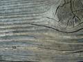
Old Barn Woodby kposeyComment: focus is too soft for me. a tripod, or making sure your cameras macro function is on, or a faster shutter speed and samller aperture (you dont need much depth of field here) would all improve the sharpness. however, i do like the composition and would have liked to see a bit more of the knot. ~mcmurma Aesthetics...4 Meets Challenge...5 Overall...4 |
| 07/25/2002 11:53:00 AM |
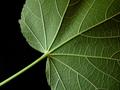
Leafby shortredneckComment: this is a nice work in color, but b&w would work even better for this image, i think. ~mcmurma Aesthetics...6 Meets Challenge...8 Overall...7 |
| 07/22/2002 02:01:00 AM |
Electric Algaeby manda4343Comment: nice color, excellent texture. ~mcmurma Aesthetics...8 Meets Challenge...9 Overall....8 |
Home -
Challenges -
Community -
League -
Photos -
Cameras -
Lenses -
Learn -
Help -
Terms of Use -
Privacy -
Top ^
DPChallenge, and website content and design, Copyright © 2001-2025 Challenging Technologies, LLC.
All digital photo copyrights belong to the photographers and may not be used without permission.
Current Server Time: 07/31/2025 08:37:40 AM EDT.