| Author | Thread |
|
|
07/29/2002 12:27:00 AM |
|
Karen: I really liked this. #43? Hmm. Well, it's a keeper. (I had given it a 9!) |
|
Comments Made During the Challenge  |
|
|
07/28/2002 04:17:00 PM |
|
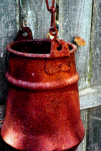
rustic :) I like this.. the color and contrast is extremely nice, as is the composition.. the framing on this shot is just about perfect :) good work :) = 8 - jmsetzler |
|
|
|
07/26/2002 06:55:00 PM |
|
An interesting photo,.. althought I can tell if thats the actual texture of the can or if it has just been over sharpened.. I really do like the colors and the contrast from the fence. |
|
|
|
07/26/2002 10:21:00 AM |
|
This photograph has nice color but the levels have been stretched to the point that the rust no longer looks lifelike. The natural beauty of the rust would have made a nice texture in and of itself. In spite of this, the composition and artistry is excellent. *5* -balynch |
|
|
|
07/25/2002 08:05:00 PM |
|
Love the textures, the colors, the subject. Wishing the bottom of the bucket wasn't cut off....though I can't decide if that detracts from the photo. |
|
|
|
07/25/2002 01:03:00 PM |
|
very beautiful, like a still life painting..my only quip from giving this a 10 is the slight clip on the bottom of the bucket..but still one of my favoriote shots and the compostion is excellent.. 9...hokie |
|
|
|
07/25/2002 01:55:00 AM |
|
I know you're trying to emphasize the texture and detail of the pot, but I think the photo loses too much with the abrupt cropping at the bottom and on the left. The rusted red with the dull wood around it on all sides would have made more of a statement, and I still think it would have built your sense of texture. |
|
|
|
07/24/2002 08:14:00 PM |
|
very good detail...the seasons are easy to see... |
|
|
|
07/24/2002 07:57:00 PM |
|
Pleasant image. Am wondering though to what extent I see texture and to what extent I see noise. Those white specks? Also wondering whether the crop of the container top and bottom is the best. |
|
|
|
07/24/2002 01:53:00 PM |
|
Rusted metal and old wood are two textures who merge perfecly, imho. I really like your picture, congratulations. |
|
|
|
07/24/2002 01:29:00 PM |
|
seems to be unfocused... otherwise, great. |
|
|
|
07/24/2002 11:42:00 AM |
interesting image. it looks more painted than weathered, though. still it is nice. a slightly wider crop showing the entire bucket (or whatever it is) would be nice. also, would like to see the small leaves that appear to be stuck in a web removed. ~mcmurma
Aesthetics...8
Meets Challenge...8
Overall...8 |
|
|
|
07/24/2002 12:10:00 AM |
|
Wow! That's a lot of texture! |
|
|
|
07/24/2002 12:03:00 AM |
|
In Focus - 4, Lighting - 4, Color Levels - 4, DOF - 5 , Interesting Composition - 5, Interesting Subject - 3 >>> Tech Scores = 4, Subject Scores = 4, Final Score = 4, RLS Sharpening Levels appear too high ... |
|
|
|
07/23/2002 04:34:00 PM |
Composition8,
Technical Aspects5,
Meets Challenge4,
Originality8,
Average Score6,
If that is a rusty pail, I think it is overworked in your editing program.
Autool.
|
|
|
|
07/23/2002 01:44:00 AM |
|
I really like this shot. Nice contrast. |
|
|
|
07/22/2002 10:33:00 PM |
|
Nice photo, I like the composition very much. |
|
|
|
07/22/2002 09:08:00 PM |
|
Good composition. I think the framing would have been to crop it a little higher and more on the left filling the frame even more. Very edgy. I think I like it. karmat |
|
|
|
07/22/2002 03:26:00 PM |
|
This is very nice, composition, color, texture, and interesting. The negitive is that it's over exposed. Kee |
|
|
|
07/22/2002 03:08:00 PM |
|
The color and texture dominant the photo and the challenge - 10 |
|
|
|
07/22/2002 02:19:00 PM |
|
good colors but a little too heavy in red |
|
|
|
07/22/2002 02:16:00 PM |
I almost love it. The composition and idea are great - maybe over contrast - Not sure - something is just not right. - Still good photo.
Ruthann |
|
|
|
07/22/2002 02:15:00 PM |
|
I love the bright rust against the dull background. Great combination of textures. 9-ClubJuggle. |
|
|
|
07/22/2002 12:38:00 PM |
|
This is the picture I wanted to take for this week! The only comment I have is that slightly pulling back a bit may have been my preference. 8 |
|
|
|
07/22/2002 12:34:00 PM |
|
nice photo with nice textures but the contrast seems to bright to me. |
|
|
|
07/22/2002 12:16:00 PM |
|
too much photo manipulation with color; would make good impressionistic study |
|
Home -
Challenges -
Community -
League -
Photos -
Cameras -
Lenses -
Learn -
Help -
Terms of Use -
Privacy -
Top ^
DPChallenge, and website content and design, Copyright © 2001-2026 Challenging Technologies, LLC.
All digital photo copyrights belong to the photographers and may not be used without permission.
Current Server Time: 06/27/2026 08:32:16 PM EDT.