| Image |
Comment |
| 08/12/2002 03:57:00 AM |
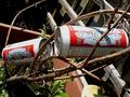
Desperate Submissionby antonabayaComment: What can I say? The New hit me right in the face. I bet you will get tons of comments on this. The humor is outstanding and something depicted to which we all can relate very well. The more I look at this the more entertained I am. Well, well done! Update: have been thinking and chuckling about this picture quite a bit. I actually like the mess that is being depicted here without an attempt having been made to close the coors and remove some of the stuff. It looks all very casual but I think this was well planned nonetheless :) I give you an 8 because an image that can entertain me that much, deserves at least that much. Journey |
| 08/13/2002 10:40:00 PM |
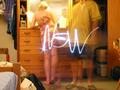
The Force Be With Youby karmatComment: Find this a powerful and compelling image. It conveys strongly the feelings of awe and being overwhelmed this child must feel when entering school for the first day. I bet you will get some comments on why you did not crop out the right wall but I think it adds dimension to the overwhelming environment the child finds it in. You may also get comments on the doors being too dark and not having enough detail. Again, I suppose you did so deliberately to add to the child's feelings of darkness and awe. Well done. -9 Journey |
 Photographer found comment helpful. Photographer found comment helpful. |
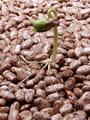
| 08/12/2002 03:16:00 AM |
Morning Harvestby puppet10Comment: I like this a lot. It has a wonderful atmosphere and I LOVE that light outside of the window. It really conveys the early morning. Nice composition. Only negative for me is that at the front of the image there is the dark shadow of the basket and the light on the harvest isn't ideal either because you were focusing the light on the outdoors. |
| 08/17/2002 12:01:00 AM |
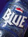
New Blueby goodtimecharleeComment: This is a very nice image. It is more successful however as an artistic image than as a product image. Good composition. What I like most of all about it is the abstract shapes of the droplets in the bottom part. Like that you turned this image, except for the white lettering and the red in the logom, into a blue world. I see two flaws with it (just my photographic illiterate taste, mind you :): The pinkish/sepia shape being the right edge of the can/bottle and then it veers off on the black background. That black corner doesn't bother me but the pinkish edge shape mars for me the effect of the BLUE WORLD. It doesn't seem to "belong" there and therefore my eye is attracted to it in order to make sense out of it My mind does know it's the edge of the bottle but my eye is strictly visual and can't harmonize it with the rest of the image. The pinkish/sepia shapes of the droplets on the bottle itself though are very pleasing because they are more subdued than that defining edge. I would find this image less successful as a product image, because the water effect hides some product information (naturally and artificially flavored) and more importantly the BLUE should have been white across all the letters rather than turning sepia-ish at the u and the e. It's probably due to the macro and the cylindrical shape of the product but I find it somewhat unfortunate and doubt Pepsi would "buy" it. This is a long comment and pardon my nitpicking. 8 Journey |
| 08/16/2002 01:19:00 AM |
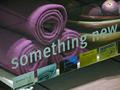
Blanketsby GinaRothfelsComment: Viewing this with my DPchallenge mind, my immediate reaction was why did you position the bowl with fruit next to the blanket. Then I realized it was a store display :). Lucky you, with that something new design on it. You are homefree! I like the composition with the diagonal, image a bit too dark at the top; something new acrylic display getsa little blurry at the top right. Good image |
| 08/16/2002 01:26:00 AM |
|
| 08/13/2002 10:53:00 PM |
Hangin' Out With The Guy Who Puts Fresh Paint On The Golden Gate Bridgeby sjgleahComment: I like this picture. Wished you would have changed the angle in order to loose the tourists in the background but without losing the view of Tiberon. The painter himself is smiling in a contrived way which is somewhat unfortunate.He knew too well a picture was being taken of him.Also find the title too long for my taste. 7 Journey |
| 08/12/2002 03:46:00 AM |
|
| 08/12/2002 03:03:00 AM |
Taking The Lead by autoolComment: That's a cool idea, a great title, and a pleasant image. Like the DOF but would have cropped out some of the top, a little boring as is but I know, I know required submission dimensions! |
| Photographer found comment helpful. |
| 08/12/2002 03:24:00 AM |
|
Home -
Challenges -
Community -
League -
Photos -
Cameras -
Lenses -
Learn -
Help -
Terms of Use -
Privacy -
Top ^
DPChallenge, and website content and design, Copyright © 2001-2025 Challenging Technologies, LLC.
All digital photo copyrights belong to the photographers and may not be used without permission.
Current Server Time: 08/24/2025 03:19:06 AM EDT.