| Author | Thread |
Comments Made During the Challenge  |
|
|
08/18/2002 07:11:00 PM |
|
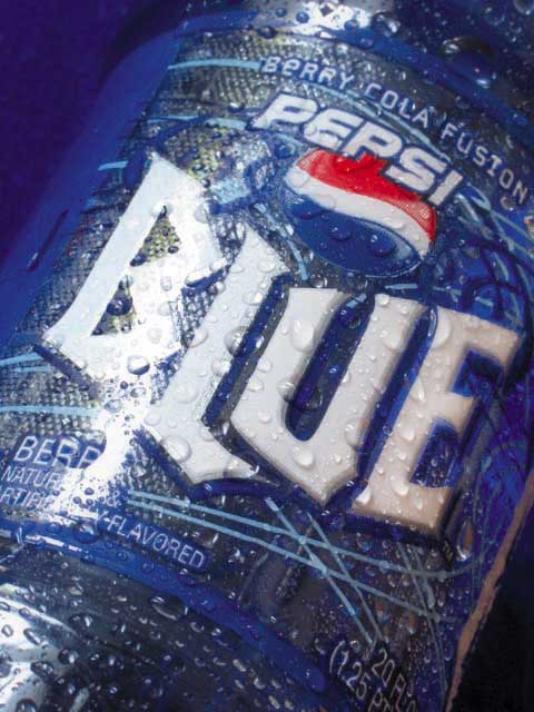
Lighting makes the left side of the label hard to read, which detracts from the overal impact. |
|
|
|
08/17/2002 07:46:00 AM |
|
I hope this comes out in the uk! Excellent photo as well. Crisp and sharp. This could be used by advertisers. |
|
|
|
08/17/2002 12:01:00 AM |
This is a very nice image. It is more successful however as an artistic image than as a product image. Good composition. What I like most of all about it is the abstract shapes of the droplets in the bottom part. Like that you turned this image, except for the white lettering and the red in the logom, into a blue world. I see two flaws with it (just my photographic illiterate taste, mind you :): The pinkish/sepia shape being the right edge of the can/bottle and then it veers off on the black background. That black corner doesn't bother me but the pinkish edge shape mars for me the effect of the BLUE WORLD. It doesn't seem to "belong" there and therefore my eye is attracted to it in order to make sense out of it My mind does know it's the edge of the bottle but my eye is strictly visual and can't harmonize it with the rest of the image. The pinkish/sepia shapes of the droplets on the bottle itself though are very pleasing because they are more subdued than that defining edge.
I would find this image less successful as a product image, because the water effect hides some product information (naturally and artificially flavored) and more importantly the BLUE should have been white across all the letters rather than turning sepia-ish at the u and the e. It's probably due to the macro and the cylindrical shape of the product but I find it somewhat unfortunate and doubt Pepsi would "buy" it.
This is a long comment and pardon my nitpicking. 8 Journey |
|
|
|
08/16/2002 11:30:00 PM |
|
Looks cool, blue and refreshing. It must be new because I haven't even seen this on the market in my area of the USA. Wish the lighting hadn't created that glare along the edge though. =7 syamjonimi |
|
|
|
08/15/2002 08:09:00 PM |
|
I don't like to see the name of the challenge (new) used in the title... too cliche or something. There are lots of other, more creative ways to express it. I've never seen this flavor of pepsi before, so it must be NEW! Looks like it could be an advertizement! Maybe a little too much "shine" on the bottle, but overall good, and I like the water droplets... you can almost feel the icy cold. |
|
|
|
08/15/2002 04:18:00 PM |
|
Wow haven't seen that yet! Nice photo, clean, clear, good color. Light is a bit harsh, but will score this a 7. Kee |
|
|
|
08/15/2002 12:47:00 AM |
|
This picture was the first I'd heard of the stuff. Then I saw it at a store, so I tasted it. It tastes like blackberry pie with fizz to me. Sooo good. Absolutely nothing to find fault with in this picture. And your title rhymes |
|
|
|
08/14/2002 10:38:00 AM |
|
Just doesn't do it for me sorry. Can't put my finger on the problem, I think that it might the light reflecting on the top. |
|
|
|
08/14/2002 06:44:00 AM |
|
Definitely new, (my kids hate this stuff) :) Like the addition of the water droplets. |
|
|
|
08/13/2002 10:26:00 PM |
|
It's not even all that good, but I guess it is new...I think it's gonna end up at the same place that Crystal Clear Pepsi went...But it's a nice picture... |
|
|
|
08/13/2002 10:23:00 PM |
Something new.
Composition - pretty good
Technical Aspects - pretty good.
Meets Challenge - yes, as long as I am aware of the market.
Visual Impact / Originality – pretty good
Jim msp
|
|
|
|
08/13/2002 08:28:00 AM |
|
|
|
08/13/2002 07:55:00 AM |
|
I think if the glare hadn't been on the B you would have done better. |
|
|
|
08/12/2002 11:36:00 PM |
|
This stuff was DISCUSTING!!! LOL. Thanks goodness this is a visual challenge, not a taste test. The light is a little bright. I have seen where people put a thin cheese cloth, or tissue paper between the light source and the subject and it makes it a lot less direct and bright. just got to be careful if you try it, to try not to put it where it makes silly shadows. Also, (and I could be wrong) you can't make out any actual image, but it appears to be some skin reflection in the bottom right corner. I've never thought about this before, so YOU actually helped ME on this one, maybe try to dress in a similar color to what you are photographing to avoid different colored reflections. Sorry it seems like I'm tearing you apart, but I really like the photo and i'm giving it an above average rating. Great job and good luck in the challenge! |
|
|
|
08/12/2002 10:37:00 PM |
|
I haven't seen this available in stores in my town yet, but I can't wait to try it. Heard it's like koolaid with fizzies. |
|
|
|
08/12/2002 10:17:00 PM |
|
Cool new blue, yummy, nice pic. 9 |
|
|
|
08/12/2002 10:12:00 PM |
|
trying to jump ahead a couple of challenges ? Needs the blue tongue in the shot.... |
|
|
|
08/12/2002 09:29:00 PM |
Composition5
Technical Aspects5
Appeal4
Creativity4
Rating5Autool
|
|
|
|
08/12/2002 08:36:00 PM |
|
looks very refreshing..like the way you captured the drops. |
|
|
|
08/12/2002 03:15:00 PM |
|
Really great shot, I can almost taste it... |
|
Home -
Challenges -
Community -
League -
Photos -
Cameras -
Lenses -
Learn -
Help -
Terms of Use -
Privacy -
Top ^
DPChallenge, and website content and design, Copyright © 2001-2026 Challenging Technologies, LLC.
All digital photo copyrights belong to the photographers and may not be used without permission.
Current Server Time: 06/28/2026 11:27:34 AM EDT.