| Image |
Comment |
| 08/20/2002 01:07:00 AM |
Self Portraitby spidermanComment: Did you actually make that drawing of the pencil. Because if you did, you sure know how to draw! Beautiful. This is a good image. Good composition. Good lighting. This is also the 182nd image I have been voting on since last night and I have seen so many images of hands drawing that my mind is a little confused about it now. So, I feel I'm not doing you justice by finalizing this now. Will give it a 6 for now but will definitely revisit lateron this week and study it with a fresh eye. Sorry. Journey Update: Mmm, yes, I like this image. It is a clean, sharp image, very nice divisions of the negative space. I have one nitpick though: there are some stray pixels around the top part of the hand and there are some white spots on top of the hand (not referring to the skin pigments). I am wondering whether that's the result of oversharpening a little?? 8 Journey Final score: 9 -- J |
| 08/20/2002 10:56:00 PM |
One #2 pencil 17,643 chickensby boyte1Comment: Haven't I seen this chicken image before, in a previous dp challenge???? The title is cute but I find the pencil here very contrived and was just put there to meet the challenge. Very nice dof. 4 Journey Update: Thanks for your PM. I wasn't implying that the exact same image had been posted here before. However I did some further checking and I was wrong on that. Apologies for that. I guess we do have different definitions about creativity. |
| 08/19/2002 01:07:00 AM |
Reflectionby BukiosComment: The point of the pencil which happens to be in the foreground is way out of focus and that happens to be the first thing you see when looking at this picture. The reflections through the spoon aren't particularly attractive either, background too cluttered and the photographer and the camera too prominent. Nice idea but you should have explored this more. |
| 08/19/2002 11:42:00 PM |
Light and Shadowby joshuazhangComment: The shadow play on this image is fantastic. However, it also results in that big white washed out area in the foreground. Would have also liked to see just a tad more sharpness at the tip of the pencil but I think the softness is also caused of the excessive light. Nice try though and will revisit this lateron this week. 6 Journey |
| 08/20/2002 12:55:00 AM |
Writing Instrument (6 letters)by sulamkComment: I've seen several other images with the same crossword puzzle theme and this is not my favorite one. The overall effect is a little snapshotish, sorry for saying that. I'm sure you tried hard. The composition could have been improved (the left arm andhand) and a bit more attention to details paid: the table cloth should have been straightened or totally removed since there is already so many elements in the picture. Never give up! 4 Journey |
 Photographer found comment helpful. Photographer found comment helpful. |
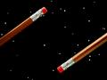
| 08/19/2002 02:31:00 PM |
Blacksheepby whobeeComment: I like this image and wonder how you did it. The increasing blur on the other pencils works very well. It creates a nice mystique. 7 for now definitely will revisit lateron this week. Journey. Update: This image is one that keeps pulling my attention again and again. As a humdrum aside, I get the feeling that the photographer is someone who likes to work with pencils since they are sharpened with a knife :) Anyway, congrat and a 10 Journey |
| 08/26/2002 01:19:00 AM |
Small Timberby hokieComment: This week I was very generous with my 10's - I gave five of them, I believe. Your image though was by far my favorite. In fact, it blew me away. Well done, Monet, eh I mean, Hokie. |
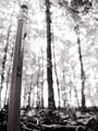
| 08/22/2002 01:17:00 AM |
Small Timberby hokieComment: I love this image and have looked at it now a number of times. It's very artistic and has great appeal to me. It reminds me of impressionist paintings. The metaphor here is sublime. Love the fact that it is in B&W. It adds to the mood. This is a tough and ambitious image and you pulled it off. The only drawback as a result is the halo around the pencil. You might consider retouching that out which, of course, you weren't allowed to do for the dpchallenge. Well done. 9 Journey Update: I'm revising my score to 10. The artisticity of this image far outweighs the flaw of the halo. Great composition too. It's a hell of a job to have taken this shot. I have a bit of a hunch who did this image but have been wrong on my hunches before :) Regards, Journey |
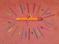
| 08/20/2002 12:00:00 AM |
Puuurdy Pencilsby evmariedogsComment: I fail to see what the elaborate line up of the pencils and chalk must convey but I just may not be familiar with it. The middle pencil must be huge if the other pencils are indeed norrmal size. Don't find the color of the background helpful; black would have been much better and stronger. 5 Journey |
| 08/25/2002 07:20:00 PM |
Negative Space Odysseyby FrooberComment: The title is more fun than the picture. The 3 negative spaces in the picture are pretty simple too. And so is the background. Good sharp pencils. 4 Journey |
Home -
Challenges -
Community -
League -
Photos -
Cameras -
Lenses -
Learn -
Help -
Terms of Use -
Privacy -
Top ^
DPChallenge, and website content and design, Copyright © 2001-2025 Challenging Technologies, LLC.
All digital photo copyrights belong to the photographers and may not be used without permission.
Current Server Time: 08/23/2025 08:05:18 PM EDT.