| Image |
Comment |
| 08/19/2002 11:54:00 PM |
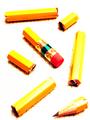
One Pencil, Slicedby AmphianComment: I love the "How" presented here much more than the actual end result. The process what you did though is great. And so are the clarity and sharpness. 6 Journey. |
| 08/19/2002 01:53:00 AM |
Rays of leadby CoreyComment: Good idea, original, and well executed. And you meet the challenge, too! lol. Journey |
| 08/19/2002 02:00:00 PM |
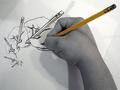
Hand Drawn Handsby sohrComment: Nice image. It doesn't grab me though. I know why that is: I am well familiar with the dynamite drawing by Escher of the hands drawing hands. So, whether I want to or not, my mind immediately makes the comparison with that Escher drawing andyour image suffers in the comparison. Good execution and composition. Image seems very grainy, particularly in the hand and arm. 6 Journey |
| 08/19/2002 02:21:00 PM |
Pen Envyby KarenBComment: Subtle humor here and I like what you did with the pen. The only thing that bothers me a little is the vast expanse of white negative space in the top left area. 6 Journey |
 Photographer found comment helpful. Photographer found comment helpful. |
| 08/20/2002 12:07:00 AM |
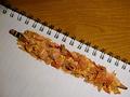
Form Precludes Functionby sjgleahComment: Great composition and clarity. I suppose the title explains why the pencil is covered by all those shavings but I don't find it resulting in a pleasing effect. Seems contrived and it takes away from the overall visual impact of the image. 6 Journey |
| 08/25/2002 07:07:00 PM |
Find the Pencilby #1 Bronco FanComment: The pencil wasn't hard at all to find but so what? I don't know what these props do on the carpet. This doesn't grab me. Journey |
| 08/19/2002 11:51:00 PM |
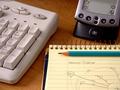
I still need my pencil.by jenaromComment: I admire the clarityof this image. The pencil is placed in a very realistic context (I say this because I just saw a number of images that left me wondering So what?). I find the overall composition a little weak: fine on the note pad and pencil but then the Palm and keyboard got tucked in there as well just because you wanted them for logical purposes that makes it hard for my eye to wonder around here (although I see some nice negative space triangles). 6 Journey |
| 08/19/2002 01:52:00 PM |
17 across.... BEACHby karen_vComment: Nice image; original and sets a nice mood. The title suits well, too. I like the fact that the foreground is sharp and focuses my attention on the subject and with detail of beach objects. Then in the background is the blurred beach scene. 6 Journey |
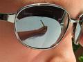
| 08/19/2002 01:01:00 AM |
Reflectionby shedonistComment: The idea is great but the execution leaves to be desired. Since this is a shot where all the details are paramount you should have controlled that environment more: get rid of the clutter, such as those chairs. The way you cropped at the right, i.e. left eye, does not look pretty. Nor does the body in the glass, is that yours or someone else's. I realize this is a very tough shot but you should have worked more on it to overcome some of those flaws. Perhaps cropping out at the bridge to eliminate the awkward other eye and whatever else can be see there would have helped a lot. Do keep trying things like this though. 5 Journey |
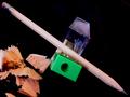
| 08/25/2002 07:15:00 PM |
#2 Still Lifeby shortredneckComment: This picture is very sharp, except for the pencil shavings. Don't care all that much for the composition. The pencil is the exact diagonal of the picture frame and effectively divides the picture in half. Colors are a little weak as well, e.g. the green of the sharpener doesn't complement any colors. 5 Journey |
Home -
Challenges -
Community -
League -
Photos -
Cameras -
Lenses -
Learn -
Help -
Terms of Use -
Privacy -
Top ^
DPChallenge, and website content and design, Copyright © 2001-2025 Challenging Technologies, LLC.
All digital photo copyrights belong to the photographers and may not be used without permission.
Current Server Time: 08/23/2025 03:51:55 PM EDT.