|
|
|
Showing 281 - 290 of ~343 |
| Image |
Comment |
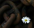
| 08/29/2004 04:14:41 PM | Hope can't be chainedby arngrimurComment: Oh, the contrasts! Soft versus hard, bright white and colors vs. very dark and blacks, smooth vs. rough, organic vs. mineral, it all combines to make for a really attractive image. Now, ... "Hope"? Without the title I could probably come up with the word "hope" as one of my first ten guesses, but then, "Hope" is a very hard concept to convert into a stand-alone image. And you've done a really great job. |  Photographer found comment helpful. Photographer found comment helpful. |
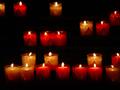
| 08/29/2004 04:08:24 PM | Candlesby NRRonComment: Ok, the candles are attracting me in this challenge. Yours are really unique in that there is such a subtle contrast between the yellow and the reds, the bright flames and the dark background. The repetition, row by row, and pattern of dispersion, add to the attractiveness of the image. The only possible criticism, for which I do not have a suggested cure, is the question of where to crop. The upper left candle is only partially shown and it would be nice to have as much dark space above the top row as there is below the bottom row - but, if including those extra areas in the image brings in other objects which would be distracting, then you did the right thing. Oh, well, enough banter. Really nice photo for a challenge on Hope. |
| 08/29/2004 03:56:54 PM | Esperanzaby 77DXComment: I've always been particial to artwork lit from within by a single candle. One of my favorites is St. Joseph the Carpenter, a painting by Georges De La Tour in the 1600s. It currently resides in the Louvre in Paris. In that one the candle is hidden behind the young boy's hand and actually turns the hand almost translucent as it lights up the painting. This photo has much of the same quality - even to the religous connotation. I really like it. Congratulations. | | Photographer found comment helpful. |
| 08/28/2004 03:10:52 AM | and.... where is my house????by kaske666Comment: The two biggest factors I used in my rating were: 1) If I came upon this image outside of the challenge, what word would it evoke ("hope" wasn't in the top five); and, 2) What do I think of the quality of the image (no detail and out of focus). If there were no title, I'd have trouble figuring out the theme. As a result, I couldn't find any positive points for which to give credit. Hey, that's just me. I sure that there were others who really liked it. | | Photographer found comment helpful. |
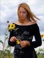
| 08/28/2004 03:00:18 AM | He loves me, he loves me not...by dwterryComment: Rated this a six, then a seven, then an eight. It kept growing on me. As a portrait, it is so striking - natural windswept hair, crystal clear focus on the whole individual, obvious symbolism of "loves me, loves me not" even without title (Why do we have to include titles, anyway?), great contrast of black dress and yellow flowers, no confusing background because of angle of shot, downward look indicative of hopeful longing - it is just a really nice photo. Doesn't hurt that the subject is very attractive also. | | Photographer found comment helpful. |
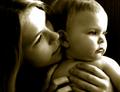
| 08/28/2004 02:15:20 AM | Bright eyesby sprite777Comment: Great composition and contrast. I'd love just a touch more detail on the highlight areas and slightly more focus on the hands, but that's just me. It works wonderfully the way it is. Love how they are so seriously concentrated on what's off to their left. Such a closeness, warmth, security and tenderness. Really nice. | | Photographer found comment helpful. |
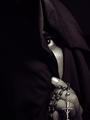
| 08/28/2004 02:10:42 AM | Hope for toleranceby nico_blueComment: Ok, I'm confused. A veiled muslim with a catholic rosary? Or am I missing something? Regardless, it is a striking photo , well balanced with nice contrast. I would have liked it even more if it was cropped with an additional 1/2 inch added on the bottom so the whole rosary shows. | | Photographer found comment helpful. |
| 08/26/2004 02:46:12 PM | Stripedby kosmikkreeperComment: Nice idea with the shadows. Like the watchful "eye", the cropping and the use of the dark background across the top. |
| 08/26/2004 02:41:36 PM | | | Photographer found comment helpful. |
| 08/26/2004 02:32:04 PM | Sale 40% Offby arngrimurComment: Just couldn't find it that interesting from my viewpoint. And the sign is kind of distracting - although I understand the relationship. Just didn't feel positive about the image. Maybe if you were working only with the legs from mid-thigh down, without the sign and without the black background on the top 1/3, maybe there would be something there. |
|
Showing 281 - 290 of ~343 |
Home -
Challenges -
Community -
League -
Photos -
Cameras -
Lenses -
Learn -
Help -
Terms of Use -
Privacy -
Top ^
DPChallenge, and website content and design, Copyright © 2001-2025 Challenging Technologies, LLC.
All digital photo copyrights belong to the photographers and may not be used without permission.
Current Server Time: 08/04/2025 03:51:41 PM EDT.
|