| Image |
Comment |
| 06/09/2006 11:09:35 PM |
Goodbyeby JLThomasComment: From the Critique Club
Ok keeping it real here. I like what you attempted to accomplish. A very interesting set up and honestly feel it could of worked well if executed properly. There is something I am learning finally after two years here at DPChallenge and I think it applies to photography in general. If any portion of your photograph does not enhance the shot take it out or do everything legal to lessen it's appearance. That should of been done with the wrinkles in your backdrop (white) and on the floor especially. I'm looking at the subject, which by the way has nice textures on the seat, but my eyes are pulled down to the wrinkles on the floor just below the chair. Then when my eyes focus on that my peripheral vision brings my eyes up to the reflection's on the white backdrop on the side. See how elements that are distracting should of been remove or lessen there appearances in the photograph.
My take on your picture is that it's about a person here one second and gone the next. I hope I'm right on that. What you could of done is increase the appearance of the subject matter. In your photograph it is overpowered by the distractions. Well all except for the chair. The shirt should, IMO, been bolder not letting us see though it. and the shoes should of been brightened up to get more detail.
These are some of the thing I feel you could of done to make this photograph better. You are showing that you have the ability to be very creative and effective in your setup physically now it comes down to technically and I believe your are on the right track and we will be seeing higher scores from you.
Keep up the good work and I hope you find this critique helpful. If you have any questions about my critique feel free to contact me. I wish you the best in your future challenges.
regards,
SDW
|
 Photographer found comment helpful. Photographer found comment helpful. |
| 06/09/2006 10:37:12 PM |
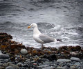
Free as a Birdby STEINRComment: From the Critique Club
First off I can't help but feel you may have entered this in the wrong challenge as a lot other commenter's have suggested. If so it is a shame because you have a great picture here that with a little more post processing would of made a great challenge entry. Even with your score be proud of your photo because it is very good.
Composition and lighting is nice and the dof is great. The bird is slightly soft focus but could of been enhanced in editing. The subject looks very good against the broken background. There is not much more to add that others have not brought to your attention. I find in this case not meeting the challenge really brought your score lower than it should of been.
Overall a very good photograph with a little more processing could of made it great. Also entering it in another challenge would of helped. I wish you the best in future challenges and I hope you find this critique helpful. If you have any questions feel free to contact me.
regards,
SDW |
| Photographer found comment helpful. |
| 06/09/2006 10:23:33 PM |
Beauty by Candlelight...by hitmanrrComment: From the Critique Club
Very nice pose and composition along with good warm tone. I think you did good with the set up and processing. Even though the soft focus is good I think the eyes would of been better if they were in focus because they make the picture. Your model is speaking volumes with her eyes making me want to know what she is looking at and thinking.
Being that this was an advanced editing challenge I feel you could of used a few more tool available to enhance your photograph. Such as selective sharpening and more.
Overall I think your photograph is very good with a little more tweaking could of been great. It does show that you are a very capable photographer showing your ability to compose the photograph is such a good light.
Keep up the good work and take advantage of advanced editing when able to bring out the wow factors in your photograph. I know it scored in the mid 5's but your photograph has the elements to be a 6+ photograph.
I also feel you did a great job meeting the challenge and the title is good. I hope you find the critique helpful. If you have any questions feel free to contact me.
Thanks,
SDW |
| Photographer found comment helpful. |
| 06/09/2006 09:17:30 AM |
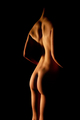
Curvesby commendatoriComment: From the Critique Club
A very nice low key image. The lighting is very good along with the focus. Your subject works well in the center of the photograph and shadows of the models body contours enhances the appeal. Very visual friendly.
If I had one spot of the image that I wish the lighting would give more detail would be the arms. Compared to the legs and lower back the light on the arms are very thin and minimal. Other than that a technically sound photograph done in a tasteful manor.
Good job!
I hope you find this critique helpful.
Thanks,
SDW |
| Photographer found comment helpful. |
| 06/09/2006 12:54:58 AM |
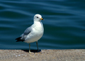
Free As A Birdby skasubaComment: From the Critique Club
Your picture is ok but lacks the power needed to retain the attention of the viewer. First I would like to say your lighting is good. There are a few things I would have to recommend changing about your photograph. First your subject is to centered and the power of the water behind him pulls my eyes to the waves because they are visually more exciting. I would of cropped in such a way to make the subject off center and I would of cropped off about 20% of the top of the photograph. The old saying if it does nothing to improve the photograph, take it out.
As far as taking the picture I believe a bird in flight would of worked better given the title of your photograph. Or maybe this shot with a lower point of view. If you look in the eyes of the bird they are really soft, almost out of focus.
Overall a good photograph but the subject in its position and light not powerful enough to pull out a high score. When taking a photograph make sure your subject is more powerful than the environment around him, IMO. Keep up the good work. This may have not been your best work or best score but you have room for improvement and I believe you will. Keep at it because your shot was good. It just need those things that take a picture over the top.
I just looked at your profile and see this is your first entry. Please don't take my critique as a bad thing look at it as something to build on. I remember my first challenge, I destroyed it. I think I scored 4.8 or so. It was so small you could of called it a postage stamp. I had lens glare and the colors was washed. I was down about my score until a kind member PMed me and gave me a good critique. That member did me the best favor being honest. I know I'm not near the photographer that some are here but I can tell you what I see and how I feel about your photograph and hope you take it as constructive. If you do your score will do nothing but improve.
Thanks for letting me be your first Critique. I hope to see you in many more challenges.
I hope you find this critique helpful.
SDW |
| Photographer found comment helpful. |
| 06/08/2006 10:33:58 PM |
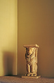
Persian Pedistal at Duskby chaliceComment: I like the tone of your photograph and the lighting is good. Your crop of the room is to tight, IMO, not giving me the sense of an empty room. It's like I could look to the left or right and see a sofa or chair. The Corner of the room (vertical line) is stronger to me than the subject. I find my eyes homing in on the line.
I don't know if you were able to, but I feel the statue would of been better placed in the corner covering up the most of the corner line and then doing some burn to take down the highlights on the line above the statue. And maybe a little more sharpness on the statue would of helped.
With all that said I feel your photograph is good and with a few adjustments could of been better. I feel you did meet the challenge even though the crop is tight. Keep up the good work and I wish you well in the challenge. 5 |
| Photographer found comment helpful. |
| 06/08/2006 03:16:33 PM |
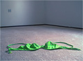
Abandonby tembaComment: I think you did a good job of showing an empty room but the picture is just ok however it does meet the challenge. There is nothing to make me say wow. You did a good job of obviously letting us see your one prop in the room. But it is a shark contrast to it's surroundings. The green is a bit to bright and blown to the point that the blue lines are hardly visible.
I like the Dof but the composition could of been a little better IMO. The corner of the room is to close to the middle of the picture and the layout of your prop is not random as it would be if someone would of pulled it off and dropped it to the floor. It looks to staged.
I would of liked to have seen the corner of the room a little more to the right of the picture (about on the third line) and the swim top off to the left in a random drop making it appear to be dropped to the floor instead of placed.
I'm trying to tie the title into the picture and the prop. I can see where the room and the title corresponds but the prop is a little of a stretch for me. But in fairness I don't know what your reason was for that particular prop, maybe abandoning a top as well and going topless. So it's not a bad title or prop.
As I was typing this I alternate shot came to mind. I think it would of taken this shot to a new level if you would of chosen a yellow poke dot bikini and had it on a rack hanging on the wall on the left side by the wall plate where the light is. Then it would of given me (the viewer) a sense of abandon room and the abandoned idea of someone being able to fit wear the bikini.
Overall your picture is not bad. I has good lighting, focus, and DOF. Composition could of been better. Good job maybe worth a second take.
Keep up the good work. 5
SDW |
| Photographer found comment helpful. |
| 06/08/2006 02:05:18 AM |
This Boy ( Beatle album 1963)by fredahenryComment: From the Critique Club
Oh I'm glad I pulled this image. I like it a lot. I think your photograph ties in very well with the title and song lyrics. The song (B side of "I want to hold your hand) is about a boy loosing his girl to another boy. And he (This Boy) wants her back. The other boy want be happy, where he will if he gets her back.
So I take that and look at the photograph and I can see that in the picture. Yes the boy in the photograph is young but we all remember I first puppy loves. And I think that is where this picture and the title along with the challenge works well. Congratulations on a good choice.
Now as far as the technical aspect of the photograph I don't see much wrong there. I love the tone -by far the best for this photo. I think the lighting from the highlights, midtones, and shadows are all great. And the composition is good.
If I had one or two things to pick on it would be the bright areas in the background. Even though they are very well softened by the use of a shallow dof they still draw a little attention away from the face. I wish his eyes would of been a little brighter showing more detail. Other than that, I think this is a great piece of work from the photo to the title to making it all fit the challenge. Great Photograph!
Keep up the good work and I hope you find the critique helpful.
SDW |
| Photographer found comment helpful. |
| 06/08/2006 01:28:10 AM |
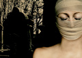
In my hour of darkness ( Let it be )by Arti-ElviComment: From the Critique Club
Very nice focus and lighting on the subject. Also good placement of the subject. As you know the photo is good as reflected by your score. But I feel a little more detail in the background, be it highlights or midtones, would of helped the overall image. And there is one place that keeps drawing my eyes and thats the perceived "V" in the middle of the photo caused by the tilt of the stone and tree. Being in the center it somehow wants to compete with the subject. I really would have really liked to see some detail on the side of the tree (if that is what is is) because it seems flat and splits the picture almost down the middle.
Overall good title with picture choice that a few adjust would of made better. I hope you find this critique helpful.
Thanks,
SDW
|
| Photographer found comment helpful. |
| 06/08/2006 12:22:56 AM |
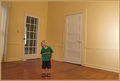
Curiosityby ShaneBlakeComment: Ok keep it real here. The photo is not bad but I have a few issues with it. The main one is the horizontal line that bends and goes down to the child's head. That is very distracting. It also, with the bend, ends up almost in the center of the picture make the picture look like it is split. I think, in this photo, black and white or some other duotone would of worked better than the colored version. Everything from the child, floor, walls, and doors seem to have the yellowish tint. And the border does not do anything to help that. I think maybe positioning the child near the glass pane door with a reflection or shadow coming it would of helped. With that said you did meet the challenge. |
| Photographer found comment helpful. |
Home -
Challenges -
Community -
League -
Photos -
Cameras -
Lenses -
Learn -
Help -
Terms of Use -
Privacy -
Top ^
DPChallenge, and website content and design, Copyright © 2001-2025 Challenging Technologies, LLC.
All digital photo copyrights belong to the photographers and may not be used without permission.
Current Server Time: 08/16/2025 10:33:49 AM EDT.