| Author | Thread |
Comments Made During the Challenge  |
|
|
06/11/2006 11:37:04 PM |
|
A good image but find the oversharpening doesn't really work for this one. Rest of the image looks pretty good. |
|
 Photographer found comment helpful. Photographer found comment helpful. |
|
|
06/11/2006 10:24:20 PM |
|
One precious thing in an empty room. At max 640 pixels, I assume that is why some edges are saw tothed, and also I would have liked the wall intersection to have made up the alingment of the photo. Skilled model! |
|
| Photographer found comment helpful. |
|
|
06/10/2006 11:37:09 PM |
|
| Photographer found comment helpful. |
|
|
06/10/2006 02:20:17 PM |
|
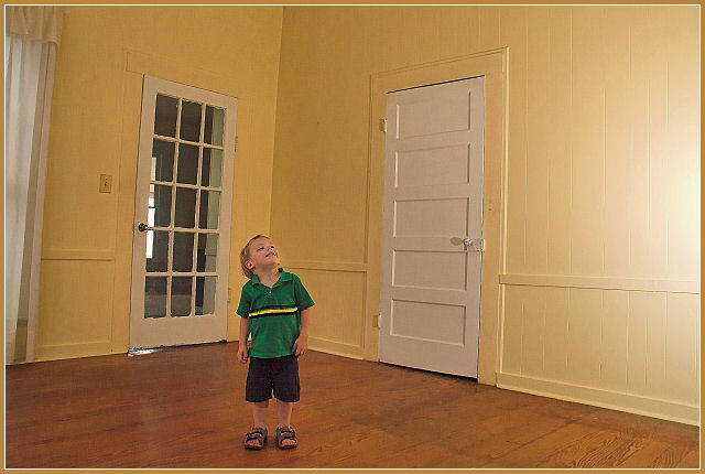
Cute and meets the challenge, but I'd have at least one line parallel with the edge of the picture - probably the line where the walls meet. |
|
| Photographer found comment helpful. |
|
|
06/09/2006 07:26:42 AM |
|
Hehehe...cute! Love the colour of the shirt against the walls. |
|
| Photographer found comment helpful. |
|
|
06/08/2006 12:22:56 AM |
|
Ok keep it real here. The photo is not bad but I have a few issues with it. The main one is the horizontal line that bends and goes down to the child's head. That is very distracting. It also, with the bend, ends up almost in the center of the picture make the picture look like it is split. I think, in this photo, black and white or some other duotone would of worked better than the colored version. Everything from the child, floor, walls, and doors seem to have the yellowish tint. And the border does not do anything to help that. I think maybe positioning the child near the glass pane door with a reflection or shadow coming it would of helped. With that said you did meet the challenge. |
|
| Photographer found comment helpful. |
|
|
06/06/2006 05:56:11 AM |
|
good idea but execution has failed, the quality of the photo is no good and the frame is really ... out. |
|
| Photographer found comment helpful. |
|
|
06/05/2006 02:11:41 AM |
|
I like the placemant of the chils the corner creates that triangle that gets the eye into the image 7 |
|
| Photographer found comment helpful. |
|
|
06/05/2006 12:36:53 AM |
|
The appearance of artifacts in this image (jaggies around/on the doors especially) is rather distracting. |
|
| Photographer found comment helpful. |
Home -
Challenges -
Community -
League -
Photos -
Cameras -
Lenses -
Learn -
Help -
Terms of Use -
Privacy -
Top ^
DPChallenge, and website content and design, Copyright © 2001-2026 Challenging Technologies, LLC.
All digital photo copyrights belong to the photographers and may not be used without permission.
Current Server Time: 07/01/2026 06:50:49 PM EDT.