| Image |
Comment |
| 01/02/2005 02:09:01 AM |
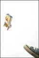
Kick the Habitby soupComment: Nice work but I feel the light is a bit bright on the cig packet. |
 Photographer found comment helpful. Photographer found comment helpful. |
| 01/02/2005 02:07:02 AM |
|
| 12/26/2004 05:54:10 AM |
Broken awayby LevTComment: Greetings from the Critique Club,
I like the idea behind the image and the lighting is very good it was the good afternoon light that gives the image character with the shadows coming across the eggs.
But it just needs a better composition to make the presentation more appealing. I suppose you could spend hours arranging things and get caught up too much without really stepping back and seeing some more basic aspects. To me the way the image is presented now it would look better if it was in landscape orientation but something I would also do would get the camera angle much lower to the ground to bring you into the subject.
You had a very good concept that just lacked a little extra planning before you shot to get you the score it deserved.
Best wishes and good luck in future challenges.
Tim Sturt
|
| Photographer found comment helpful. |
| 12/26/2004 12:11:46 AM |
Rebel Yellby umbrisComment: Greetings from the Critique Club,
This was a good subject for this challenge but it lacks any real focal point, which leaves the viewer thinking that it just a pile of junk. If you could have displayed it in such a way that the rebel body and logo was more prominent I think you would have had a much stronger image.
The image is nice and sharp with very good lighting and exposure but it’s far to busy which is the real problem and is probably what held it back in the scoring.
The visual image of a camera in pieces would certainly evoke emotions amongst fellow photographers so you did well in your selection but it just needed better composition.
Good luck in future challenges
Regards
Tim Sturt
|
| Photographer found comment helpful. |
| 12/25/2004 11:55:33 PM |
Dilapidated Barnby rayg544Comment: Greetings from the Critique Club,
This was a good subject for this challenge but the colors appear a little flat and could have been improved with a little saturation. I don’t think that the border adds anything to the image but that is just my personal taste.
Composition wise the image is a little dull and perhaps if it was shot from further to the right you could have used the fence line as a leading line also if you stood further away so we could see more of shed in it’s environment. There is also something bright red in color on the right side of the shed that is distracting.
I notice that the sun is low in the sky, which is good, but maybe for added impact you could have shot it earlier in the morning or later in the afternoon.
Overall the image is a little bland but didn’t need much work to get a much better outcome.
Good luck in future challenges
Regards
Tim Sturt
|
| Photographer found comment helpful. |
| 12/25/2004 04:46:26 PM |
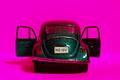
SlugBugby dwolffComment: Greetings from the Critique Club,
The hot pink has over powered this image and does not work well with the color of the car. It has almost engulfed the subject and this is exaggerated by the shallow DOF I would have preferred to seen more sharpness in the doors.
Composition wise it also is a little to central and maybe could have been better if the car was turned slightly on an angle. I think most voters would have missed the broken taillight and the angle of the bumper because of the harsh color and would found it hard to understand why it is in a broken challenge.
In most cases that I have seen the use of toys/models etc have not done well with the voters and because of that should be avoided unless you don’t care about the votes it receives.
Good luck in future challenges
Regards
Tim Sturt
|
| Photographer found comment helpful. |
| 12/25/2004 06:51:24 AM |
Why My Mouse Won't Workby cloudsmeComment: Greeting from the Critique Club,
The first noticeable element to this image is the great lighting used it really is first class. The composition is very good for portraiture with the eyes in just the right spot.
Probably the next most important thing I notice is that the picture lacks the impact that is required for a challenge titled broken. To me something broken can be quite dramatic and a mouse in the hands of a toddler will probably end up broken but this is not the same as visually displaying something broken. I think this is the area where voters have marked you down because they found it hard to make that link.
Overall this is a very good portrait but not really suited for this challenge.
Good luck in future challenges.
Best Wishes
Tim Sturt
|
| Photographer found comment helpful. |
| 12/25/2004 04:09:07 AM |
Broken CD Surfaceby WinterbergComment: Greeting from the Critique Club,
I love this image the outrageous colors really jump out at you. Together with the graphic nature of the smashed CD create a first class abstract image.
I was surprised to see that it was straight from the camera as it looks like the colors are saturated but I now can see how the single light has brought theses out. This image would not look out place in a Sci- Fi movie set or even a CD album cover such is the quality of it.
It is a little disappointing that this image didn’t receive a ribbon but the DPC crowd always have trouble digesting abstract type images or images where a bit of artistic license is rendered. This is the first time I have seen this image and will be adding it to my favorites I like it so much.
Congratulations on such a great image and good luck in future challenges.
Best Wishes
Tim Sturt
|
| Photographer found comment helpful. |
| 12/24/2004 07:53:23 PM |
Fly the Flagby NodeComment: Greetings from the Critique Club,
This is a very striking image that can evoke many thoughts and interpretations to me it seems like a medieval battleground following a large battle. In fact it could possible be a scene from Lord of the Rings.
An image like this can carry the viewer away because of its intrigue and should score well. It will have a lasting impression and those that view because they will search further into the image so your selection for this challenge was excellent.
Silhouettes need to be sharp as possible and this is. The composition is great although I would have been inclined to have the moon a little more right of the flagpole. The treatment you have given the clouds by burning is very good and gives that extra dark gloomy feel that compliments the focal subject.
Overall Bob you have a excellent photograph with some very clever digital darkroom treatment to give a very thought provoking image, great work.
Cheers
Tim
|
| Photographer found comment helpful. |
| 12/22/2004 07:33:35 AM |
Abandonedby rmtm333Comment: Greetings from the Critique Club,
This image had so much potential but fell down a little in the basic composition in my view.
You have great colours and textures in the stone and wood and contrasted well with the jagged edged glass. The image is sharp and the exposure is handled well the subject has a fair bit of intrigue about it and meets the challenge ideally. The desaturation of wood works very well in this image and perhaps we could have seen more of it.
The more I look at it the more it says “central image” this would have helped enormously, I feel that you would have scored much higher if you didn’t crop as tight on the left and tried to center the window frame. I would also like to see more of the wood at the top and less of stone on the bottom and then you would have a much more pleasing to the eye type image.
Congratulations on an image that is very good and scored well but could have scored better.
Best Wishes
Tim sturt
|
| Photographer found comment helpful. |
Home -
Challenges -
Community -
League -
Photos -
Cameras -
Lenses -
Learn -
Help -
Terms of Use -
Privacy -
Top ^
DPChallenge, and website content and design, Copyright © 2001-2025 Challenging Technologies, LLC.
All digital photo copyrights belong to the photographers and may not be used without permission.
Current Server Time: 08/06/2025 09:20:54 AM EDT.