| Image |
Comment |
| 11/24/2004 12:40:12 AM |
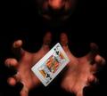
Psychic authorityby theodor38Comment: I see this as defying authority. I am trying to figure out why the artist chose the Kind of Clubs. I am sure there was a reason. I like the lighting and the shape contrast of the linear shape of the card and the curves and shadows ow the subjects hands and in the hint of his face. Captivating photo. |
| 11/24/2004 12:37:52 AM |
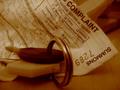
Bummer....another speeding ticket!by SweetlipsComment: This is brilliant. Nice use of muted color and great focus on the words of the ticket. I would like to see a little tighter focus or a little softer focus on the keys. Take it one way or the other. Right now it just seems that they are a tad soft unintentionally. Very nice photo. Framing is the key to why this photograph works for me. The corner of the summons just barely skimming the right edge of the frame and the placement of the keys and their movement out of the frame adds just the right tension. Sweet. |
 Photographer found comment helpful. Photographer found comment helpful. |
| 11/24/2004 12:34:26 AM |
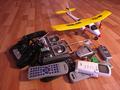
Where is the key of freedom?by paha_lComment: I like the idea, because gadgets can rule your life. The title and the airplane don't work for me. I really think the artist was on to something with the gadget idea. There are some great shape motif possibilities in this image. Creative, but undefined and to frenetic for me to grasp a focal point. |
| 11/24/2004 12:30:59 AM |
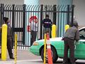
The Crossingby rkligmanComment: Great color combination. There is certain focal point, so I am unsure what is the authority here. The car seems to take the focal point. The use of the bars could offer an interesting take on authority, maybe cropping tightly to the man in front of the stop sign. The artist would have to play with it a bit to see if it would work. Just a thought. |
| Photographer found comment helpful. |
| 11/24/2004 12:27:03 AM |
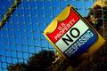
I dare you!by twentyfivesComment: Great angle, it gives a dizzying effect which works well with the concept, but I would crop this a little tighter. It seems to be fading off the frame due to the shadow. That takes away from the imposing image the artist was trying to convey, especially since the title makes a dare. I would also shoot the shot from below even more. Let the sign tower over the viewer. |
| Photographer found comment helpful. |
| 11/24/2004 12:22:44 AM |
Authorityby arsenalComment: Interesting lighting and shadow. I am not sure what I think of the use of this as a symbol of authority. Perhaps an even more extreme angle, shot from below would convey the message better. |
| Photographer found comment helpful. |
| 11/24/2004 12:21:23 AM |
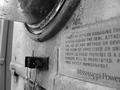
Electric Meterby kittenfcComment: Interesting point of view. I like the gritty realism of the photo. I would like a more determined focal point so that the message would come across more powerfully (get it- sorry, couldn't help myself.) Very interesting contrast of line and curve. |
| Photographer found comment helpful. |
| 11/24/2004 12:19:06 AM |
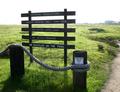
Nature Rules!by ZippyComment: Your focal point would have more impact if it were lit better and framed diferently. Interesting idea. I like the irony of your title. Very creative. |
| Photographer found comment helpful. |
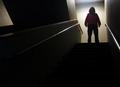
| 11/24/2004 12:17:53 AM |
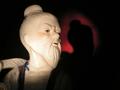
The Man Upstairsby ShadowrainComment: This gives me the feeling of horror rather than authority; however, sometimes they are the same thing, aren't they? I would have cropped the light on the brick wall out of the image, it distracts from your focal point, which is imposing. |
| Photographer found comment helpful. |
| 11/24/2004 12:16:30 AM |
|
| Photographer found comment helpful. |
Home -
Challenges -
Community -
League -
Photos -
Cameras -
Lenses -
Learn -
Help -
Terms of Use -
Privacy -
Top ^
DPChallenge, and website content and design, Copyright © 2001-2025 Challenging Technologies, LLC.
All digital photo copyrights belong to the photographers and may not be used without permission.
Current Server Time: 08/01/2025 10:01:31 PM EDT.