|
|
| Image |
Comment |
| 02/23/2003 07:24:24 PM | |  Photographer found comment helpful. Photographer found comment helpful. |
| 02/23/2003 07:16:09 PM | Alone in the Light by indigo997Comment: A cliche, but perfectly done! Lighting, focus, composition, even the finishing border is very professional. Excellent job! | | Photographer found comment helpful. |
| 02/23/2003 07:12:13 PM | |
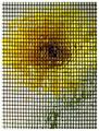
| 02/23/2003 07:07:08 PM | Portrait of a Gerbera (Chuck Close tribute)by 'PongComment: Very interesting. I like this abstract and I think this is very creative (well, creativity inspired by Mr. Close probably, but that's ok).
The grid maybe is a little bit too thick because the flower is almost not recognisable, but maybe that was intened.
It takes some time until you notice that some of the spaces are filled with water and create a refraction. There seems to be no pattern though.
If this photo was inspired by a spcific painting from Chuck Close, I would like to know which one. I looked on the Web for a while but didn't fine one. | | Photographer found comment helpful. |
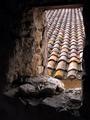
| 02/22/2003 10:21:48 PM | Other Sideby crabappl3Comment: Greetings from the Critique Club, Danny!
Composition: Very interesting. At a first glance I also would have said, that you should have cropped more from the right side. But then I realised that the patterns on the wall are quite interesting. But there is something about the composition which feels odd. I think using the rule of thirds would improve the photo. The centering doesn't fit here. I don't know if it would have been technically possible, but instead of cropping from the right I would like to see more from the left side. Then there also could be seen more of the darker area on the left, which corresponds the the right side.
Lighting: I guess the red colour comes from a wrong or no white balance setting. I don't know of that was intentional but I would like it be more "natural". I know it's a bit silly because for this subject it does not matter if it's red, yellow, blue or green. But the red just _looks_ like a technical "error". While testing some different crops I also changed the hue a little (+16) which results in a more golden/yellow tone. I think that's much better.
The "star" effect created by the small aperture is nice.
Focus: Generally ok. 1/2s exposure time, so you surely used a tripod. I can't make out where the camera focussed, but the foliage could be a bit sharper.
Challenge: Met. A deeper tunnel would have had more impact, but it certainly fits to the challenge theme.
Creativity: Well, not overly creative, but not totally boring either.
If you have questions just send me an Email. I'll happily discuss this more.
-Stephan
| | Photographer found comment helpful. |
| 02/16/2003 08:58:37 PM | Mariners Fanby timj351Comment: Greetings from the Critique Club, Tim.
Composition: Not so good. The only positive element I can see are some lines guiding the viewers eye to your subject. But there are more elements I don't like. Primarily the background which is competing with your subject. I also would like to see either the whole logo or not at all. The centered subject placement makes this photo looking like a generic family photo album photo. Maybe that was your intent (regarding the challenge theme) but it's boring.
Pesonally I would have placed your niece more to the left, under the arm of the elk mascot and cut the logo.
Lighting: It probably was overcast so the lighting looks very flat. This also makes the photo look boring. The difference of the lighting conditions in the background photo and on your subject is a bit strange. They don't "fit" together.
The brighter "band" of reflection on top of the photo is distracting.
Focus: The focus is ok. Everything is in the same focus. I can't see anything bad but also nothing good on that.
Challenge: Yes. This is a cliche subject, photographed in a very cliche manner (family photo album style).
Creativity: I'm a bit torn apart. On the one hand I can't see much creativity here. It really looks like a photo you made for your family. There is nothing technically and on your subject which makes me (as not a member of your family) want to look at it for some longer time.
On the other hand the challenge theme was "cliche" and maybe you did all this on purpose. Maybe you did on purpose a non-special composition, lighting and focus and chose this subject. Well, this would be really interesting to know. Unfortunately you didn't say anything about your intent in the photographer's comments.
Overall Opinion: To be honest, I was really surprised to see that this photo was made by you. I mean I counted 9 ribbons you achieved and you regularly score above 6 but this really just looks like a private snapshot to me. As described above it would be interesting to know if that was your intent. It wouldn't make the photo more interesting to me but at least I would understand it. ;-)
|
| 02/10/2003 01:21:49 PM | Decaying Beautyby stephanComment: To be honest I was a bit disappointed by my inital score (5.0) last Monday. I thought it was the kind of photo which would score a bit higher here on DPC. But one thing is for sure: The scores here on DPC always will be a miracle to me ;-)
Your comments were helpful, because they gave me feedback about what you think, but I mostly don't agree :-)
Many people said that the lighting was too dark. Well it is dark, but in my opinion it's not too dark. That was what I wanted to do. The flower almost vanishing in the darkness. It hought that would fit to the "decay" theme.
Also people wished I had cropped it more tightly. Well, that was also intended. The original actually was more tightly cropped and I put more space around it by adding a black border (well not really a border because you can't see it, but you know what I mean). Without that I felt that the flower was too big and you basically look into the middle black area. Making it smaller and adding the black space, brought more atention to the petals. Maybe that was a wrong decision, but I don't really think so.
The light painting technique didn't seem to be visible. Nevertheless I like it very much and I'm sure I'll work with that a bit more.
The most funny comment was from joanns, because it hit the nail on the head. Yes, I waited too long and the flower decayed much faster than I thought, so I couldn't do my "pretty flower cliche" I previously had in mind ;-)
Thanks again to everybody for your feedback.
|
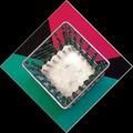
| 02/09/2003 08:16:39 PM | Beadedby GraciousComment: Greetings from the Critique Club, Grayce.
Composition: I like this most. The nested patterns are a nice abstract and especially the 45 degree rotation makes this is a nice eye catcher. The strange foam sheets carry this idea on very nicely. I don't know if you made the sheets yourself or if you bought it like that, but the strange lines and the contrast between colour/black is nice.
Personally I find one thing distracting and that's the view on the candle holder. It's almost perfectly from straight above, but there is a small angle which makes the 4 walls seen differently (one side smaller, another side bigger). I guess it's because the rest of the photo looks sp very geometrically accurate that this looks like a flaw. The perspective gives the subject depth, but I think a more flat look would work better for such an abstract 2D pattern.
Lighting: First, I think the lighting could be better. The colours are a bit dull and I also don't like the shadow of the candle holder. A more uniform lighting from all sides, without any shadow would work better.
While playing around with oyur photo in my image editor I noticed that when inverting the colours, they look like the green-white-red italian flag. I think this (or a different hue) would have had a much higher impact.
Focus: As far as I can see everything is in the same focus (small aperture?). This was a good choice because a narrow DOF, suggesting depth, would hurt the abstract look in my opinion.
Challenge: Yes. The photo certainly fulfills the challenge.
Creativity: To me the subject looks a bit boring. But even boring subjects can be made look interesting. If that was the intent (was it?) then I want to say "way to go!". I like abstract photos :-)
Overall opinion: Personally I don't like the overall result, but there are some nice elements I really appreciate. Message edited by author 2003-02-09 20:17:57. |
| 02/03/2003 08:27:33 PM | Abstractby stephanComment: The image of course was legal by DPC rules. Someone submitted it for disqualification and I sent in my description. It was a real photo which I scaled down to 4x4 pixels and then up again to 512x512 pixels.
So on the one hand it's technically still a photo but on the other hand also a computer generated pattern. This contradiction was what I liked. But I agree that it's not really a photo fitting to this site and the score shows it ;-)
The final decision to submit this was because I personally like the pattern and the colours and it's much closer to the type of photography I recently started to like.
Again, thanks a lot to everybody for the numerous comments. It's really interesting to see such a broad variety of opinions on a single photo ;-)
|
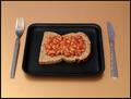
| 02/02/2003 09:42:44 PM | A square mealby snaperukComment: Good composition although I think an even higher angle would have been better.
The lighting seems to have a red tint. Maybe the auto white-balance failed or maybe it's the natural colour of the background. If that's the case then I think a white background would have been better.
I know it's nitpicking, but you should have positioned the blade of the knife to the left side. Somehow that's what strikes me first on this image ;-) |
Home -
Challenges -
Community -
League -
Photos -
Cameras -
Lenses -
Learn -
Help -
Terms of Use -
Privacy -
Top ^
DPChallenge, and website content and design, Copyright © 2001-2025 Challenging Technologies, LLC.
All digital photo copyrights belong to the photographers and may not be used without permission.
Current Server Time: 08/12/2025 06:39:10 AM EDT.
|