| Image |
Comment |
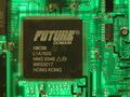
| 08/18/2002 04:27:00 PM |
This is where something new is at...by TrexXComment: I like this photo a lot. I like the lighting from the back, I like how it portrays "something new". Technically I don't see much I would improve. Maybe an additional light source from the side to make the golden pins of the processor more shiny. One of my favourites this week. -stephan |
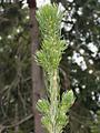
| 08/17/2002 09:18:00 AM |
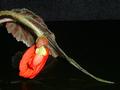
New Growthby waltomlComment: I like the thaw (or is that resin?). Maybe you did it on purpose but I don't like how the tree in the background is almost aligned to the subject. I think it would have been better to move to another position so that the background is more uniform and less distracting. Also the lighting is not so good. The subject looks very flat. |
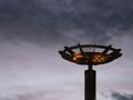
| 08/18/2002 04:29:00 PM |
New Dayby jeremyaComment: Beautiful photo! Good use of the rule of thirds. I love the lighting and the clouds make a very interesting background. -stephan |
| 08/17/2002 09:39:00 AM |
Web Designerby HendrikComment: Very funny :-) Creative title! It also fits to the challenge very good. The focus is a bit strange. I understand the the spider is blurred and that's actually a nice hint that she is busy with her work. But parts of the web (lower left side) have a good focus while other parts like the center of the web or the lower right side are blurred. I would have liked ot much more when the whole web was in fucus. A smaller aperture could have helped. The lighting is very good. -stephan -stephan |
| 08/17/2002 09:29:00 AM |
Palm Puppyby MorganComment: Cute subject. The photo looks fuzzy which in my eyes is good in this case, because it fits to the subject. However creativity is not so good and the photo is not really one where I say "Yikes! That's amazing" (and I'm not much better in this ;-)) -stephan |
 Photographer found comment helpful. Photographer found comment helpful. |
| 08/18/2002 04:40:00 PM |
New Life, New Father, New Loveby SonifoComment: First I thought "Oh no, not another baby photo" but then I saw that it's the whole scene and the gesture of the father you wanted to portray. The sunset and the frotal lighting are beautiful and it really adds to the photo. The photo transports a warm and good mood. It wouldn't be necessary to have such an almost over-explaining title. The photo works on it's own. -stephan |
| Photographer found comment helpful. |
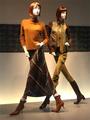
| 08/18/2002 04:34:00 PM |
Styleby MiekaComment: Very "stylish" ;-) Creative interpretation of "something new". I like this photo. The setup of the display dummies creates an interesting dynamic. Also the lighting is good. -stephan |
| Photographer found comment helpful. |
| 08/17/2002 09:57:00 AM |
Opening Soonby syamjonimiComment: Clever title! ;-) Composition is good. The curve makes the photo interesting. Lighting is not so good. Did you use a flash? There is glare on the leaf. I also don't like the background. One party grey, one part black. -stephan |
| 08/17/2002 09:52:00 AM |
Scent of a photoby conqComment: I like this photo a lot. Very good composition, lighting and focus. I love the diagonal lines. -stephan |
| 08/17/2002 10:58:00 AM |
Noneby TonyKComment: Very nice photo. I like how you portrayed the "kitsch". You chose your background well. I can't say anything how this photo could be improved. -stephan |
Home -
Challenges -
Community -
League -
Photos -
Cameras -
Lenses -
Learn -
Help -
Terms of Use -
Privacy -
Top ^
DPChallenge, and website content and design, Copyright © 2001-2025 Challenging Technologies, LLC.
All digital photo copyrights belong to the photographers and may not be used without permission.
Current Server Time: 08/14/2025 09:01:18 AM EDT.