| Author | Thread |
Comments Made During the Challenge  |
|
|
08/18/2002 11:49:00 PM |
|
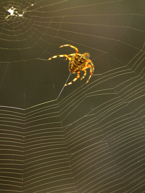
Not bad...Try a faster shutter speed however...Looks a bit fuzzy |
|
|
|
08/17/2002 11:35:00 AM |
|
Good shot, the spider seems a little out of focus, i give it a (7) |
|
|
|
08/17/2002 09:39:00 AM |
Very funny :-) Creative title! It also fits to the challenge very good. The focus is a bit strange. I understand the the spider is blurred and that's actually a nice hint that she is busy with her work. But parts of the web (lower left side) have a good focus while other parts like the center of the web or the lower right side are blurred. I would have liked ot much more when the whole web was in fucus. A smaller aperture could have helped. The lighting is very good.
-stephan
-stephan |
|
|
|
08/17/2002 06:22:00 AM |
|
Very nice framing, and I love the title :) |
|
|
|
08/16/2002 03:54:00 PM |
|
I love pictures of spiders, and although I know the focus is on the "new" web, I think the spider needs to be more in focus. And maybe cropped more closely to the focal point. |
|
|
|
08/16/2002 02:51:00 PM |
|
too bad it wasn't in focus, but still a good composition. |
|
|
|
08/16/2002 02:47:00 PM |
|
A little fuzzy on the spider, but a wonderful catch. I don't know how close your cam can go, but it would have been interesting to see the web spinning more closely. Challenge well met. This is a 9. Swash |
|
|
|
08/16/2002 10:48:00 AM |
|
Captured the web beautifully, but the spider is blurred. Composition is good. Meets challenge? Vaguely. |
|
|
|
08/16/2002 05:31:00 AM |
|
|
|
08/15/2002 09:47:00 PM |
|
LOL! Cool idea of "web" designer! I give you a 7. |
|
|
|
08/15/2002 04:18:00 PM |
|
The composition is great... if the focus were a little better this would be perfect. |
|
|
|
08/15/2002 11:38:00 AM |
|
very cool composition. little soft though. |
|
|
|
08/15/2002 08:55:00 AM |
I wanted so badly to score this higher than I did because I really like the composition. I had to take off points mainly because of the focus not being on the spider as the subject. The color of the background is good and compliments well with the color of the spider. The bright spot of the web center in the upper left is a little bit distracting too but may be less so if in focus. Was this shot in your camera's macro mode or not? I kind of get the feeling it wasn't or if it was you may have been out of it's effective macro focus range.
Score: 5
Courtenay |
|
|
|
08/15/2002 12:45:00 AM |
|
I seem to get new web designers as fast as I can shake a stick at them. Definitely new |
|
|
|
08/14/2002 12:24:00 PM |
|
Try this on a cold day, as they slow down and help you freeze the motion a bit better. |
|
|
|
08/14/2002 06:29:00 AM |
|
Great opportuinity for a shot and very well framed. Slight fuzzyness around the spider but nothing worth fretting about. |
|
|
|
08/13/2002 10:25:00 PM |
|
|
|
08/13/2002 06:46:00 PM |
|
Gets a :) on the wit front and the web has great texture... |
|
|
|
08/13/2002 01:41:00 PM |
|
The bluriness of the photo is distracting. The lower portion of the web is in focus, but the upper portion is blurry. |
|
|
|
08/13/2002 08:58:00 AM |
|
I can't stand spiders but this is one of my favorite pics so far. Perfectly fits the challenge and I love your composition. |
|
|
|
08/13/2002 08:18:00 AM |
|
|
|
08/12/2002 08:57:00 PM |
Composition7
Technical Aspects4
Appeal7
Creativity7
Rating6Autool
|
|
|
|
08/12/2002 03:17:00 PM |
|
Try a little more aperature the next time. You'll get some more sharpness. In that way not only the web is sharp, but also the spider. |
|
|
|
08/12/2002 03:02:00 PM |
|
they make it looks so easy...and to think I went to SCHOOL for web design.....hmmm.. |
|
|
|
08/12/2002 11:58:00 AM |
|
|
|
08/12/2002 10:58:00 AM |
|
Great title! Nice composition. If the spider were more in focus, this would have been awesome! Otherwise, great idea and good job! |
|
|
|
08/12/2002 10:19:00 AM |
|
This had SUCH potential, but due to blue/focus problems, I can't give it a high score. |
|
|
|
08/12/2002 07:19:00 AM |
|
Great idea, the spider just seems to be out of focus |
|
|
|
08/12/2002 01:32:00 AM |
|
Catchy title. This is a really neat photo. Not only is it a new web, it's a new house, and new dining room table, and a new fridge. Congrats and good luck. |
|
Home -
Challenges -
Community -
League -
Photos -
Cameras -
Lenses -
Learn -
Help -
Terms of Use -
Privacy -
Top ^
DPChallenge, and website content and design, Copyright © 2001-2026 Challenging Technologies, LLC.
All digital photo copyrights belong to the photographers and may not be used without permission.
Current Server Time: 06/28/2026 09:23:29 PM EDT.