| Image |
Comment |
| 08/27/2002 07:26:00 AM |
Creativity Toolby stephanComment: Thanks again for your comments. Never got so many before :-) BigSmiles got it. I chose this soft and fuzzy focus to distract from the hand and the drawing and to draw attention to the pencil only by the colour. So no I won't make it sharper or show more details of the hand ;-) I agree with hbunch7187, I would have liked to light the shadows inside the hand more. But I had only one lamp and another one would have cast another shadow on the pencil and I think multiple shadows look bad. Oh well... I wonder how professional photographers solve such problems ;-) I saw a photo which used the same technique. It was on a beach and there was only a red cloth in contrast to the sepia toned beach background. I was astonished by the effect. So I tried it, too. It's my first photo here on DPC where I felt that I was able to actually do the photo the way I imagined it in my mind. I didn't like how the colour came out, too. Too neon and almost green. But I still learn The Gimp and wasn't able to fix that at this time. I'll post a description how I did the postprocessing effect to the forum. |
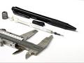
| 08/25/2002 06:24:00 PM |
Mechanicalby jeremyaComment: Very nice idea! I like the simple composition and the lighting. Focus is good, too. I wonder how it would look in b&w because it does not have much colour and I think it would look better when completely desaturated. -stephan |
| 08/25/2002 06:17:00 PM |
Red and White by RemieComment: I love this photo! The red/white contrast is great! Good composition and lighting. Only flaw I see is the merger of the white pencil with the white area, while the red pencil is more easily distinguishable. -stephan |
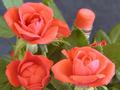
| 08/25/2002 09:19:00 AM |
Rose Wanna-Beby kevinswopeComment: Nice idea! Only flaw I can see is that the pencil seems (at least to me) not to be in focus. But since the pencil is the subject I think it should be in focus. |
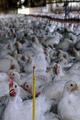
| 08/25/2002 07:01:00 PM |
One #2 pencil 17,643 chickensby boyte1Comment: I must admit that I have a hard time scoring this photo objectively. To me it's so sad to see these chicken caged in these poor conditions. Is your photo an approach to make a statement for ethical treatment of animals? -stephan |
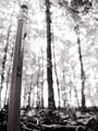
| 08/25/2002 07:10:00 PM |
Small Timberby hokieComment: Creative idea! Good DOF to focus on the pencil. B&W was a good choice, too. Is that an ant on the pencil? Cute ;-) -stephan |
| 08/25/2002 06:18:00 PM |
One of a Kindby bdshortComment: Perfect! Excellent composition, lighting, focus. Very creative and a nice style. -stephan |
| 08/25/2002 07:46:00 PM |
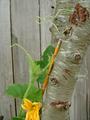
Back to School Hybridby shedevilComment: I don't really understand this photo ;-) The background could be better because it almost merges with the tree. -stephan |
| 08/28/2002 11:57:00 AM |
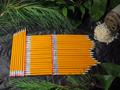
Pencil-vaniaby alanfreedComment: Oops. Actually I thought that it was a wordplay on Transylvania and the pencils resemble lots of peg's (these things which are used to kill vampires). The framing by green wood somehow backed that up (in my weird mind). I think a lot of people had problems recognizing this as the state Pennsylvania because they aren't from the US. |
 Photographer found comment helpful. Photographer found comment helpful. |
| 08/25/2002 06:36:00 PM |
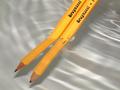
Fractionby TrexXComment: Nice idea! It took me some time to see that the right pencil was breached to compensate the refraction. The waters is a good background, too. Nice lighting. -stephan |
Home -
Challenges -
Community -
League -
Photos -
Cameras -
Lenses -
Learn -
Help -
Terms of Use -
Privacy -
Top ^
DPChallenge, and website content and design, Copyright © 2001-2025 Challenging Technologies, LLC.
All digital photo copyrights belong to the photographers and may not be used without permission.
Current Server Time: 08/14/2025 08:58:43 AM EDT.